There’s no denying there are certain tropes, certain artful conceptions, in horror genre illustration. Horror themes are swiped and reused from one artist to another – and, thus, throughout the 1960s-1980s you see the same basic tropes played out again and again on horror paperbacks, comic books, VHS boxes and magazine covers.
This is not a criticism – reusing a theme is nothing to be ashamed of. Indeed, all art borrows from other artworks. Plus, a paperback or magazine cover is a very limited canvas -you can only do so much with this format. It’s not the Sistine Chapel – it’s small, and it’s also got to be simple and attention grabbing. Plus, certain concepts and ideas simply work and others don’t – so, naturally, the ones that work tend to get implemented more often.
But enough of this talk. Let’s look at some examples…
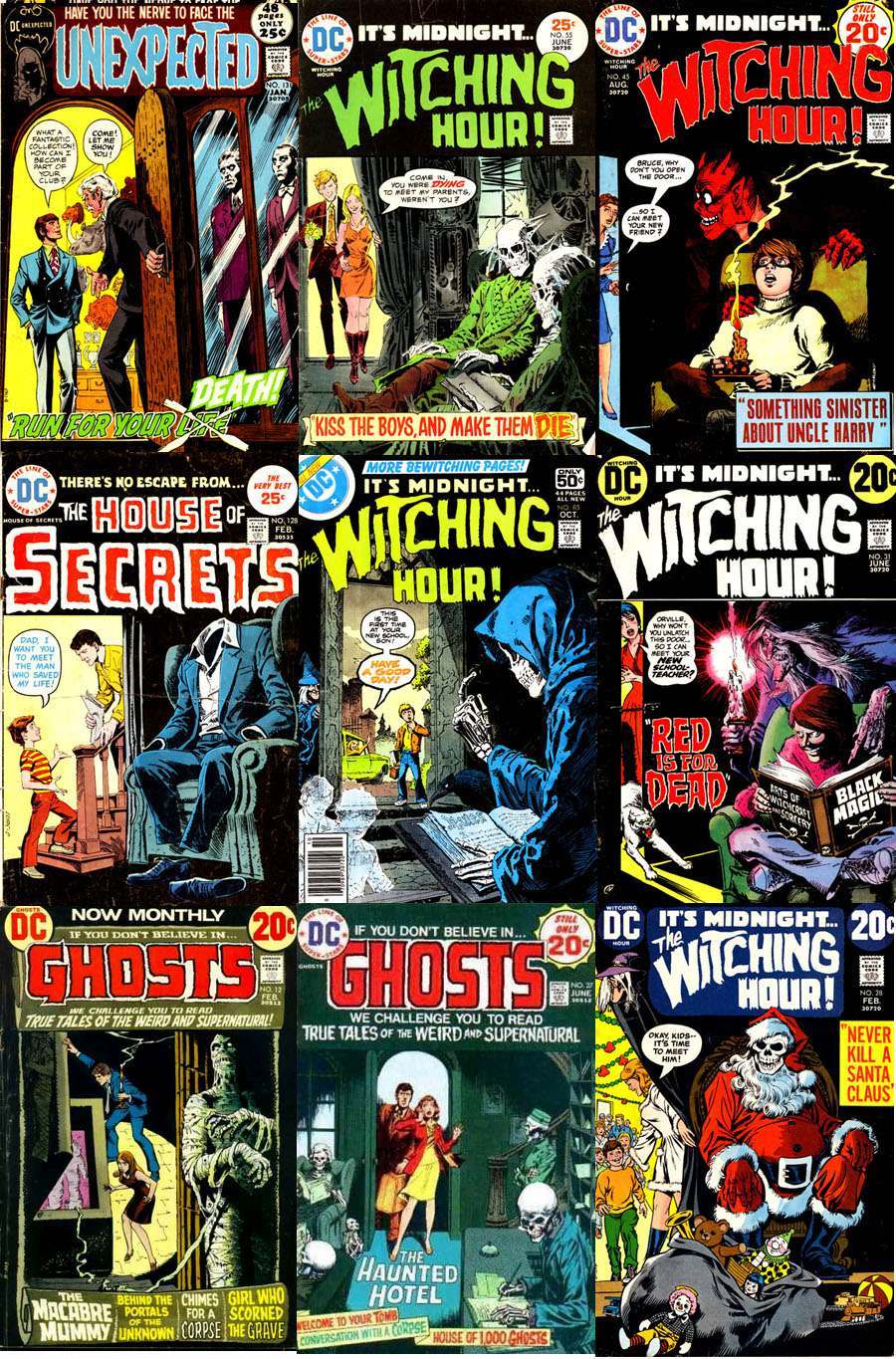
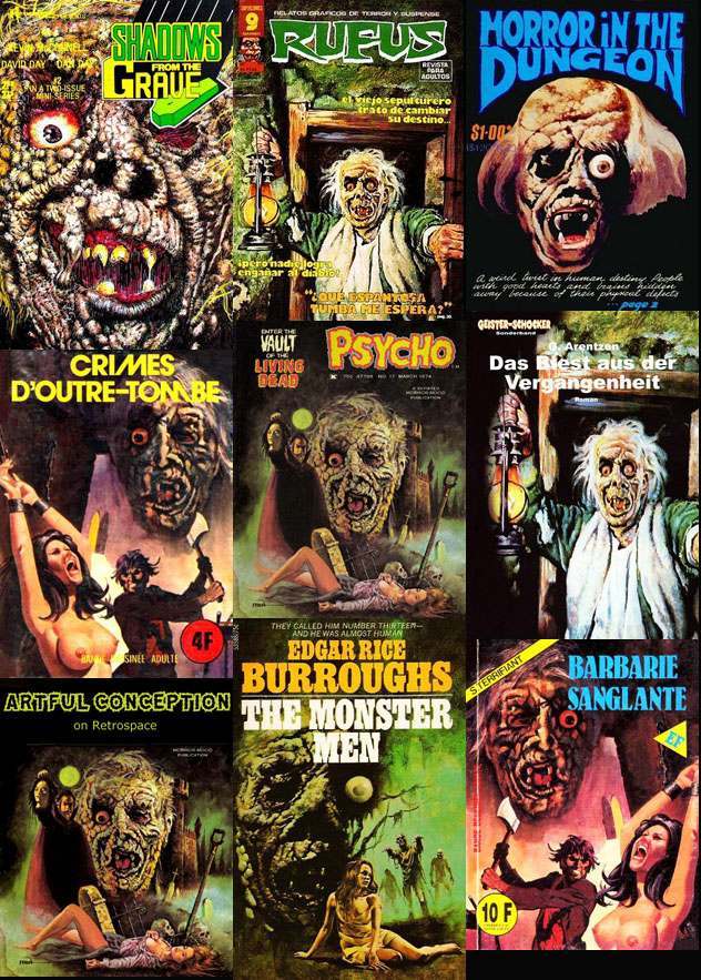
THE OPEN DOOR – EVIL AWAITS
Theme: A door being opened (on the left hand side) with a horrific creature waiting on the inside – the viewer is from the perspective facing the oblivious people about to have the shock of their lives. It’s an extremely effective arrangement, and it’s been recycled to death.
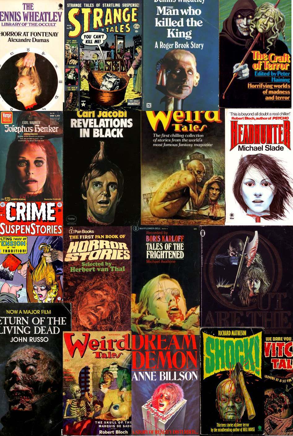
THE SEVERED HEAD
Next: What says horror better than a severed head? It’s an old standard, and one of the main offenders which caused the uproar in the fifties that resulted in the comics code. (for more on this, check out an earlier article)
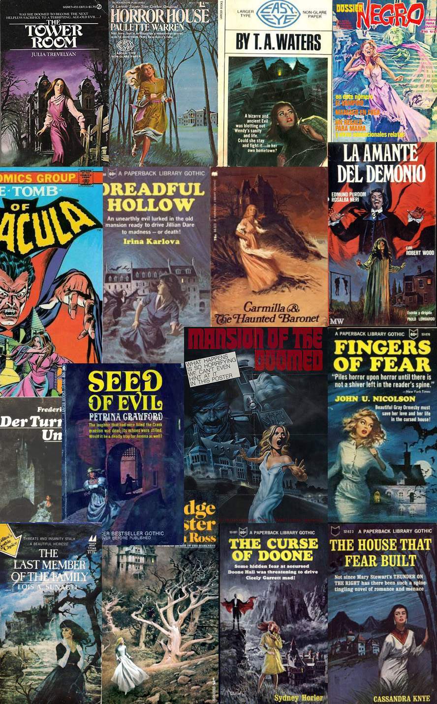
WOMEN RUNNING FROM HOUSES
Women running from houses is perhaps the most time-honored horror trope of them all. Indeed, Gothic paperback romances of the sixties and seventies stuck to this theme without exception. Recently, we analyzed this trope in detail.
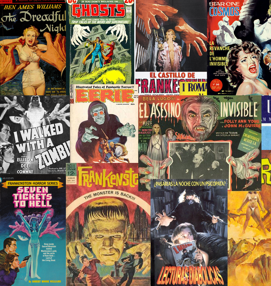
GIANT MENACING HANDS
Then, there’s the old reliable “scary hands” motif. The come in two basic varieties. First is the outstretched hands about to grab hold of some poor victim…
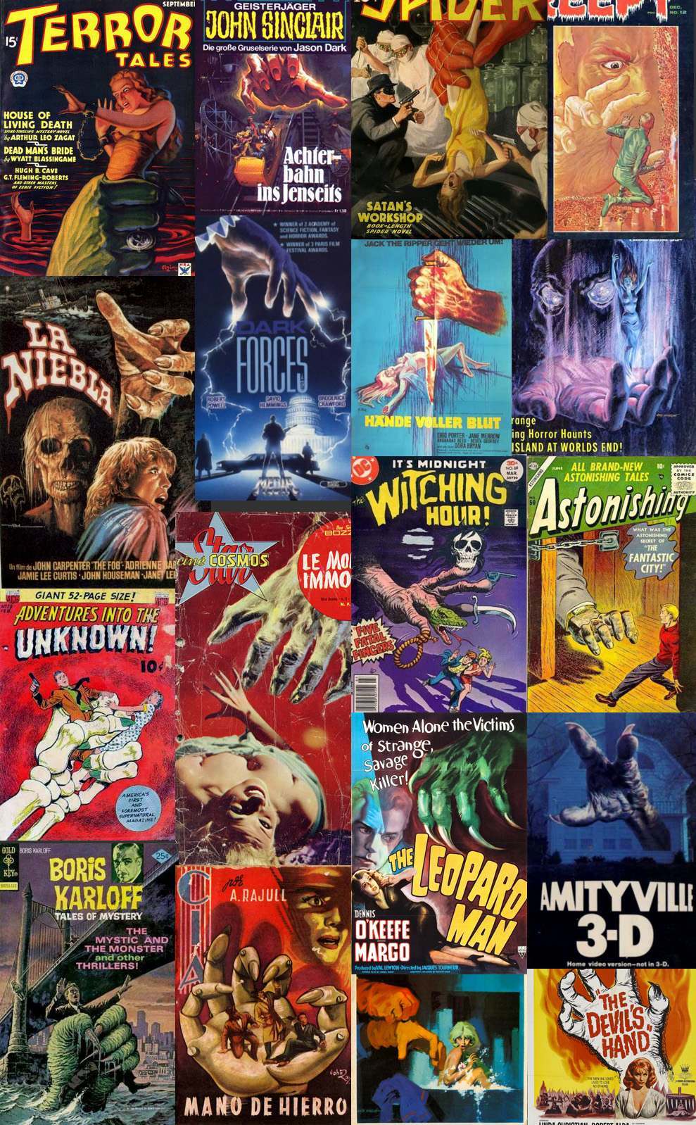
GIGANTIC HANDS
… and then there’s the Giant Hand. The theme is pretty common in science fiction; however, this is a horror post, so we’ll just look at examples in this genre. Personally, I’m not frightened of the giant hand, but I think this variation is not necessarily used to evoke fright, but rather the dread of an all powerful force of evil that man is powerless to resist. Just a theory.
LAZY IMITATIONS
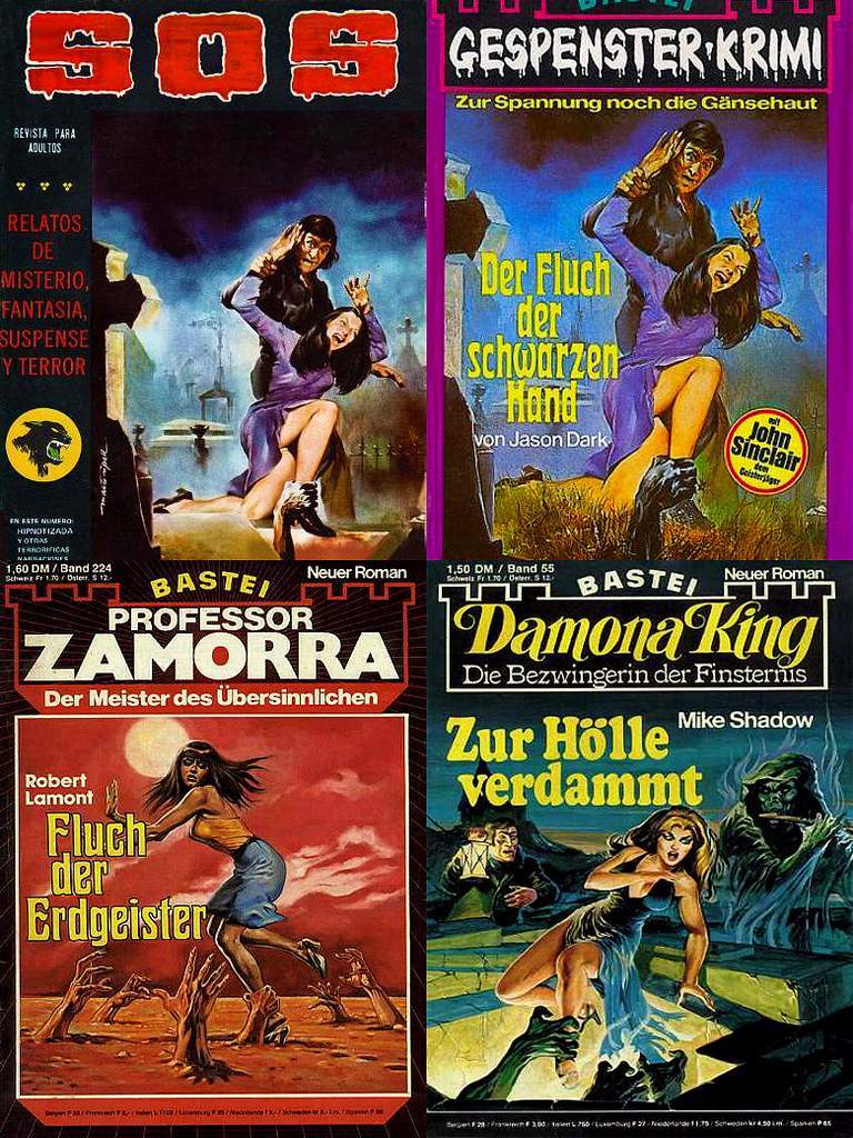
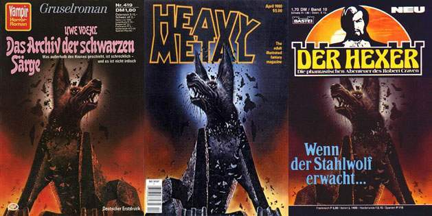
But not all repeated images are the result of honest adherence to tropes that work – sometimes it’s just plain laziness. If imitation is the sincerest form of flattery, then horror illustrators are the biggest flatterers of any genre – especially when it comes to European horror. Every time I see a foreign horror novel I get a feeling of déjà vu. A feeling that I’ve seen that cover somewhere before.
You’ll note that these are not the same book. It’s totally different authors and different stories.
Some of these aren’t “imitation” so much as the artist selling the same artwork to multiple outlets. Sometimes art directors will flip or reverse the image or manipulate the color to fit their own tastes or the needs of the publication.
That ghastly face repeated below has its origins from the 1961 production of “The Picture of Dorian Gray”. Conceived by make up effects master Dick Smith.
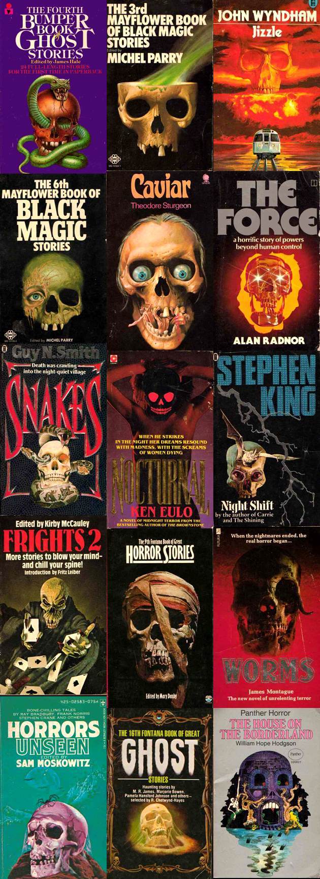
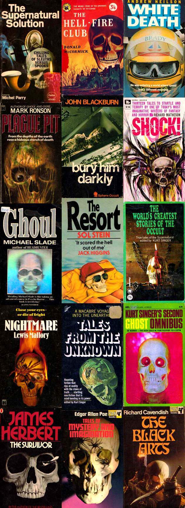
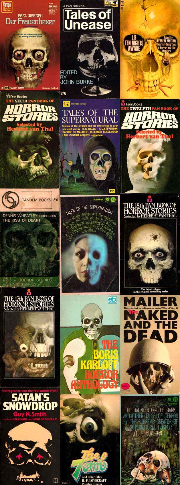
THE SKULL
The human skull is a powerful image – it instantly reminds us of our mortality and evokes that subtle fear abiding in all of us of what lies beyond. It should come as no surprise that this symbol is routinely used in the horror genre. After all, horror fiction is all about fear, and what is a more compelling than the fear of death, epitomized by the very face of death – the skull.
Of course, being a default image has its problems. A lazy or unimaginative illustrator can always fall back on the skull. Indeed, there are legions of lackluster skulls adorning thousands of forgettable paperbacks and movie posters. Were I to spend the next year compiling them for you, I wouldn’t come close to scratching the surface.
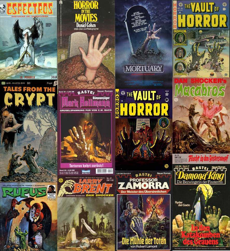
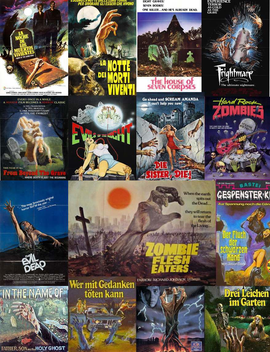
HANDS FROM THE GRAVE
And last but not least, what image is more synonymous with the horror genre than hands emerging from the grave?
Would you like to support Flashbak?
Please consider making a donation to our site. We don't want to rely on ads to bring you the best of visual culture. You can also support us by signing up to our Mailing List. And you can also follow us on Facebook, Instagram and Twitter. For great art and culture delivered to your door, visit our shop.
