If you’re selling your product in a comic book, it makes sense to have your advert look like a comic as well. God knows, Hostess did this in spades (read more about that in Flashbak’s Pulitzer Prize winning article Crime Fighting with Twinkies: Comic Book Superheroes Turn To Sugary Cream-Filled Cake). Tobacco companies did the same – not necessarily in comic books, but with that same comic book format (see also Carcinogenic Comics: Doral Cigarette Ads For Kids).
As you’ll soon see, comic book style adverts could be used to sell everything from feminine hygiene products to half-naked statues. Let’s take a look, shall we?
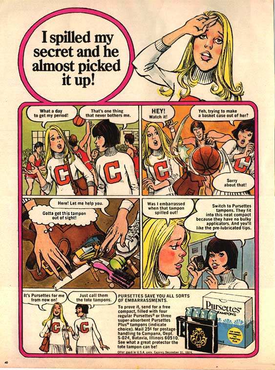
“Gotta get this tampon out of sight!” You can feel this poor girl’s panic. I wonder if teenagers today would feel similar embarrassment. I’m guessing, in most cases, a gigantic pulsating dildo could fall on the floor, and today’s teens wouldn’t bat an eye.
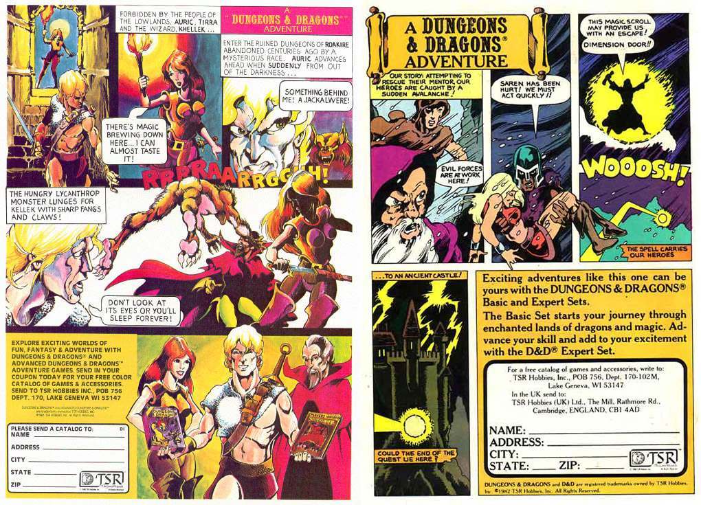
1980s Dungeons and Dragons adverts were something to behold – the handiwork of a young Bill Willingham, who would go on to some cult popularity in the 80s with his super-team The Elementals; today he’s best known as writer/creator of Fables.
For yet another reference to a previous article, check out 5 Reasons to Love Dungeons & Dragons in the Early 80s.
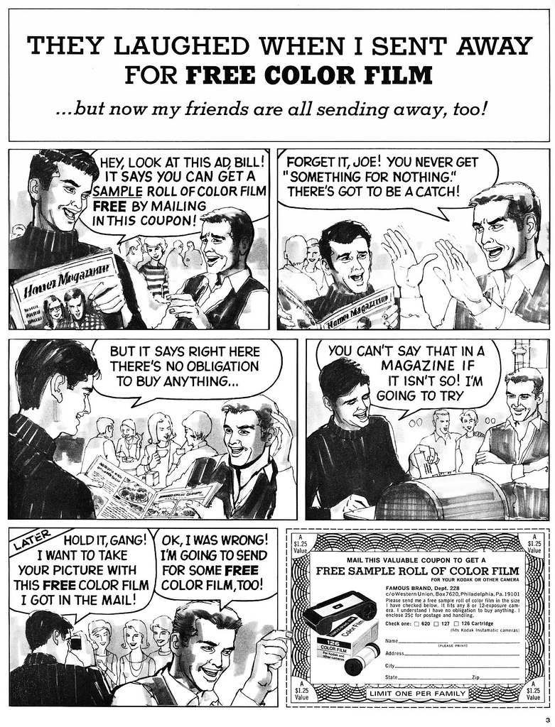
My favorite line from this one is “you can’t say that in a magazine if it isn’t so”!
Joe is evidently a very naive fellow…. .
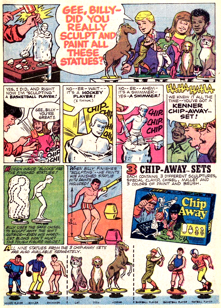
I can’t help but wonder why, of all the types of statues, they chose to highlight the swimmer. I mean, how did they even guess it was a swimmer in the first place? It just looks like a dude in his underwear. If my dad had caught me sculpting this thing, he would definitely have thought I was gay.
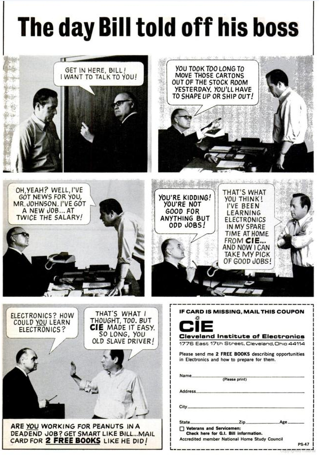
Oh, yeah. It’s the dream of many a man – to get in your boss’ face and say Johnny Paycheck’s immortal words: “Take this job and shove it!” I wonder how many poor shlubs out there actually told their bosses off only to find CIE was a complete sham and have to go groveling back.
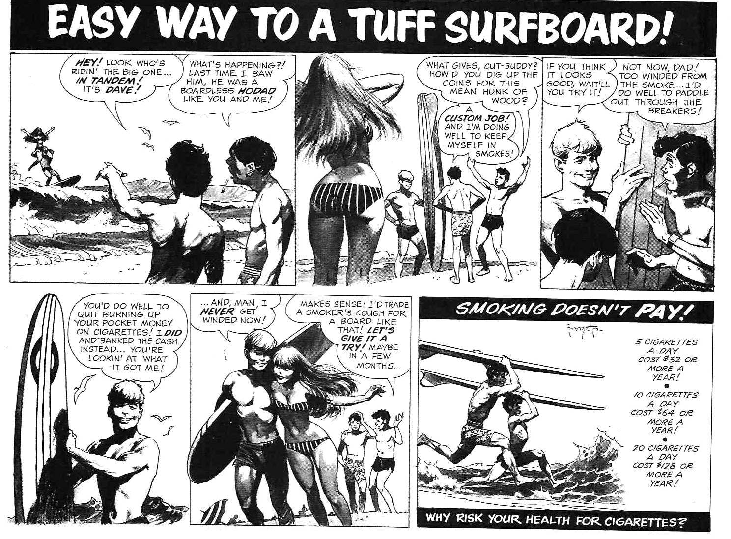
If you’re wondering who illustrated this, look no further than the thick booty – it should be immediately evident that this is by the great Frank Frazetta (his signature in the last panel is also a clue).
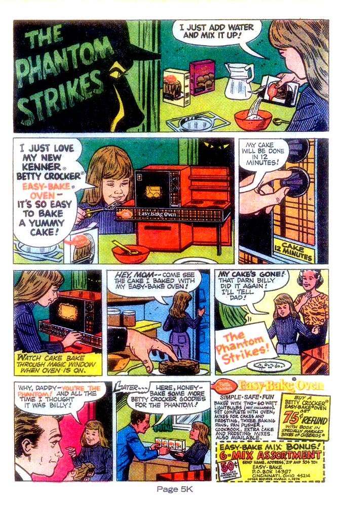
Check out this father lurking around in the shadows watching his daughter bake. He looks like a demonic peeping tom. Is he watching her from a crawlspace?
I picture this dad watching his son’s baseball games from under the bleachers, laughing maniacally from the darkness.
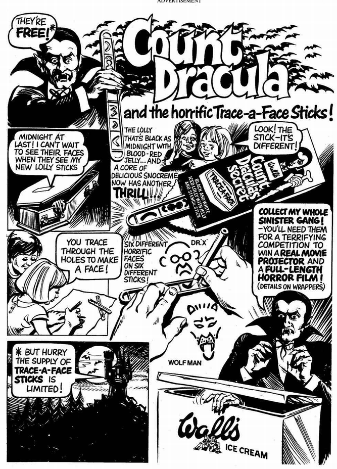
Excellent ad, but the whole “trace a face” thing is a bit of a joke. I mean, look at the stick – it’s nothing but a few curvy lines and circles….. seems like even the least talented artists among us could manage that without need of a stencil. Ya think?
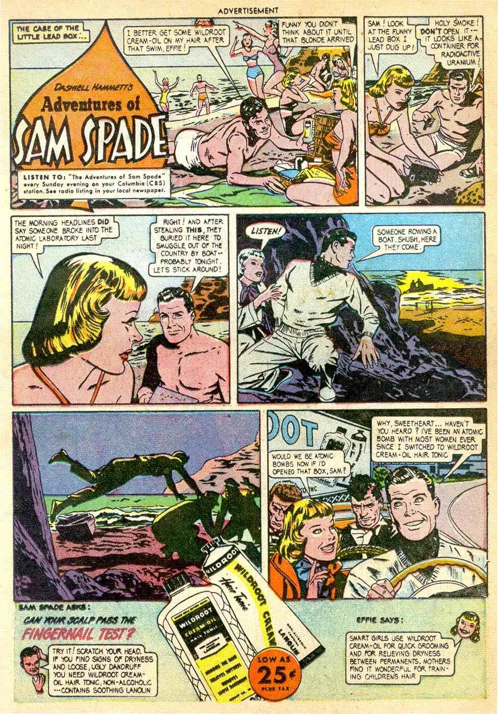
“Why, sweetheart… haven’t you heard? I’ve been an atomic bomb with most women ever since I switched to Wildroot cream oil hair tonic.”
Huh? What does that even mean?
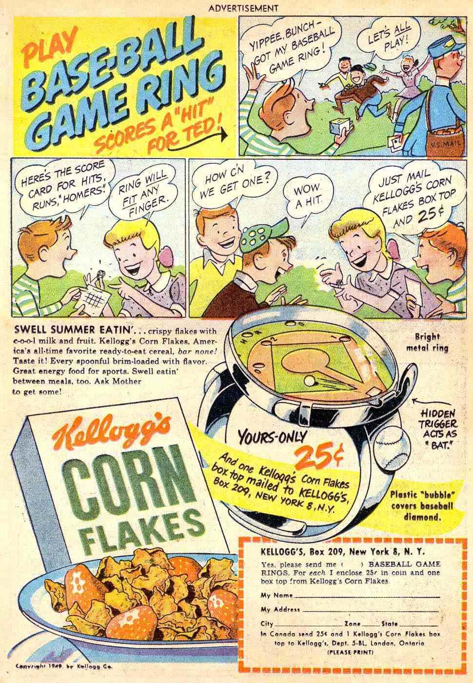
Wow. All this action on the top of a ring! That baseball must be about the size of a subatomic particle.
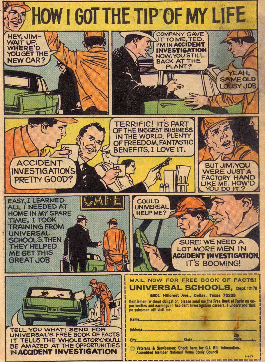
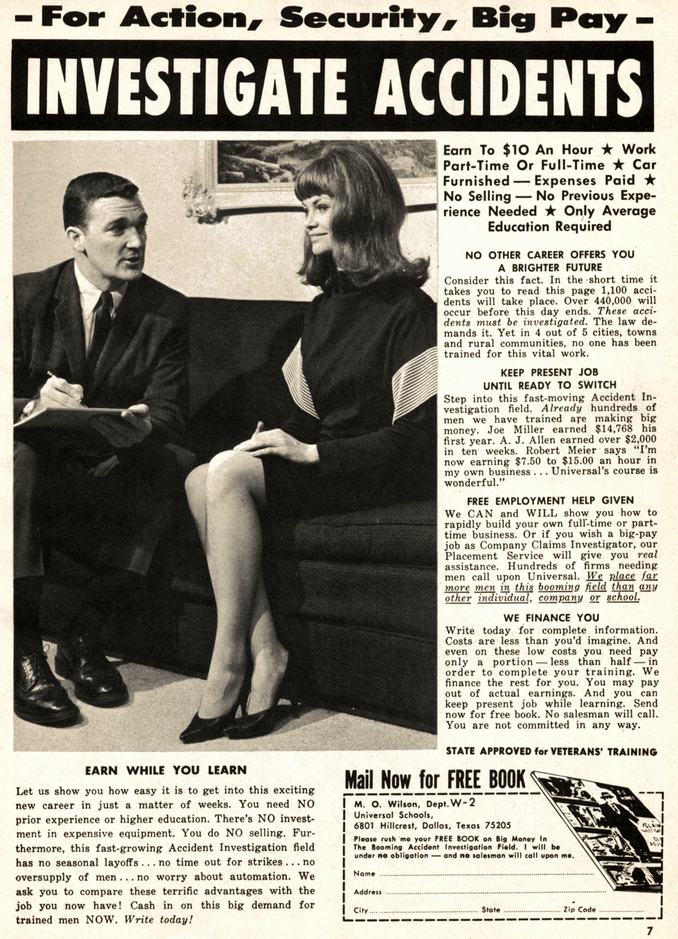
It seems like every vintage men’s magazine has an advertisement encouraging men to pursue a career in accident investigation. Obviously, this was some sort of scam. Why would they advertise for an accident investigator (AKA Insurance Adjuster)? I’ve always thought this was odd.
Regardless of its legitimacy, I love these ads. The non-comic book format adverts make it look like you’ll be the next 007. It seems nearly every ad features a pretty damsel in distress, and a sharp dressed manly-man coming to her aid. She’s always grinny friskily, while he’s professional and oblivious to her advances. Here’s an example of one below…
Of course the greatest insurance investigator of the 70s was ’Banacek’ (George Peppard).He’d always find the missing object/person, explain how the scam was done and collect a million from the insurance company for the trouble. And look cool doing it.
The show never mentioned if he got into the profession by responding to an ad in ’ Swank’.
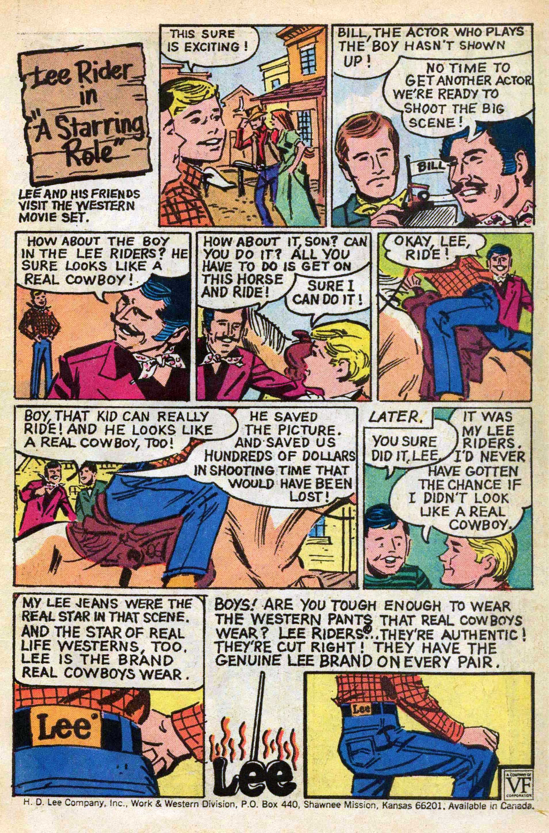
“How about the boy in the Lee Riders. He sure looks like a cowboy……. Care to step into my trailer, young man?”
And so, the boy in the Lee Riders filled in for the missing actor and saved the studio “HUNDREDS of dollars.”
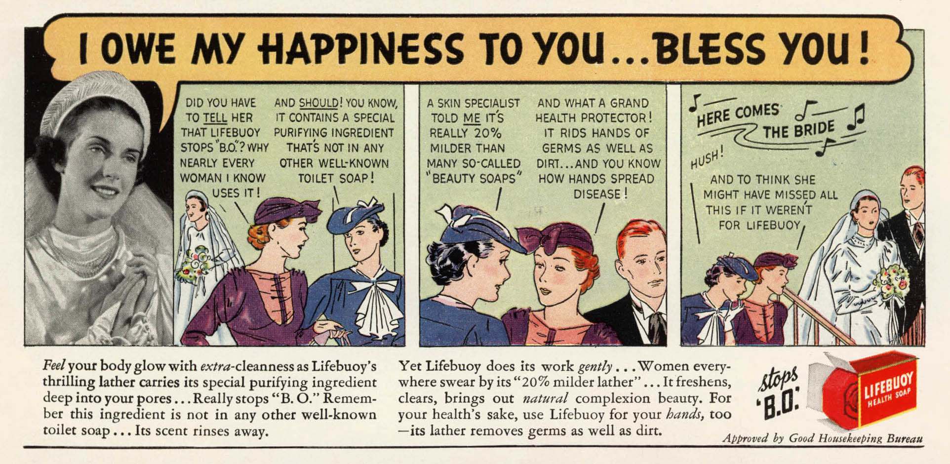
Body Odor (B.O.) nearly destroyed this happy union. Thank God this kind woman thought to tell this bride about the miracles of soap.
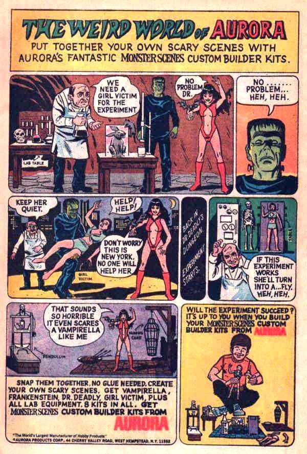
A lot has been said about the infamous Aurora Monster Scenes advertisement that appeared in comic books in 1971. The notorious ads were pulled, and so was the product after much public appeal. Perhaps rightly so, given the violent nature of it all….. I mean, I can understand a Frankenstein or Vampirella model,but a “girl victim” model?…. Really:?
As if this controversy wasn’t enough, Vampirella sports a pronounced camel-toe both in the ad and on the model itself (Aurora claims it was due to the shrinking plastic).
Evidently, there were a whole lot of burgeoning sadists back in the early seventies, because, before the public outcry got too loud, Aurora added to the product line with such accessories as: The Pain Parlor, The Hanging Cage, Gruesome Goodies, and The Pendulum.
Today, these model kits are extremely valuable, especially considering the original molds were destroyed in 1974 for their beryllium steel.
[Also note the line “Don’t worry. This is New York! No ones going to help her” is an allusion to the imfamous Kitty Genovese case in the mid-1960s. Miss Genovese was brutally beaten, raped and murdered outside of her apartment building while her neighbors stood at their windows and watched – not one person lifted a finger to help! Thus giving rise to New York City’s very bad reputation during this period.]
Below are the small comics illustrated by Neal Adams that came with the kits.
For more comic book advertising goodness, step right this way…
Would you like to support Flashbak?
Please consider making a donation to our site. We don't want to rely on ads to bring you the best of visual culture. You can also support us by signing up to our Mailing List. And you can also follow us on Facebook, Instagram and Twitter. For great art and culture delivered to your door, visit our shop.
