No matter how they are articulated, ideas about product design nearly always include the maxim, “the experience is the product.” Every interaction is important, especially first visual impressions, which not only represent the product, but the entire company as well. But car design—where engineering and safety considerations are at least as important as aesthetics—would seem to present another challenge entirely. No matter how sleek a table, armchair, or handheld device appears, none of those products have to manage wind shear, protect vulnerable bodies in high-speed collisions, or be expected to haul passengers and cargo. Such functions introduce significant regulation that further constrains the choices a car designer can make.
Cars are tiny houses on wheels, escape pods, and, most importantly from a marketing standpoint, conspicuous status symbols that cost quite a bit of money to make and buy. Given those costs, it’s no wonder carmakers generally play it safe when it comes vehicles destined for mass production. A few, time-tested designs tend to predominate for decades, but every once in a while, weird features from concept prototypes will make it to the market, or a company with a conservative reputation will try something new, sometimes in imitation of their competitors. The results are frequently disastrous.
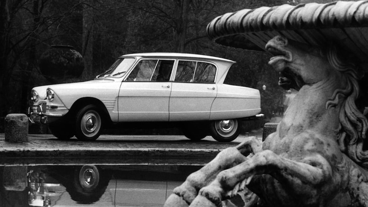
Take some of oddballs here that Automobile magazine designated as among the “ugliest cars ever made.” Writer Aaron Gold rubs it in with the subtitle, “… and some of them don’t even have good personalities.” Car buyers get the final say on whether a design has mass appeal—so even the ugly Ford Taurus could overcome its visual shortcomings with bullish reliability. Not so the ugly Citreon Ami, which “looks as if its entire greenhouse is being blown back in a stiff breeze.” Hardly an advertisement for a car’s robustness. “Even the French hated it—in 1962 the Ami 6 was outsold two-to-one by the ancient 2CV on which it was based.” To use a marketing cliché, the Ami was New Coke to the 2CV’s status as “automotive icon.”
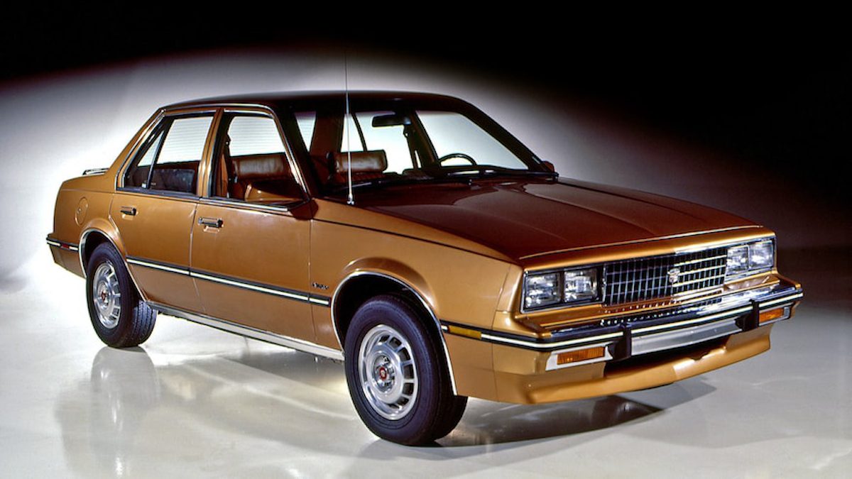
According to Trayan Stamov, professor of Industrial Design at the Technical University of Sofia, “the task” of a car’s design “is to ‘translate’ in an illustrative form the style and vision of the company.” Whatever could Cadillac have been thinking when they decided to “turn the Chevy Cavalier into a luxury car,” as Gold writes, with their profoundly underwhelming 1982 Cimarron? As an economy car, it’s boring but fine, but “as a Cadillac, the Cimmaron was small, chintzy, and completely lacking in the design artistry and sophistication one expects from an upscale car.”
What exactly determines “sophistication” in auto design? Quality and distinctiveness, for one thing, though the specifics vary across cultures and eras. We know it when we see it, and the Cimmaron ain’t it. There are many basic auto design principles that hold across the industry. For one thing, as Vehicle Design instructor Lee Walton points out, “all surfaces are curved,” even in the boxiest-looking cars. “No matter how subtle the curve, every single surface on any car is curved. To keep design and manufacturing simple, cars tend to concentrate curvature in one direction. Most of the form is horizontal to the ground.”
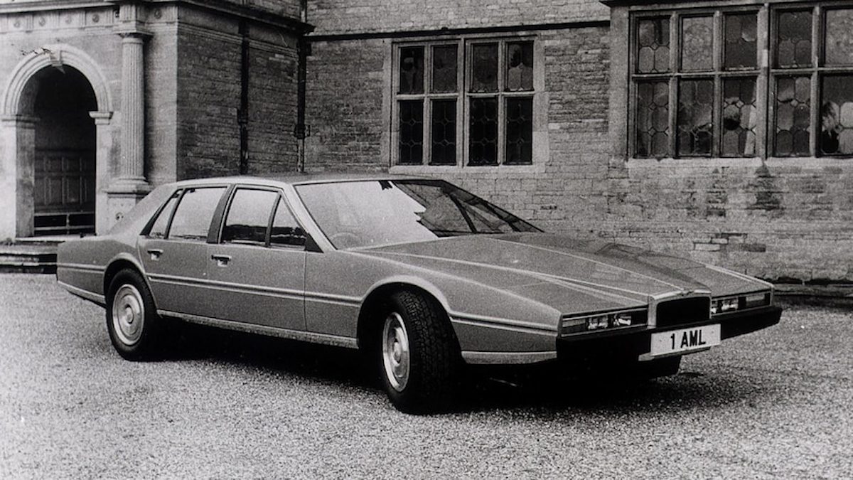
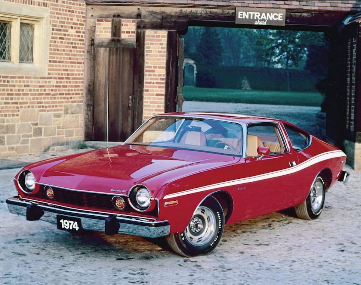
With this basic brief satisfied, all sorts of invention is possible, though designers stray too far from the mean at their peril. Take the 1974 AMC Matador at the top, “clearly designed as an American interpretation of the classic European sport coupes,” but designed, as so many American cars were in the ’70s, with its curves in all the wrong places. The Matador resembles the stereotypical “consummate ugly American: Fat, excessive, lazy, and gawd-damn proud of it.” One the other end of the spectrum, we have the ’76 Aston-Martin Lagonda, which flattens all its curves, and its entire profile, until it “looks like an 80s-era Chevrolet Caprice that went four rounds with a rolling pin and lost.”
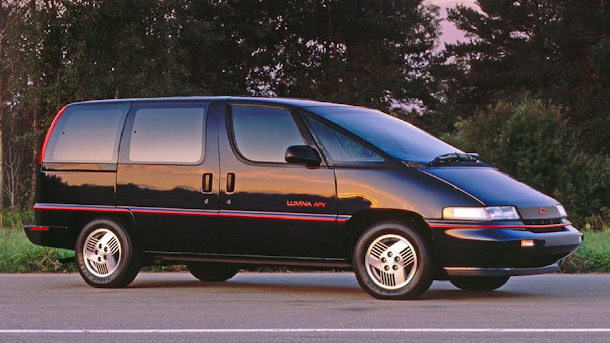
Gold isn’t kind to Chevrolet in his comparisons. Maybe this is deserved, especially when it comes to the one of the ugliest vans ever made, the 1990 Lumina. The “dustbuster van” whose ridiculous form makes one feel like they’re “driving from the backseat” shows how aesthetic fails lead directly to failures of the so-called user experience. In car design the results can range from daily annoyance to deadly catastrophe. And when it comes to realizing pleasing shapes in three, mobile dimensions, the auto industry’s aesthetic missteps—and there are millions of them on roads around the world—are almost impossible to get away from. See more classic eyesores below and at Automobile.
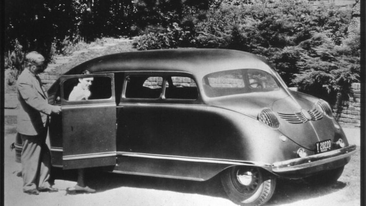
1935 Stout Scarab
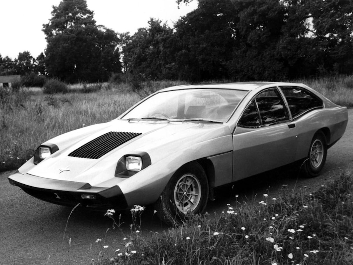
1968 Marcos Mantis
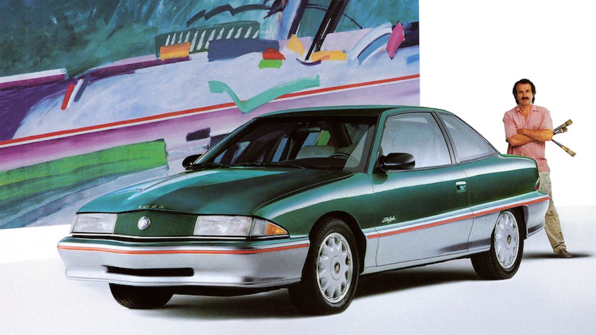
1992 Buick Skylark
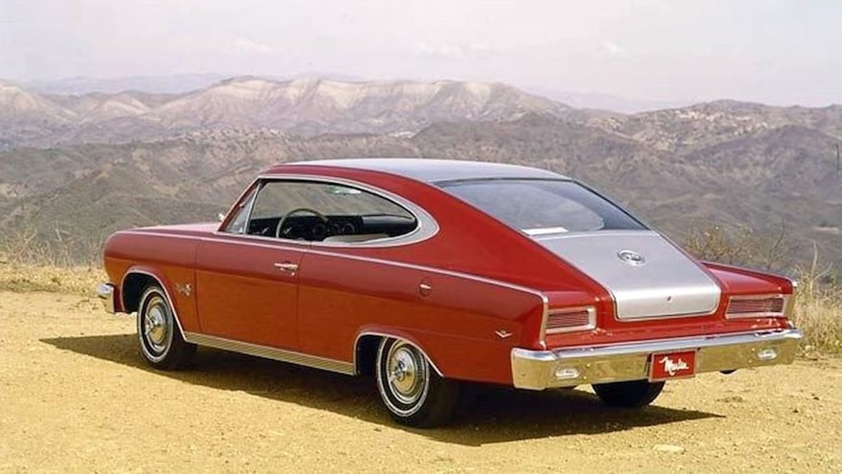
1965 Rambler Marlin
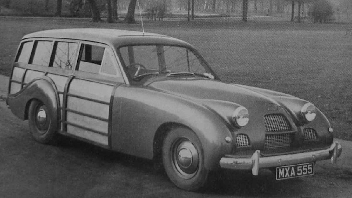
1951 Allard P2 Safari
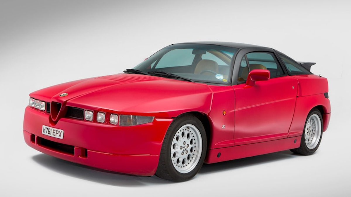
1989 Alfa Romeo SZ
Would you like to support Flashbak?
Please consider making a donation to our site. We don't want to rely on ads to bring you the best of visual culture. You can also support us by signing up to our Mailing List. And you can also follow us on Facebook, Instagram and Twitter. For great art and culture delivered to your door, visit our shop.

