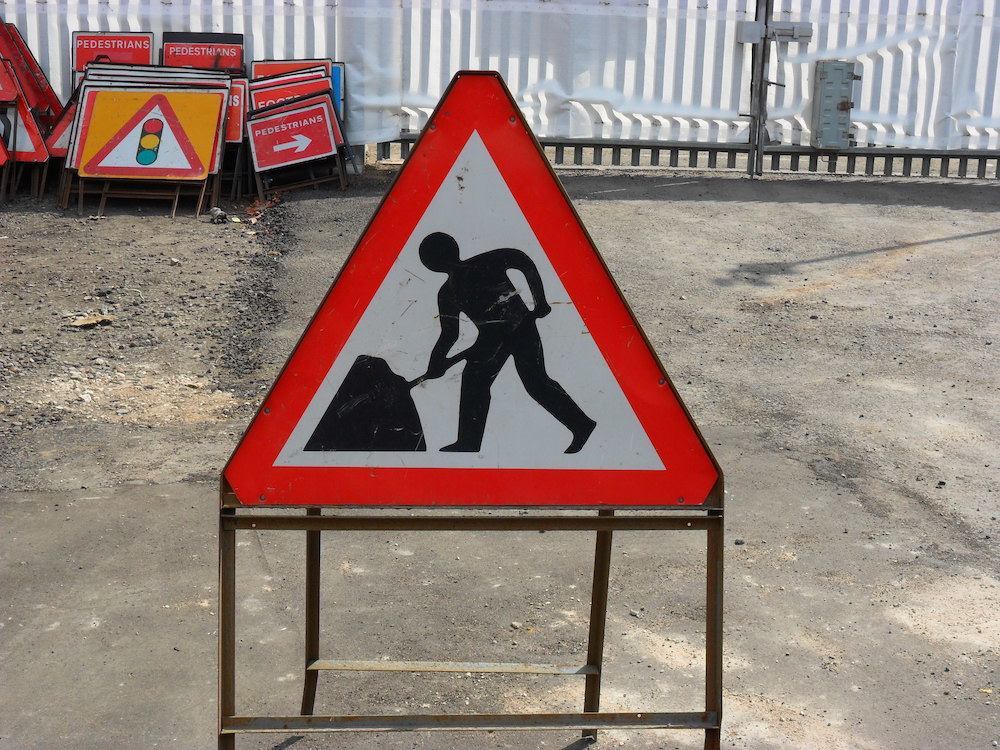
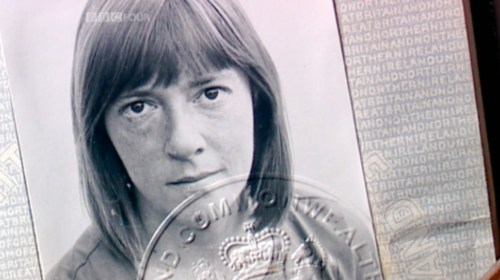
You might not know the name Margaret Calvert, but the British know her road signs. In 1964 Calvert and Jock Kinneir (1917-1974), her former tutor at Chelsea College of Art, finished creating the country’s road signs, like the one for Men At Work (above). (On 1 January 1965 the new road signage system became law.)
Calvert says of the man digging: “Man having difficulty with a large umbrella… Of course, once you see that, it just looks like a large umbrella, but I don’t mind that.”
She told Frieze: “I now regret that I didn’t put a corner of a spade on the ‘men at work’ sign, it would have stopped all the jokes about a man struggling to put up an umbrella!”
Many of these pictograms…
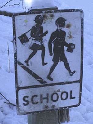
“….were inspired by aspects of her own life. The cow featured in the triangular sign warning drivers to watch out for farm animals on the road was based on Patience, a cow on her relatives’ Warwickshire farm. Eager to make the school children crossing sign more accessible, she replaced the image of a boy in a school cap leading a little girl, with one of a girl – modelled on a photograph of herself as a child – with a younger boy.”
Calvert described the old sign as being: “quite archaic, almost like an illustration from Enid Blyton… I wanted to make it more inclusive because comprehensives were starting up.”
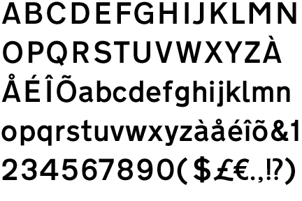
Calvert and Kinneir designed the typeface for Britain’s national motorways, British Rail, the British Airports Authority and the Tyne & Wear Metro. (Jock also designed the MOT symbol whilst working at the Design Research Unit).
Their first job together was for Gatwick Airport. One thing led to another. Says Calvert:
Colin Anderson, Chairman of P&O-Orient Line, saw Gatwick and got onto Jock to design a luggage label system for illiterate porters. He then became chairman of the committee looking at the motorway signs… we never really thought it would eventually be applied throughout the whole country. The committee was the first of such a stature to employ a designer as consultant. We had to re-think and re-do work continually. Sir Hugh Casson a was key figure on the Anderson committee [formed in 1957 to review Britain’s motorway signage requirements] and commissions Kinneir to design the new system, and T. G. Usborne of the Ministry of Transport, who was on both the Anderson and Worboys committees, was absolutely crucial in getting the whole job done. He saw the whole thing as a two stage job, stage one for motorways and stage two for all the roads.
The designers spent years testing for legibility in all sorts of extreme conditions; in the rain, at night, at speed. It was huge job. In 1958, Kinneir told her: “If this takes off it’s going to be the biggest job that any graphic design team has ever tackled.”
In 2015 Calvert featured in the Times:
The success of Gatwick led soon after to the motorway commission. This was in the early Sixties: the M1, Britain’s first motorway, had started to unspool down the spine of the country; Wilson’s white heat of technology was blazing; and motorists were dazzled. Car design had improved but sign design remained static with erratic fonts, designs and sizes. Crashes were frequent.
The government decided that something must be done and that meant new road signs for the entire country, created by a combination of design and empirical testing. Kinneir was chosen and in turn hired Calvert. Today it seems absurd that such a small team would be chosen for such an enormous job but it was, thinks Calvert, necessary. “It had to be small. Anything bigger would just be another committee.” The implication being that, once you get a committee to design a horse, you get camels.
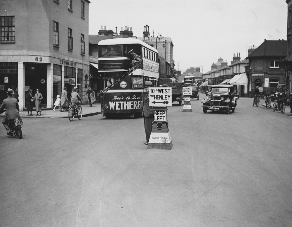
14th June 1934: Temporary road signs, dubbed ‘wooden policemen’, are deployed by Berkshire police to ease traffic congestion en route to the Ascot races, Maidenhead, Berkshire. (Photo by Fox Photos/Getty Images)
Calvert told the BBC:
“It required completely radical thinking. The information wasn’t there in terms of reading distance, clarity and letter spaces. We had to make up the signs and then test them. It was instinctive.”
They were tested in an underground car park and in London’s Hyde Park, where they were propped up against trees to determine the most effective background colours and reading distances.
One of their biggest decisions, which caused upset among conservative commentators at the time, was to opt for a combination of upper and lower case letters.
“The actual word shape was the most distinctive thing because if you had Birmingham in capitals, from a distance, it’s difficult to read but in caps and lower case you have word shape,” says Calvert. “That was fundamental.”
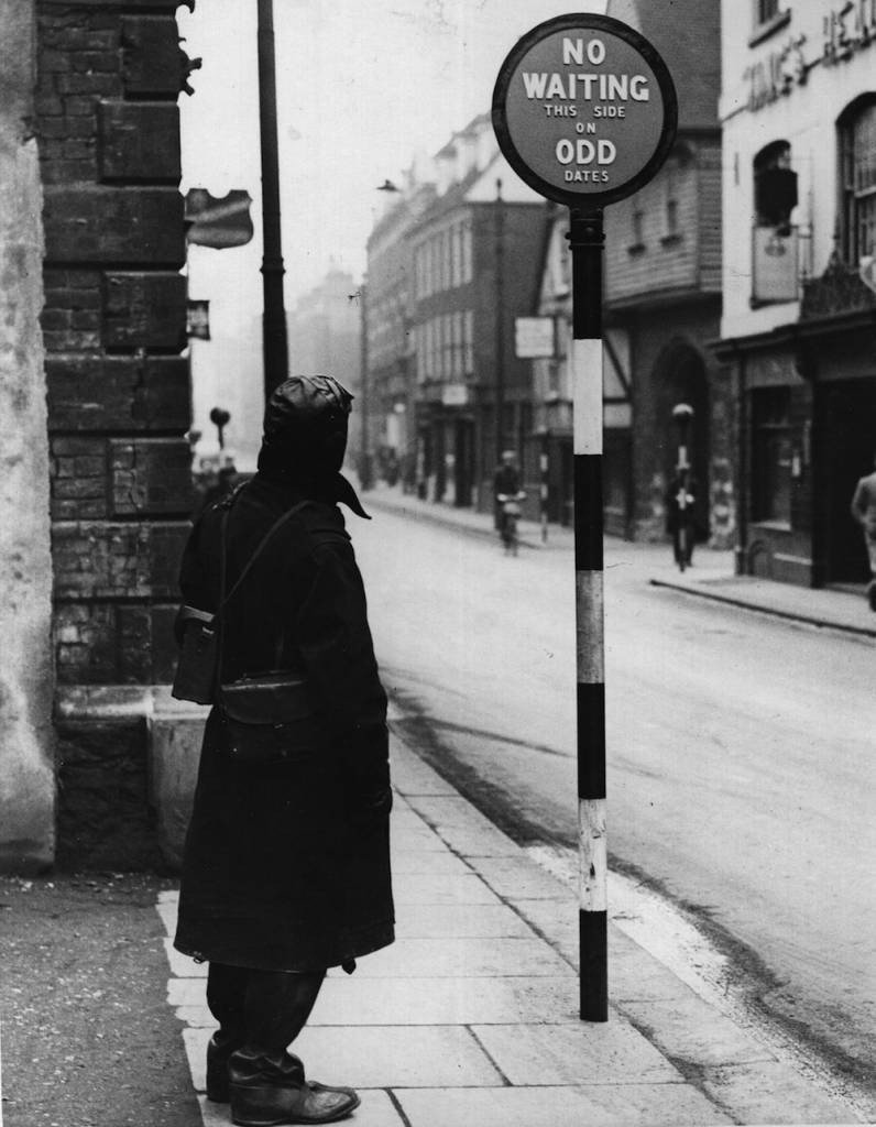
16th December 1935: New road signs at Rochester indicate to the motorist which side of the street he can park on which date. (Photo by Hulton Archive/Getty Images)
Being invisible is hard.
Transport and Motorway [the fonts the duo devidsed], which is used only for route numbers on motorways, are still the only two typefaces permitted on UK road signs. Transport is also used in several other countries, including Iceland, Ireland and Portugal, and in much of the Middle East.
Transport may not be pretty but it is one of the most effective and useful typefaces in the UK, says Simon Garfield who wrote Just My Type, a book dedicated to fonts.
“The last thing you want to do when you’re driving along at 77mph is think ‘look at that lovely L or T’. All you want to do is be told where you are and where you turn. The key is not noticing it. When you are designing a typeface for signage, you know you have done well when no-one comments on it.”
Jock Kinneir, who died in 1994, was resigned to this fact. In 1965, he acknowledged that his and Calvert’s designs fulfilled their function so efficiently that the public would take them for granted: “Direction signs and street names are as vital as a drop of oil in an engine, without which the moving parts would seize up.”
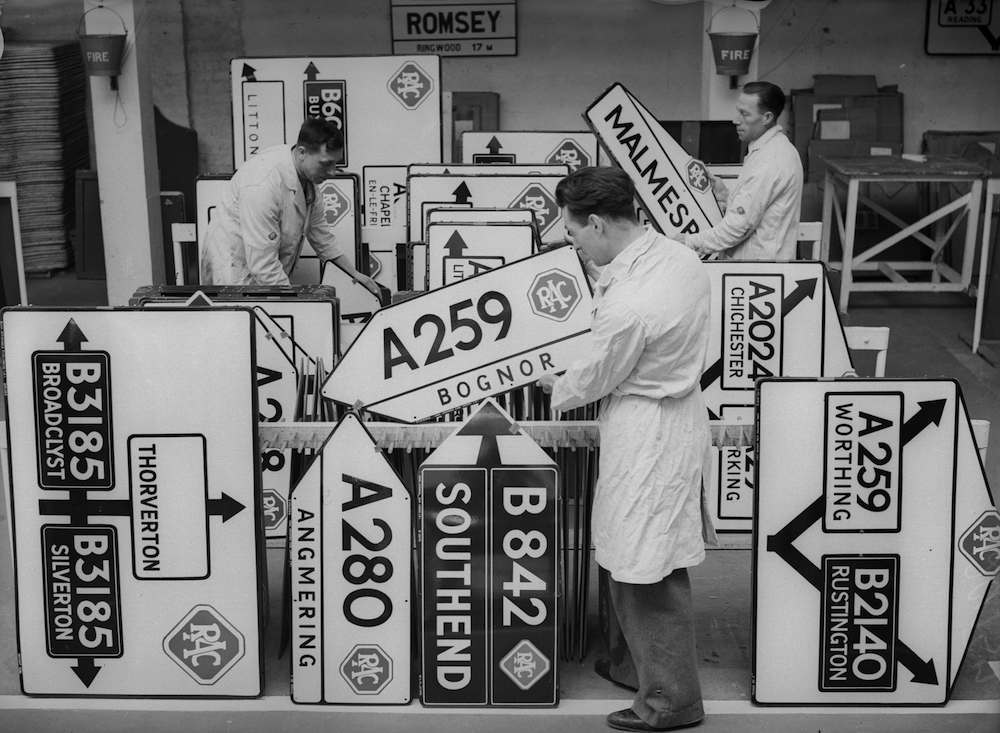
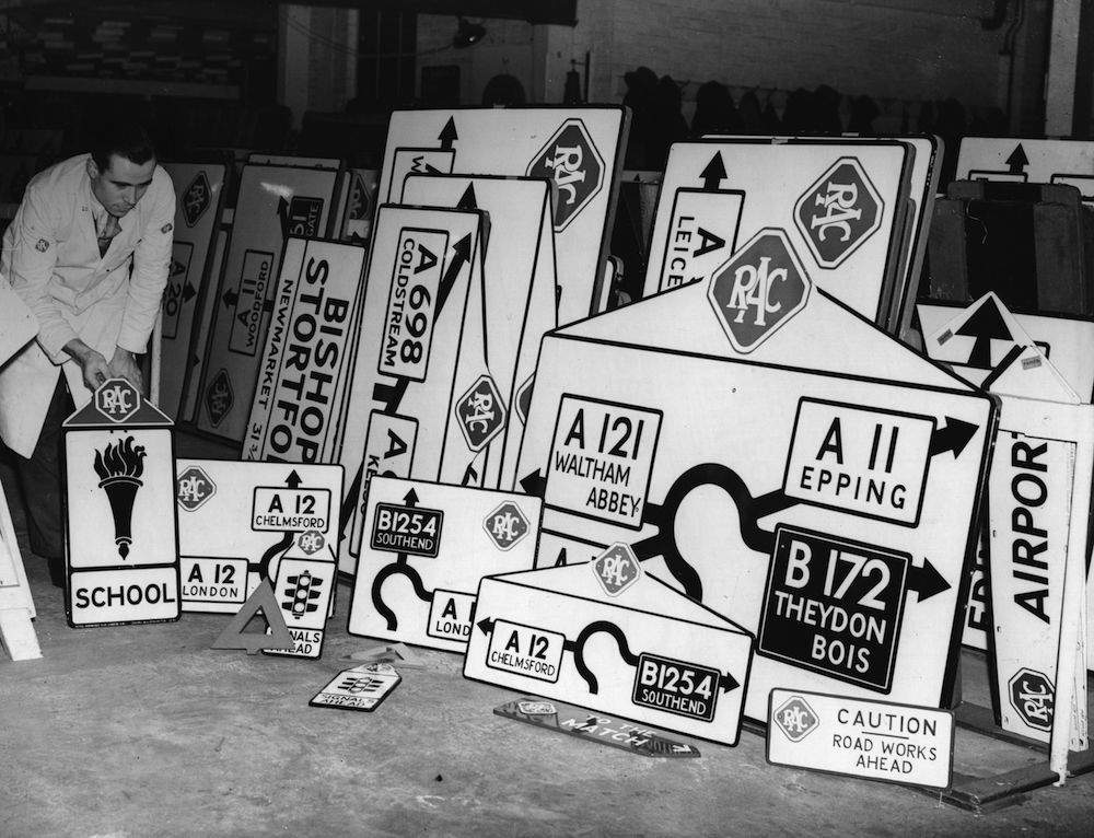
8th April 1936: New roadsigns being stored at the RAC sign factory at Victoria, London. (Photo by Ward/Fox Photos/Getty Images)
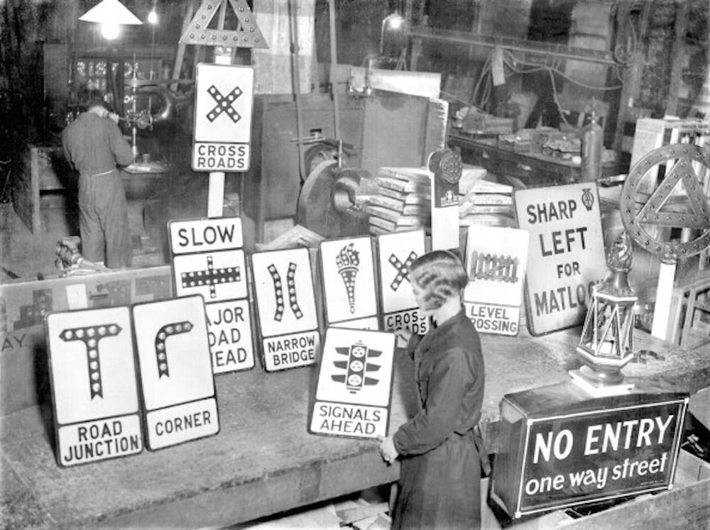
UNITED KINGDOM – JANUARY 01: Traffic signs, displayed in the factory they are made in. (Photo by Planet News Archive/SSPL/Getty Images)
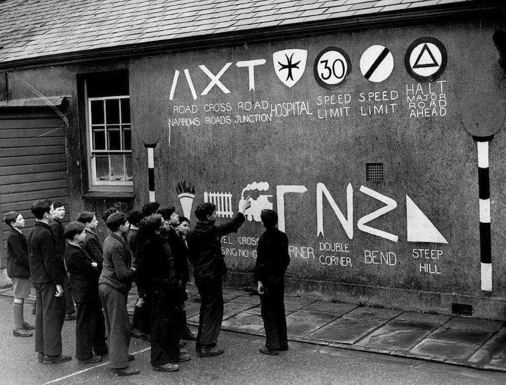
March 1939: Schoolboys study the plethora of roadsigns on a wall at Cefn Coed School, Merthyr to remind children of ‘safety first’. (Photo by Fox Photos/Getty Images)
9th February 1938: Half-size road signs for teaching schoolchildren shown with normal size signs. (Photo by Fox Photos/Getty Images)
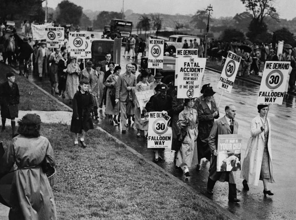
UNITED KINGDOM – AUGUST 01: Hampstead Residents Demonstrating For A Speed Limit In Their Street In London On August 1937 (Photo by Keystone-France/Gamma-Keystone via Getty Images)
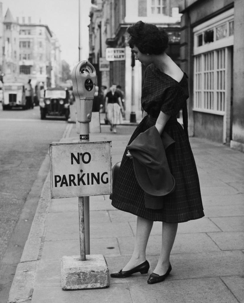
Yvonne Brecher examining a newly-installed parking meter fitted with an aparently incongruous ‘No Parking’ sign, in Upper Brook Street, London, 10th July 1958. Shortly afterwards, the sign was removed and Britain’s first parking meter scheme came into force. The meter is one of 648 to be installed in a pilot scheme in the West End and Mayfair areas of London. (Photo by George W. Hales/Fox Photos/Hulton Archive/Getty Images)

30th October 1959: A worker at ‘Franco Signs’ in Boreham Wood, Hertfordshire prepares new motorway signs for the stretch of road between London and Birmingham. (Photo by William Vanderson/Fox Photos/Getty Images)
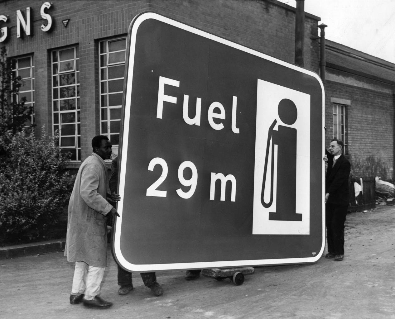
One of the huge signs for the London-Birmingham motorway is wheeled from the Borehamwood factory. The sign reads ‘Fuel 29m’. 1959 (Photo by Fox Photos/Getty Images)
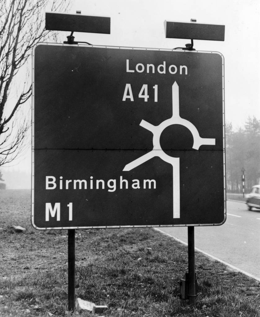
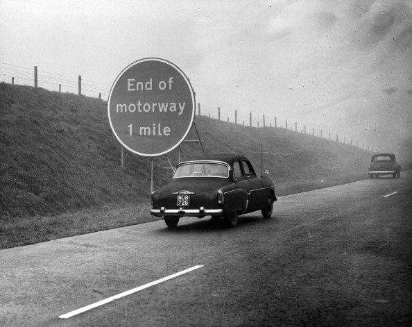
20th February 1962: A road sign at the entrance to the London to Birmingham motorway. (Photo by Peter King/Fox Photos/Getty Images)

2nd November 1962: Schoolchildren at the Queen’s Park Primary School on Droop Street, London, learn about Safety First and the Highway Code. They are using bicycles and scooters on a playground marked out with roadways, zebra crossings, junctions with traffic lights, and various road signs. (Photo by Fred Morley/Getty Images)
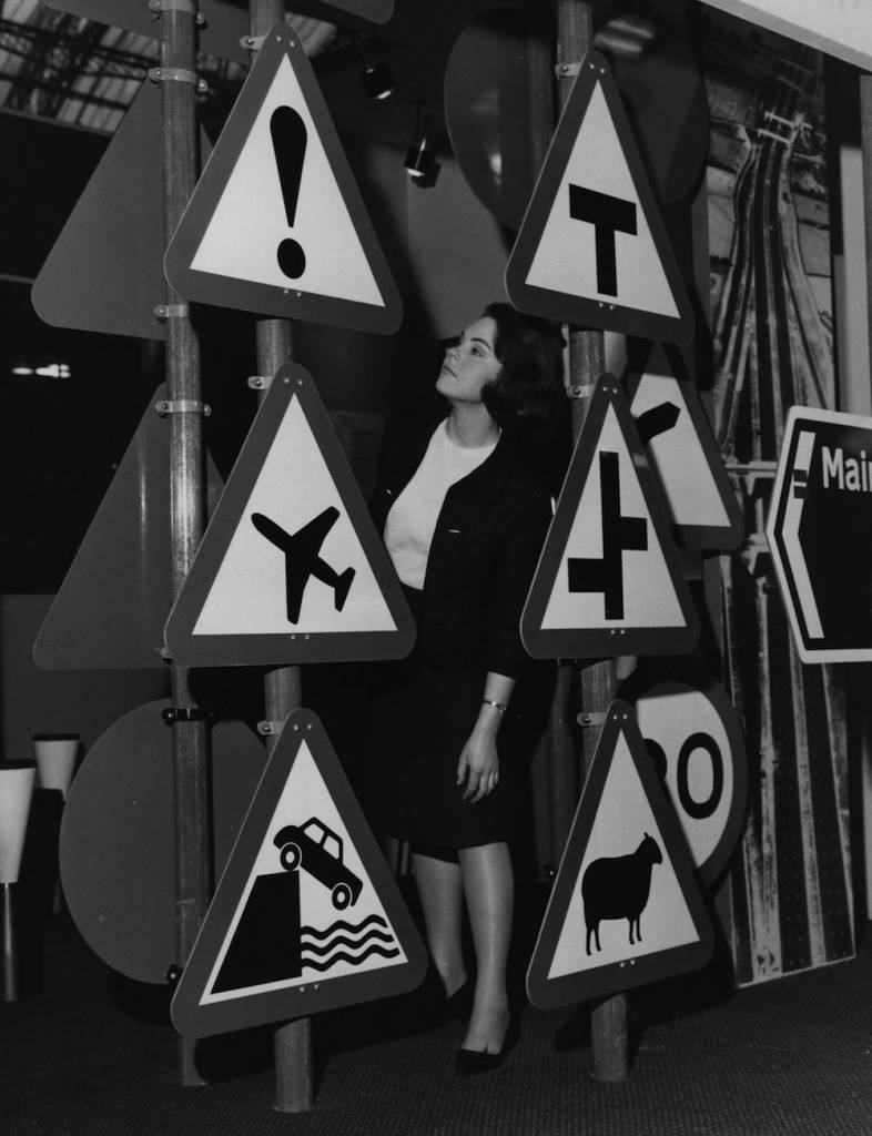
A display of road traffic signs at the Public Works and Municipal Services Exhibition at London’s Olympia, London. (Photo by Fox Photos/Getty Images)
Would you like to support Flashbak?
Please consider making a donation to our site. We don't want to rely on ads to bring you the best of visual culture. You can also support us by signing up to our Mailing List. And you can also follow us on Facebook, Instagram and Twitter. For great art and culture delivered to your door, visit our shop.
