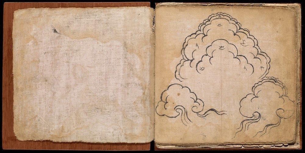
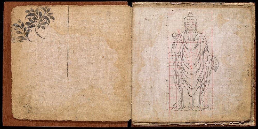
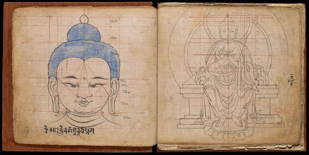
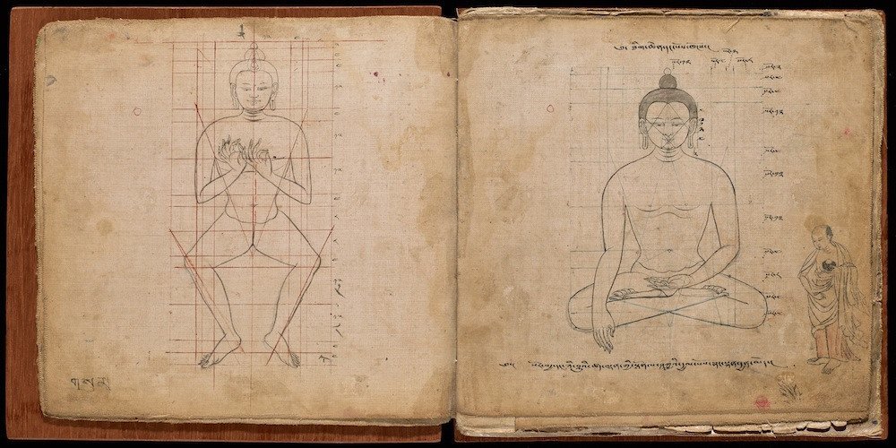
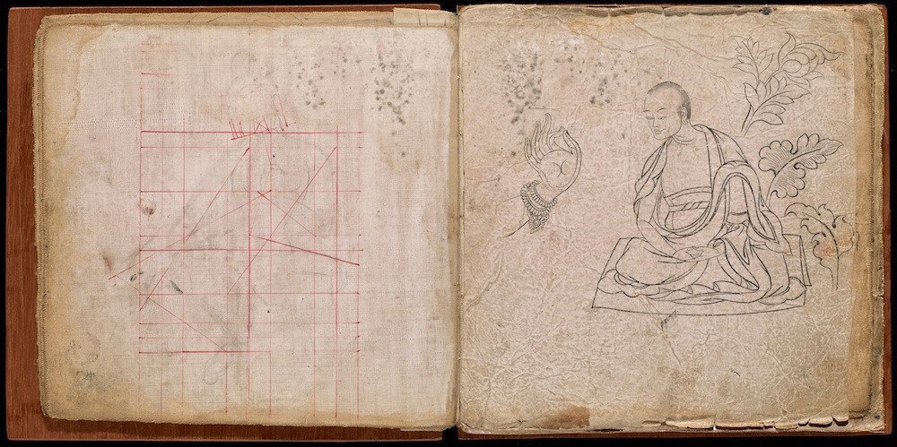
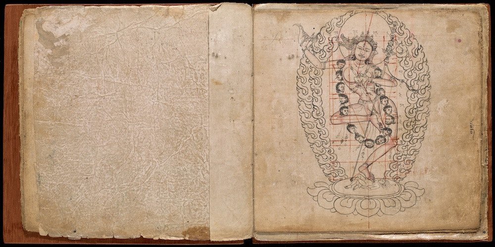
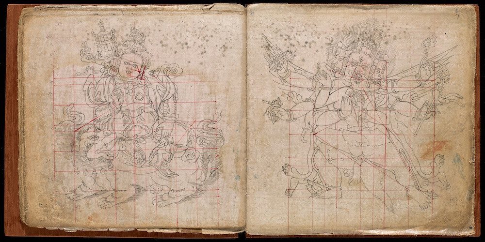
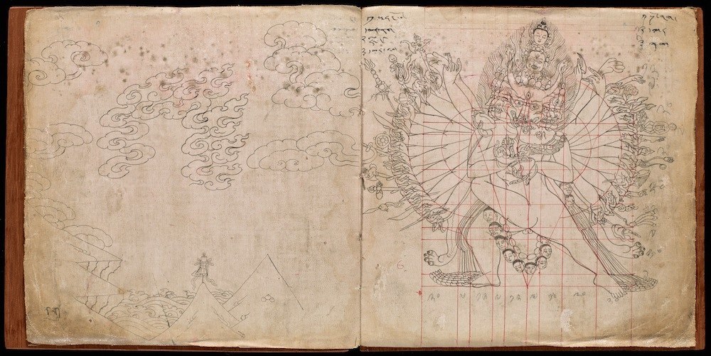
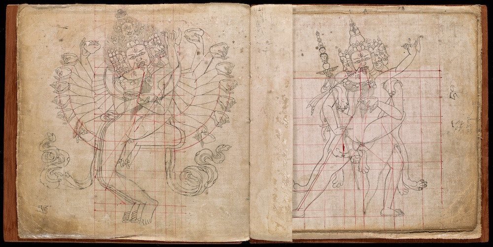
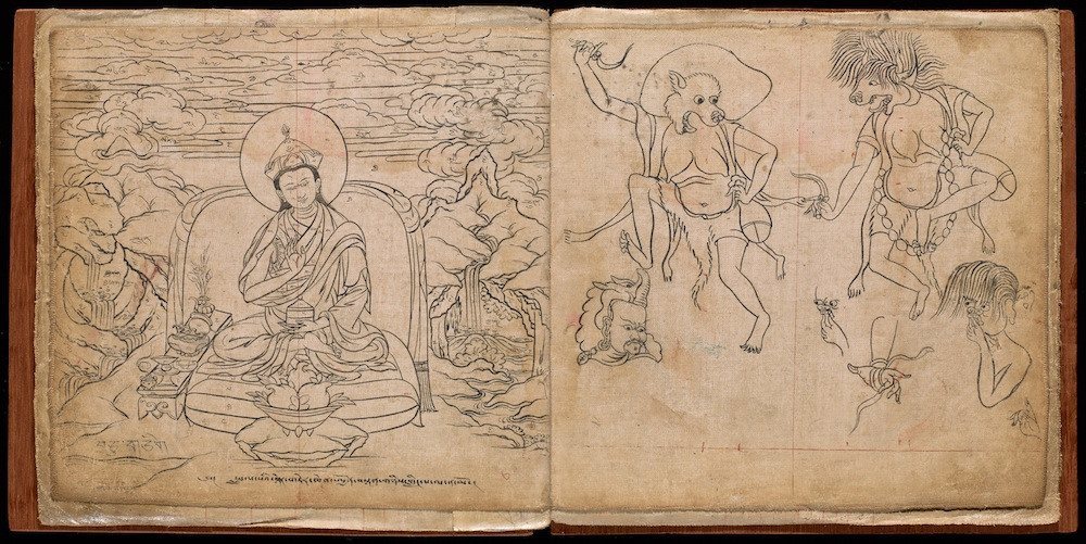
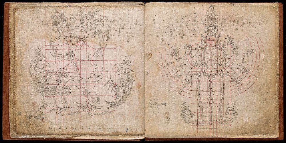
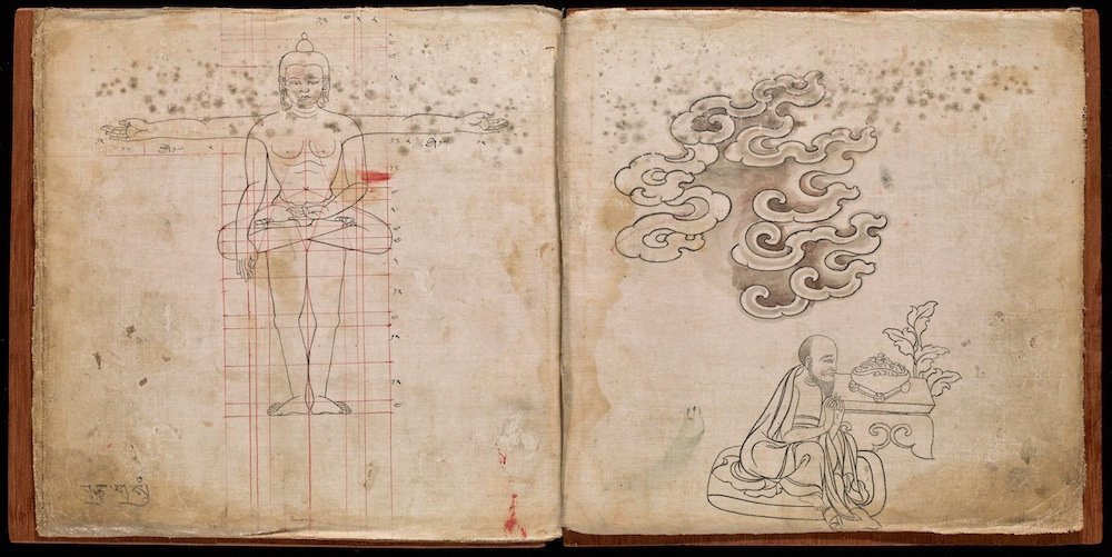
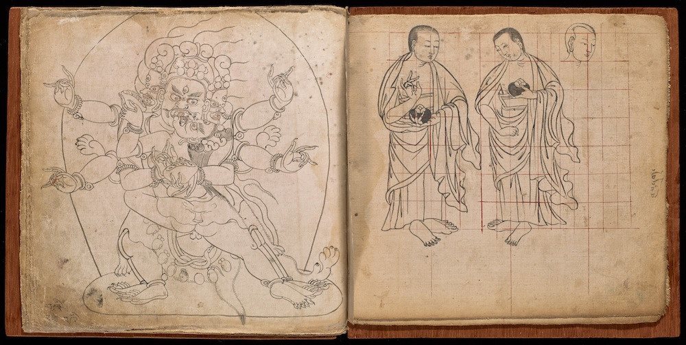
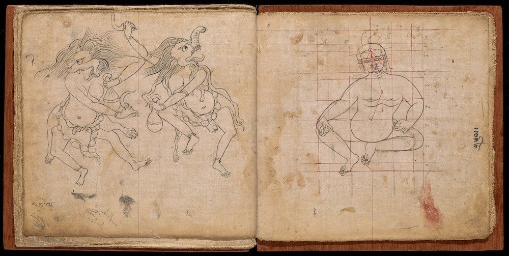
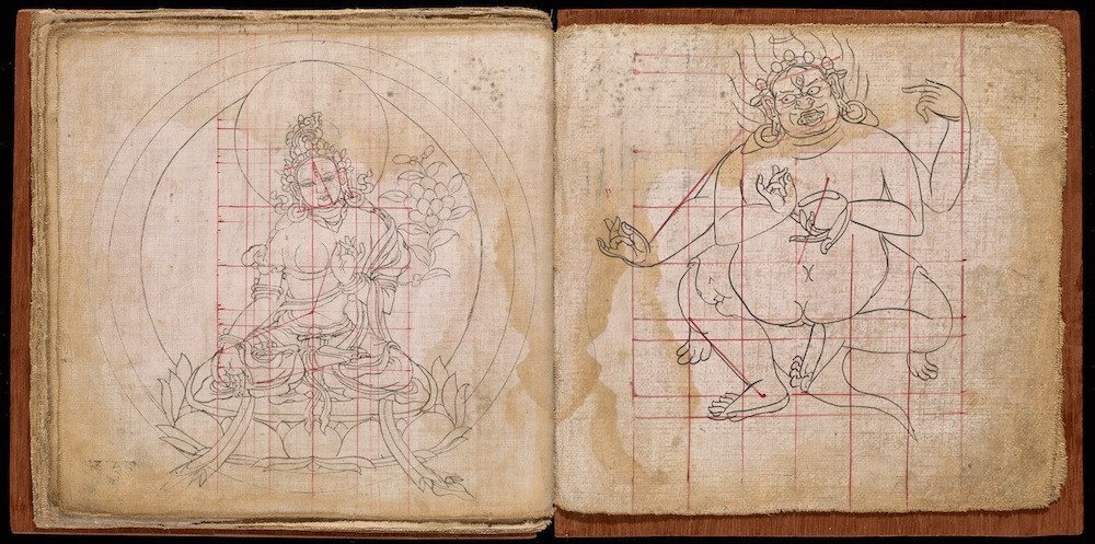
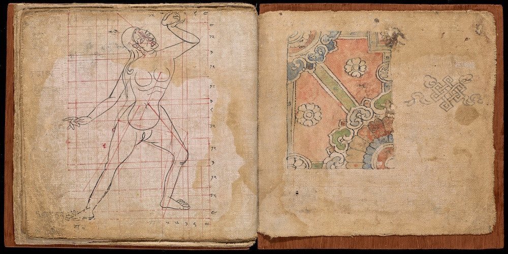
Cartoonists have a guide on how to draw the Buddha. No such guide exists for God, Jesus, Shiva or even Mohammed. With them you just have to wing it.
Smithsonian reports:
Born some time around the early 4th century B.C., Siddhārtha Gautama was a Nepalese monk and wandering sage whose teachings went on to underpin Buddhism. As Buddhism spread, pictorial representations Gautama —the Buddha—were expected to be so particular that guidelines emerged as to how he should be drawn. Public Domain Review points to a book from the 1700s that shows, precisely, how the Buddha and other important Buddhist figures should appear.
Written in Newari script with Tibetan numerals, the book was apparently produced in Nepal for use in Tibet. The concept of the ‘ideal image’ of the Buddha emerged during the Golden Age of Gupta rule, from the 4th to 6th century. As well as the proportions, other aspects of the depiction – such as number of teeth, colour of eyes, direction of hairs – became very important.
The rules are clear, laid out in 32 greater Laksanas and 80 lesser ones. The Victoria and Albert Museum says the Buddha should be seen with wheels on his hands and the soles of his feet. The Buddha should have webbed fingers and toes; long arms; ankle bones that are hardly noticeable; soft, curly hair; hairs of the body point upwards.; cheeks like a lions; and “eyes the colour of sapphire”.
Would you like to support Flashbak?
Please consider making a donation to our site. We don't want to rely on ads to bring you the best of visual culture. You can also support us by signing up to our Mailing List. And you can also follow us on Facebook, Instagram and Twitter. For great art and culture delivered to your door, visit our shop.
