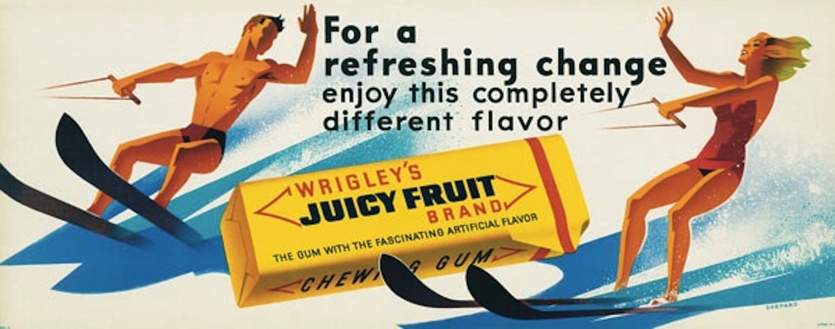
As a kid growing up in Seattle, art director and design historian Norman Hathaway got his first taste of Otis Shepard graphics the same way most of us did—by chewing a piece of gum. He didn’t know it yet, but from the 1930s to the 1960s, Shep, as Otis was known, designed everything from the slender sleeves that wrapped sticks of Spearmint, Doublemint, and Juicy Fruit to the enormous billboards that promoted these iconic Wrigley’s products to the world.
For most of us, the wrappers were trash, the billboards yet another come-on to get us to buy yet another thing. At first, that was the case for Hathaway, too, but he made the connection between Wrigley’s and Shepard when he was an aspiring artist in high school. In the 1970s, Hathaway devoured the illustrated instructional texts Shepard had written on airbrushing techniques. Then, thanks to numerous trips to his local public library, Hathaway learned that his airbrush guru was the creator of those gum advertisements, and a good deal more.
More recently, in 2008, Hathaway found himself immersed in Shepard again when he was writing Overspray: Riding High with the Kings of California Airbrush Art. At the time, there was scant information available on Shepard, even though the artists Hathaway interviewed for Oversprayhad hailed Shepard as one of the mid-20th-century’s most influential graphic artists. So Hathaway decided to gather what he could of Otis Shepard’s work and post it on Flickr, just to put it all in one place. That modest first step led to Dorothy and Otis: Designing the American Dream, which was co-authored by Hathaway’s frequent collaborator, Dan Nadel, and published by Harper Design.
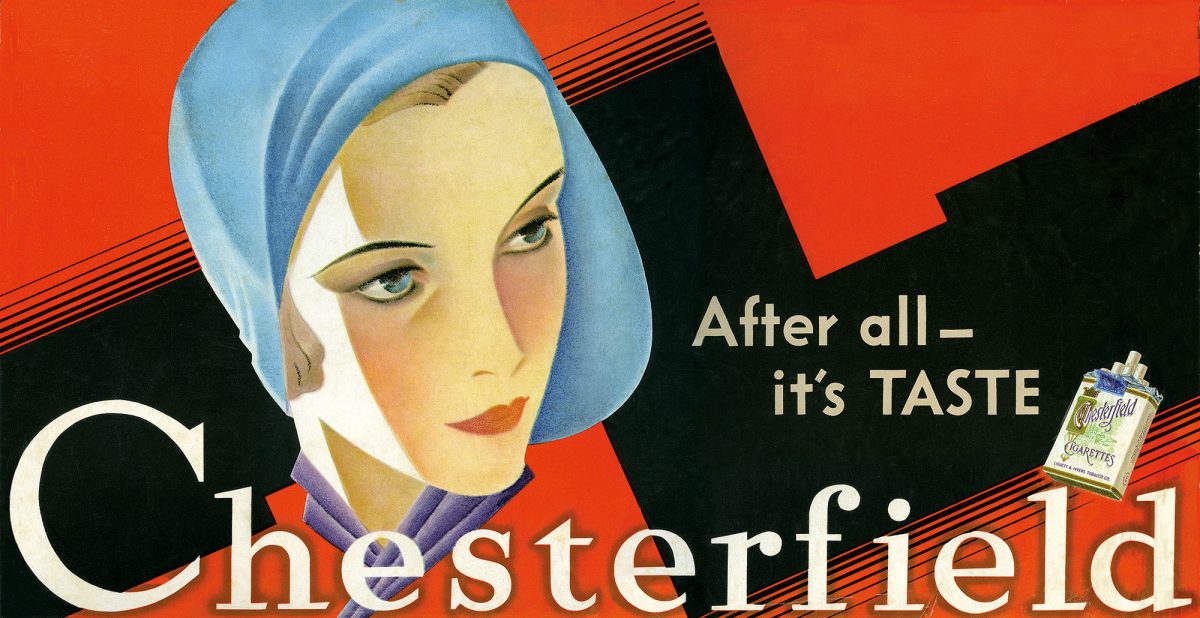
Top: In 1939, Otis Shepard introduced the Doublemint Twins to the world. This billboard reportedly sparked a surge in sales of this style of hat. Above: Dorothy and Otis Shepard’s 1930 billboard for Chesterfield Cigarettes featured a portrait of Dorothy by Otis.
“Generally, I’ll start a private group,” Hathaway says, explaining how he sometimes uses Flickr to organize his ideas, “but I guess I left the Otis Shepard page public. I didn’t think too much about it. There were maybe 10 images. And then, in late 2009 or early 2010, someone left a comment.”
That someone was Erin Shepard, Otis’s granddaughter. “I was shocked anyone even knew who he was,” Hathaway says. “Otis was so obscure. And when she mentioned that some of the images I had posted were actually by someone named Dorothy, I thought, ‘Oh, boy, who’s Dorothy?’ I didn’t even know she existed.”
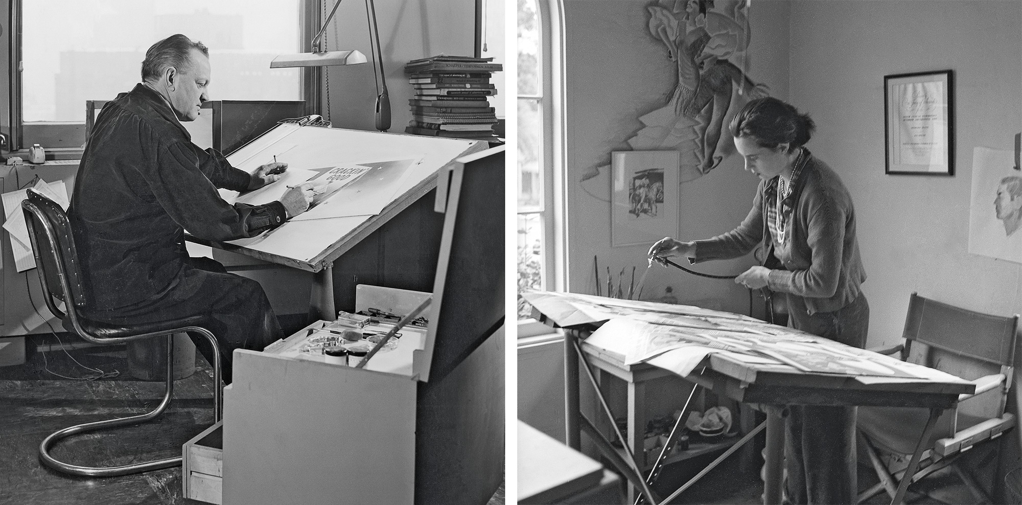
Otis and Dorothy Shepherd Via
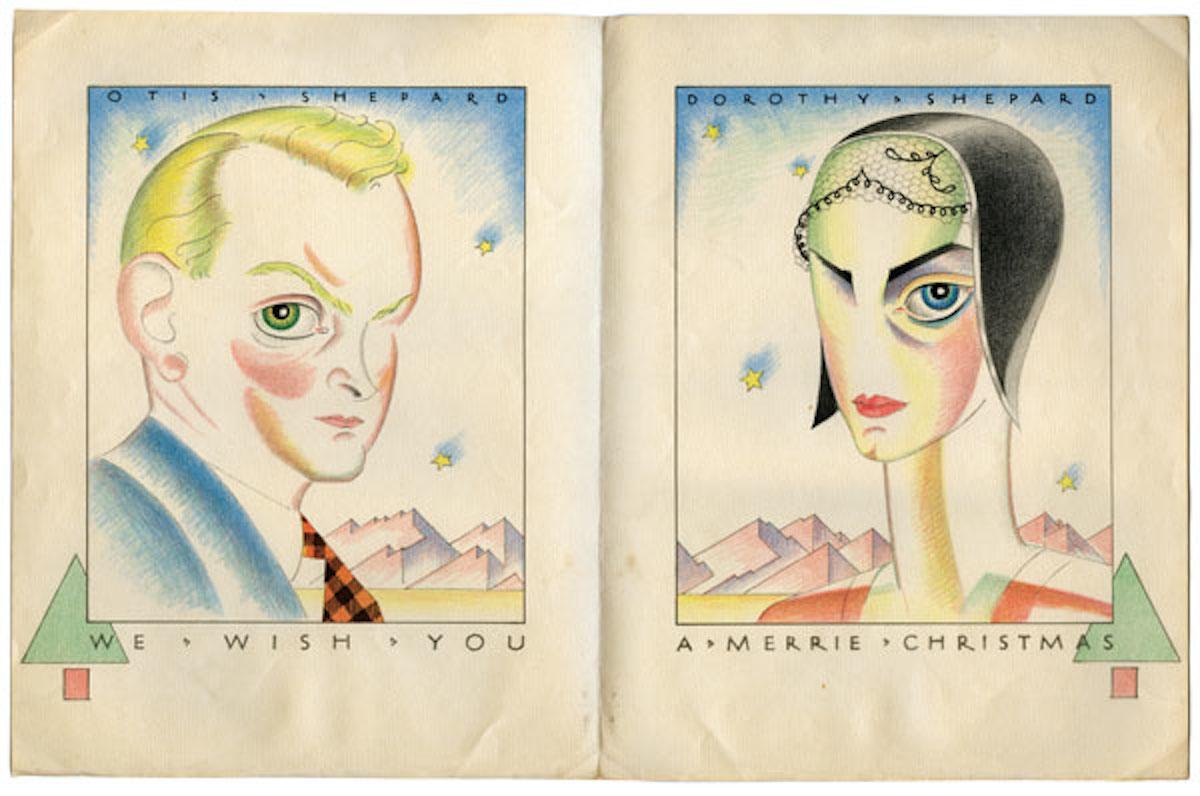
Dorothy was Erin’s grandmother, Shepard’s first, second, and only wife (the couple divorced before remarrying later in life). An accomplished artist in her own right, Dorothy Van Gorder was the beautiful, brainy, and well-bred Nora to Shep’s dashing, gregarious, and hard-drinking Nick. Before their marriage in November of 1929, Dorothy attended the California School of Arts and Crafts (now called the California College of the Arts) in Oakland, where she met Otis, who was teaching at the school to scout talent for billboard company Foster & Kleiser in San Francisco, where he worked. Shep had been the firm’s general manager before going off to fight in World War I. Upon his return from the war, he was quickly rehired, and by the time Dorothy met Shep in the late 1920s, he was the billboard firm’s quintessential “idea man.”
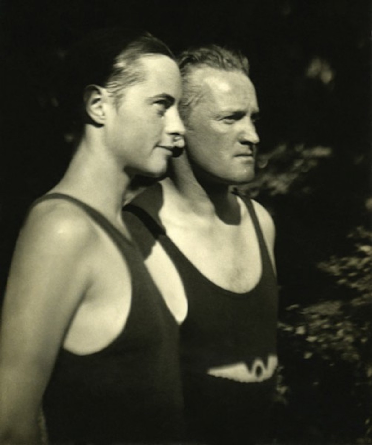
This photograph of Dorothy and Otis was taken by Dorothy’s brother, Hale, when the then-unmarried couple visited Dorothy’s parents’ house in 1928 or 1929.
“In a funny, romantic-comedy kind of way, it made sense that this self-taught guy, who projects a totally rough background, would be attracted to a woman who’s bohemian and yet comes from a refined family,” says Nadel. “You can imagine the appeal for him. Here was this woman who embodied everything he was striving for, in a sense. She had graduated early from high school and college. She was avant-garde in the Bay Area in the 1920s, sunbathing nude on the roof of her apartment building, that sort of thing. She must have been amazing, and they must have had a hell of a lot of fun.”
Virtually none of this was known to anyone outside the Shepard family when Erin left her note on Hathaway’s Flickr page. Before long, the two were talking over the phone, and Erin was encouraging Hathaway to call her father, Kirk Shepard, who lived in Arizona and was Otis and Dorothy’s youngest child.
“I called him the next day,” Hathaway says. “We spoke for probably two hours. He gave me a lot of information on his parents, to the point where I thought it sounded like it could be a book. I called Dan Nadel, who has published a lot of books and has been a collaborator, to see what he thought. He instantly felt like I’d found something serious, and agreed to help give it a go.”
At this point, though, Hathaway had few images for the book beyond the handful on Flickr. “I tried to get some visuals from Kirk, but he wasn’t especially tech savvy,” Hathaway says. “So Erin suggested we meet her at Kirk’s since she was planning a visit with her children. She thought that if she was there, it might be more conducive to collecting some stuff. We didn’t have a book deal or anything, but Dan and I decided to just go down there and pursue it.”
In retrospect, it was kind of an audacious action to fly from New York just to learn about the graphic-design history of a gum wrapper. “I hadn’t thought to ask beforehand how much stuff he had,” Hathaway admits. “I knew he had something, but as we were driving up to the house, I thought to myself, ‘If we get there and they only have three of four pieces, this is going to be embarrassing.’”
Nadel remembers his hot August excursion to Arizona a little bit more pointedly. “When we got off the plane,” Nadel recalls, “I turned to Norman and said, ‘If there’s nothing here, I’m gonna fucking kill you.’”

Dorothy Shepard designed numerous billboards for clients during the 1930s, including this one for Underwood Typewriters.
Fortunately, the cache of images Erin and Kirk had been alluding to was good enough to prevent a charge of manslaughter. “They were super-sweet people,” says Hathaway of the Shepards. “And their dining-room table was heaped with material—scrapbooks, boxes of negatives, rolled-up posters, things like that. Dan and I started opening the scrapbooks and were just stunned into silence, which is something for us. Within two minutes, we were looking at each other like, ‘Wow, this is it.’”
While Kirk Shepard deserves immense credit for keeping his parents’ legacy intact, it was Dorothy who created the often-meticulous documentation of the couple’s lives and careers. “We did lot of research and found additional materials aside from what we got from the family,” Hathaway says, “but Dorothy kept amazing records. We might have been able to do the book without her work, but thanks to her captions and notes, we were able to track everything by date—where they were, what they were doing—and patch together their history from that. For me, that’s the important thing about the book,” he adds. “It shows a couple’s life and how the work was part of it, not just nice examples of their work.”
“It’s both of their stories,” Nadel agrees. “She’s totally under-recognized, even though she was making this very progressive work at a time when few women were doing graphic design professionally, let alone at that level. I guess I’m equally fascinated by each of them, but we titled the book Dorothy and Otis instead of Otis and Dorothy because we wanted to give her story its due.”
Two of the key, if oppositional, aspects of Dorothy’s story were her independence as an artist and the role she played in helping to shape her husband’s career. For example, she seems to have been the catalyst that pushed Otis to leave his comfortable gig at Foster & Kleiser for the life of a freelancer in New York. There, the couple collaborated on a number of projects, beginning with a billboard for Chesterfield Cigarettes that featured Shep’s portrait of Dorothy against a black-and-red background. In addition to being her husband’s muse, Dorothy airbrushed the lettering, which was every bit as dominant a feature on the final billboard as her impassive, sloe-eyed gaze.
The Chesterfield job led to more billboard collaborations for automobile and oil companies, as well as solo projects by Dorothy for Folger’s Coffee and Underwood Typewriters, although there may have been more: As Nadel and Hathaway write in Dorothy and Otis, “She scrupulously documented Shep and his work in scrapbooks but saved little of her own.
“Otis was supportive of Dorothy and definitely thought she was extremely talented,” Hathaway says. “She was very highly regarded for her time, but I wouldn’t have wanted to be in the shadow of that guy, just because he was so spectacularly brilliant. He had the talent, but also the personality, the charm, all that stuff. I think it would have been difficult to have a super high opinion of yourself when you’re around someone like that. He was the man.”
In the advertising world of 1930s New York, being a man (let alone the) was actually rather important since the industry was very much a male domain. Still, it’s not entirely clear to Hathaway that Dorothy did not achieve the same level of success as her husband only because of sexism and her husband’s long shadow. “I think a lot of what happened to her was also the result of working in the billboard industry,” he says, explaining that the trade was a step removed from the advertising mainstream. In addition, the Shepards were freelancers working directly with clients rather than through one of the many advertising agencies that were just beginning to dominate the advertising business of the 1930s. “I think it’s a real tribute to her that she didn’t let all that stuff get in the way of having a successful career,” Hathaway says.

That said, it was Otis, not Dorothy, who forged the decades-long relationship with P.K. Wrigley in 1932. Wrigley would become the Shepards’ most generous patron, and eventually one of Otis’ closest friends, but according to Dorothy and Otis, the two got off to an awkward start. At their first meeting, Wrigley wanted to buy a couple of Shep’s designs outright, but Otis played hard to get, refusing to take Wrigley’s money unless it was a down payment on a full campaign that Shep argued would be more effective. Later, when Wrigley expressed his distaste for the visual appearance of one of Shep’s ads, Shep sarcastically dismissed his client’s sense of aesthetics by asking him, “Are you selling chewing gum, or are you going to hang this in your parlor?”
“I think Wrigley trusted Otis,” says Hathaway. “They got along well on a personal level, and I think he respected Otis’ work ethic. Shep became well known within the Wrigley company as the one person whom P.K. could trust to give it to him straight and not be a yes-man. Sure they had big arguments and things like that, but neither took it personally. Wrigley respected Otis’ mind and convictions.”
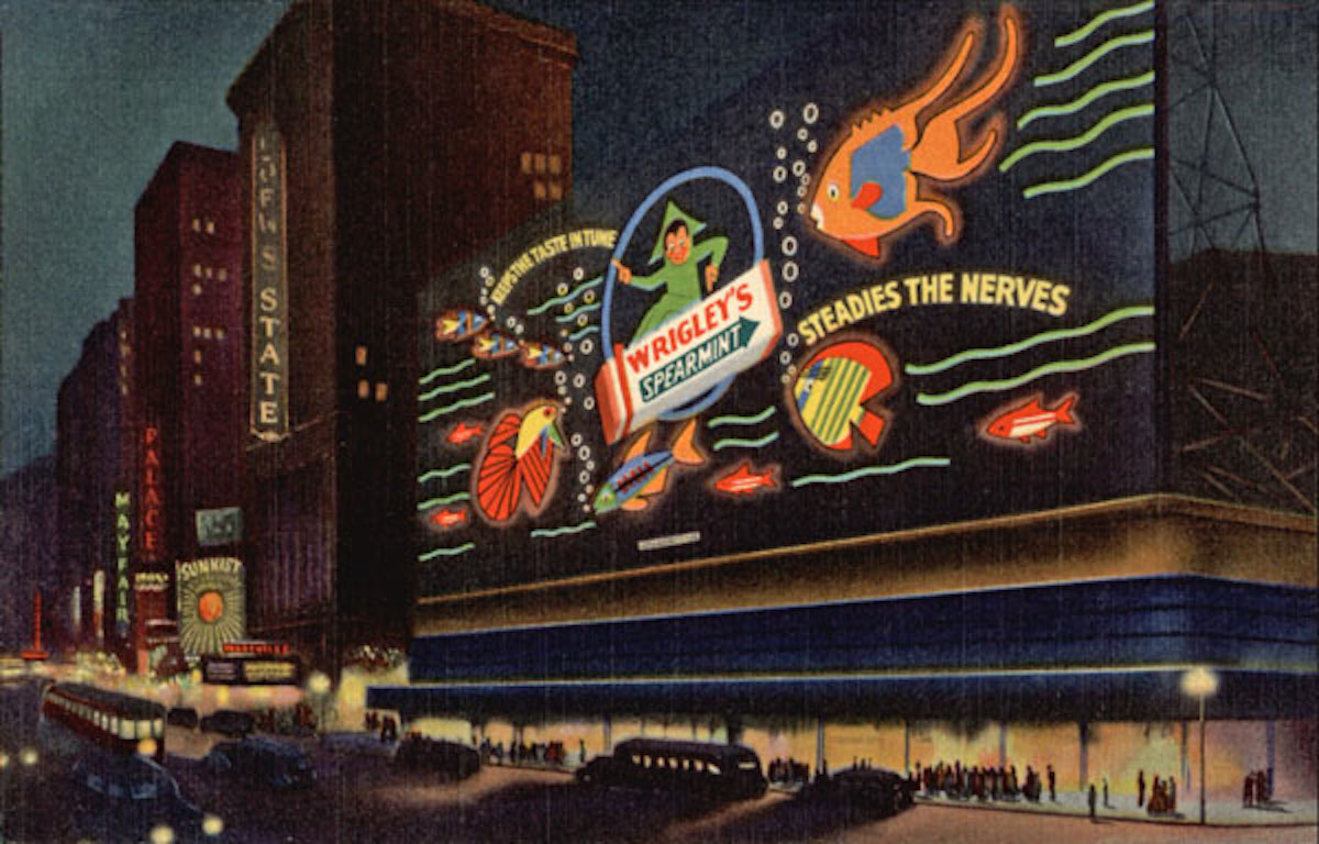
The Wrigley’s Times Square Spectacular, shown here in a postcard, was designed in 1936 by Dorothy Shepard. At the time, it was the largest neon ad in the world, a full block long and eight stories tall.
From the contemporary vantage point, it’s tempting to look at Otis’ work from the 1930s and see only its sense of style. But Shepard was not interested in pushing the aesthetic agenda of Symbolism and Abstraction in advertising art, in setting himself up as the American counterpart to the European modernist designer Joseph Binder, whom the couple had met on their honeymoon in 1929. Like Wrigley, Shep was all about results.
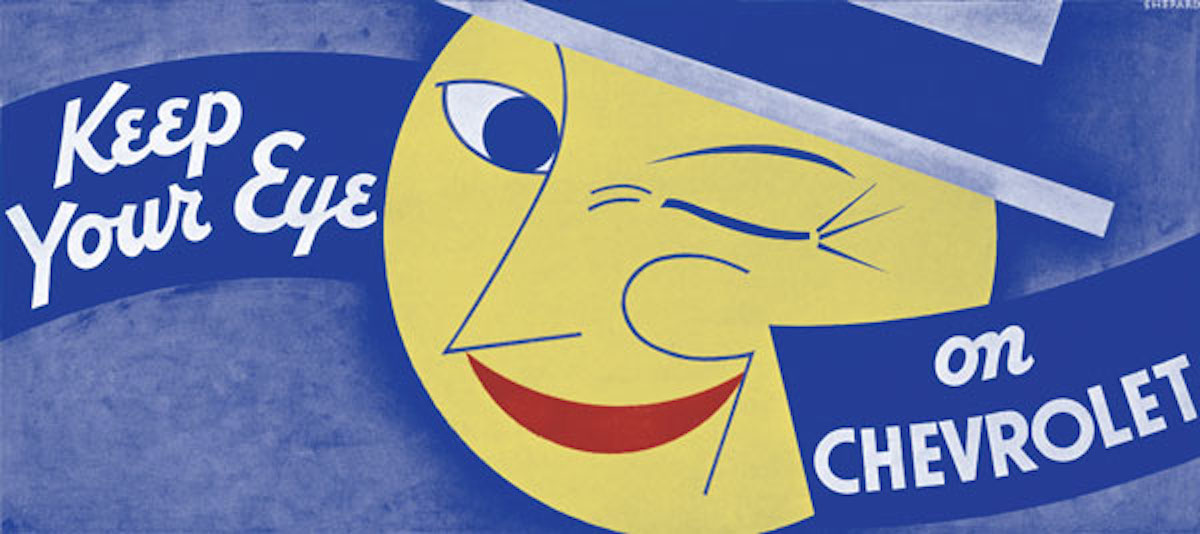
Take a Wrigley’s gum wrapper: To differentiate the three major gum brands, Shep limited himself to a few bold colors and a couple of variations in the shape of the arrows on each flavor’s wrapper. His billboards were equally straightforward, characterized by their soft airbrush fades and hard linear edges. Sure, it was a style that took its cue from Binder’s work, but style was not the point.
“Otis was interested in effectiveness and immediacy,” Hathaway says. “He thought that working in symbolic imagery was stronger than trying to be realistic because the resulting picture that lodged in the viewer’s mind would be more memorable.” In other words, Shep didn’t distract his viewers with virtuoso details, regardless of their artistic merit. “He felt the Europeans had figured that out, and that it was the smarter approach. Otis was a pragmatic person when it came to advertising. Everything he did was about being as successful as possible from a commercial standpoint.”
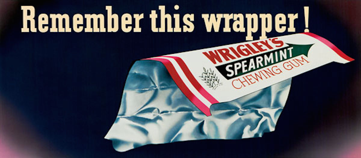
This Otis Shepard billboard from 1945 reminded customers that Wrigley’s gum would be back as soon as the war ended.
If Otis was the man, Wrigley was the puppet master, regularly summoning Shep to Chicago to work on campaigns for the chewing-gum magnate’s brands while Dorothy stayed at home in New York caring for the couple’s first child, Gordon (Kirk’s older brother), who grew up with learning disabilities because of a breached birth and was ultimately institutionalized.
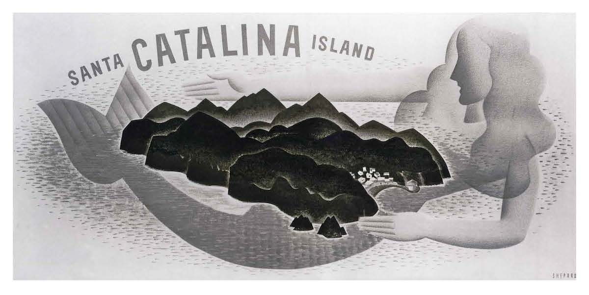
Coinciding with the work he was doing for Wrigley’s gum products (in one year during the 1930s, Shepard’s designs appeared on some 20,000 billboards), Shep and Dorothy, along with young Gordon, were whisked away to work on another of Wrigley’s numerous enterprises, Santa Catalina Island, which sat just off the Southern California coast. Wrigley wanted to transform the rustic island into a fashionable year-round resort, and he entrusted the Shepards to design just about all of it, from the location of palm trees planted in the town of Avalon to the uniforms (costumes, really) worn by postal workers and the island’s other service-economy employees. Otis Shepard created brochures for would-be tourists and Dorothy designed the signage to direct them to gift shops once they arrived. In short, they had been invited to remake paradise.
 Otis and Dorothy spent four years on Santa Catalina Island in the mid-1930s, creating everything from posters (above) to signage and uniforms for the Wrigley-funded resort.[/caption]
Later in life, Dorothy would describe this period on Catalina as four glorious years, but reading Dorothy and Otis, life on the island doesn’t exactly sound idyllic. If Otis and Dorothy had begun marriage as creative equals, by the time they got to Catalina in the mid-1930s, their roles were already starting to harden. Dorothy looked after Gordon and created the aforementioned costumes and signage, painted murals for playgrounds and bars, and designed the interiors of Avalon’s main hotel, the St. Catherine, as well as the ferries that brought customers to it.
Shep did plenty of design work during his years on Catalina (cocktail-lounge menus, matchbooks, and even physical amenities in Avalon), but he also spent a sizable chunk of his time doing “guy” stuff, which included being the jester-like emcee at the island’s frequent parties, and horsing around and drinking with employees of yet another growing Wrigley empire, the Chicago Cubsbaseball team, whose players took spring training on the island. “Otis was a great athlete,” Hathaway says. “He was very keen about baseball, so he bonded with most of the Cubs people.”
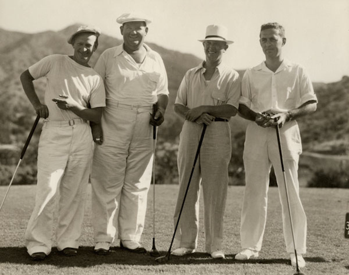 On Catalina, Otis Shepard (left) hobnobbed with the island’s famous guests, such as Oliver Hardy and Stan Laurel (center). At right is his patron, P.K. Wrigley, who owned the majority share of the island.[/caption]
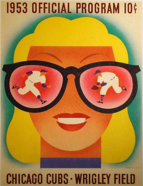
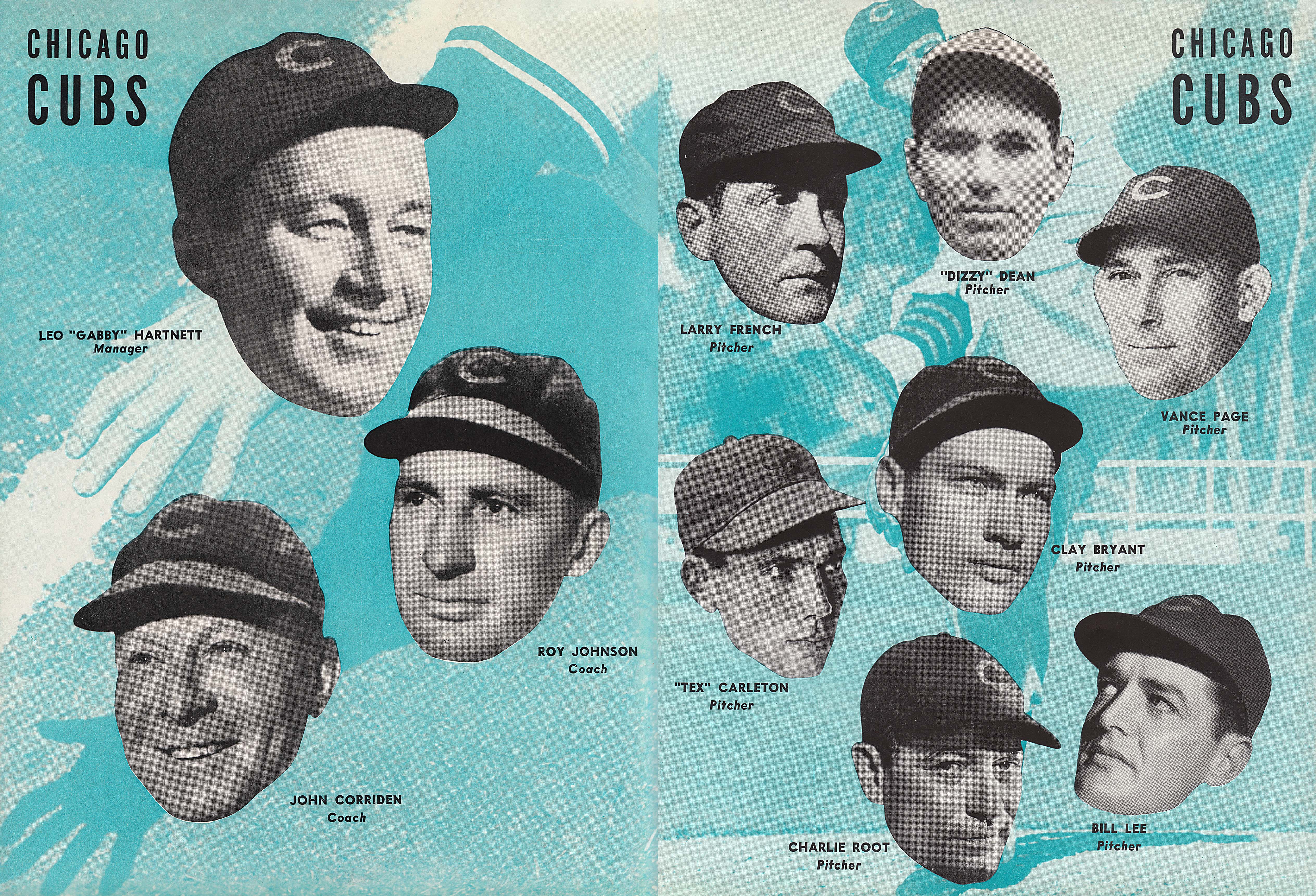
Naturally, Shep became involved in the design work for the team, too. As he had done in New York at the beginning of the Wrigley’s gum campaigns, he’d shuttle to Chicago to oversee all aspects of the Cubs look, from uniforms and mascots to the 1937 renovation of Wrigley Field—it was Shep, for example, who thought it would be a good idea to plant ivy along the inside of the outfield wall, giving the park the signature look that is so beloved today.
Roughly in the middle of their busy island years, Dorothy became pregnant again, only to lose what would have been the couple’s second child at birth. To regain her strength and peace of mind, Dorothy swam laps in Avalon’s sheltered harbor and produced an award-winning series of billboards for Pabst. Otis took refuge in work, too, fueled by increasing amounts of alcohol and what may have been multiple extramarital affairs, including one rumored romance with actor Johnny (“Tarzan”) Weismuller’s wife, Lupe Vélez.
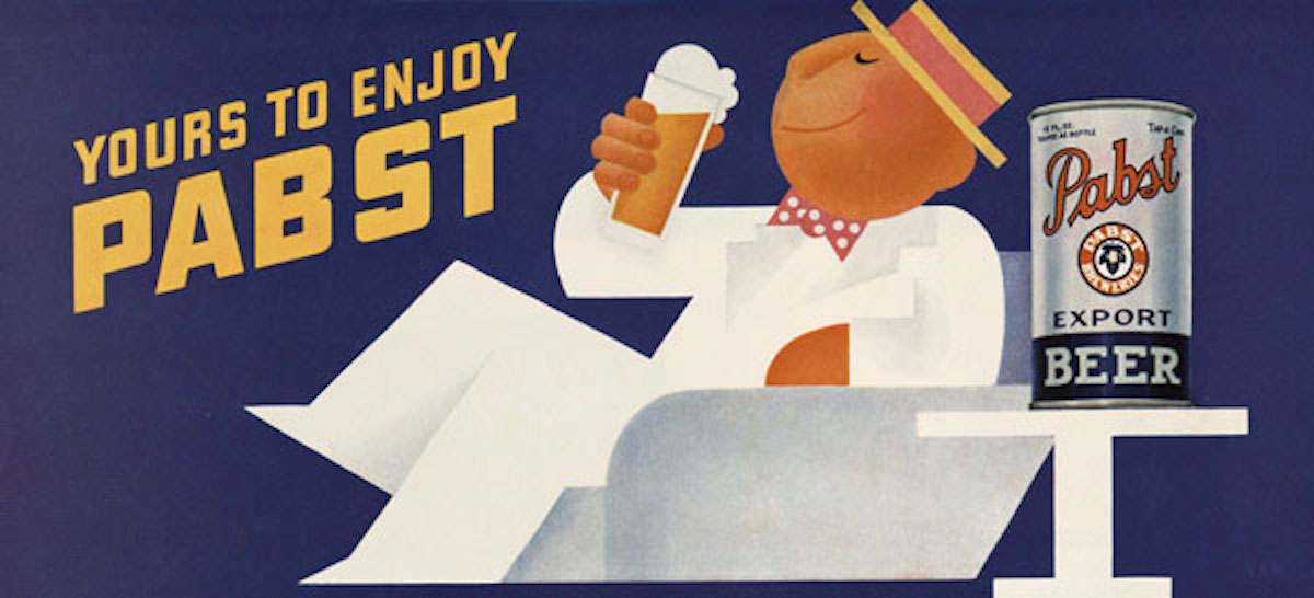 In 1936, while she was living in Catalina, Dorothy Shepard won an award for a series of billboards she created for Pabst.[/caption]
By 1938, it was time for the Shepards to leave the island, eventually settling back in Chicago, where Kirk was born. Now, Otis had the Chicago Cubs to occupy his attention—during World War II, he also designed programs and the Sonja Henie-inspired uniforms for Wrigley’s “All-American Girls Softball League,” which was basis for the 1992 film “A League of Their Own.” For her part, Dorothy was leaving her career behind, occupied by the care required for Gordon (he was sent to a sanatorium in Topeka, Kansas, in 1942) and young Kirk, with whom she retreated to Catalina for a few years before relocating permanently in 1949 to a suburb of San Francisco, where Shep had bought a pair of homes—one for his mother, Nancy, and another for his estranged wife and Kirk, whom he would visit once or twice a year.
Against this soap-opera backdrop, Otis produced some of the most exuberant and striking work of his career, both for the Chicago Cubs and Wrigley’s gum. For example, the Doublemint twins, whom Shepard had introduced in 1939, were now a part of the cultural landscape, as they would be throughout the 1950s.
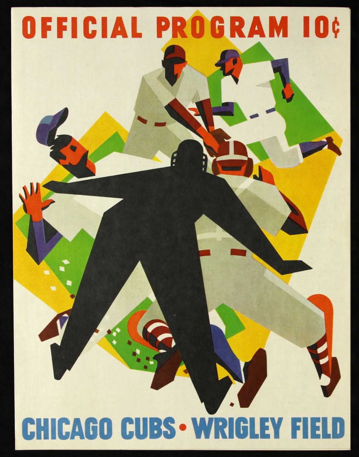
In the first year of that decade, Shepard also designed his most iconic Cubs program, which depicted an enormous baseball looming in the foreground, almost appearing to grow in size, as if it had just been hurled at the reader by the ball’s pitcher, whose frozen form looms behind it. “When Shep drew pitchers,” Hathaway says, “he’d get them in the best pose and reduce the elements down to their essentials, so everything was just so dynamic and strong. It wasn’t just a drawing by an artist but a drawing by someone who obviously understood the sport. That’s what made his baseball stuff so convincing.”
From the 1930s to 1960s, Otis Shepard designed uniforms, programs, and logos for yet another Wrigley property, the Chicago Cubs. At left is perhaps his most iconic program, from 1950. At right is another from 1966, when Otis was retired from Wrigley’s but still doing work as a freelancer.
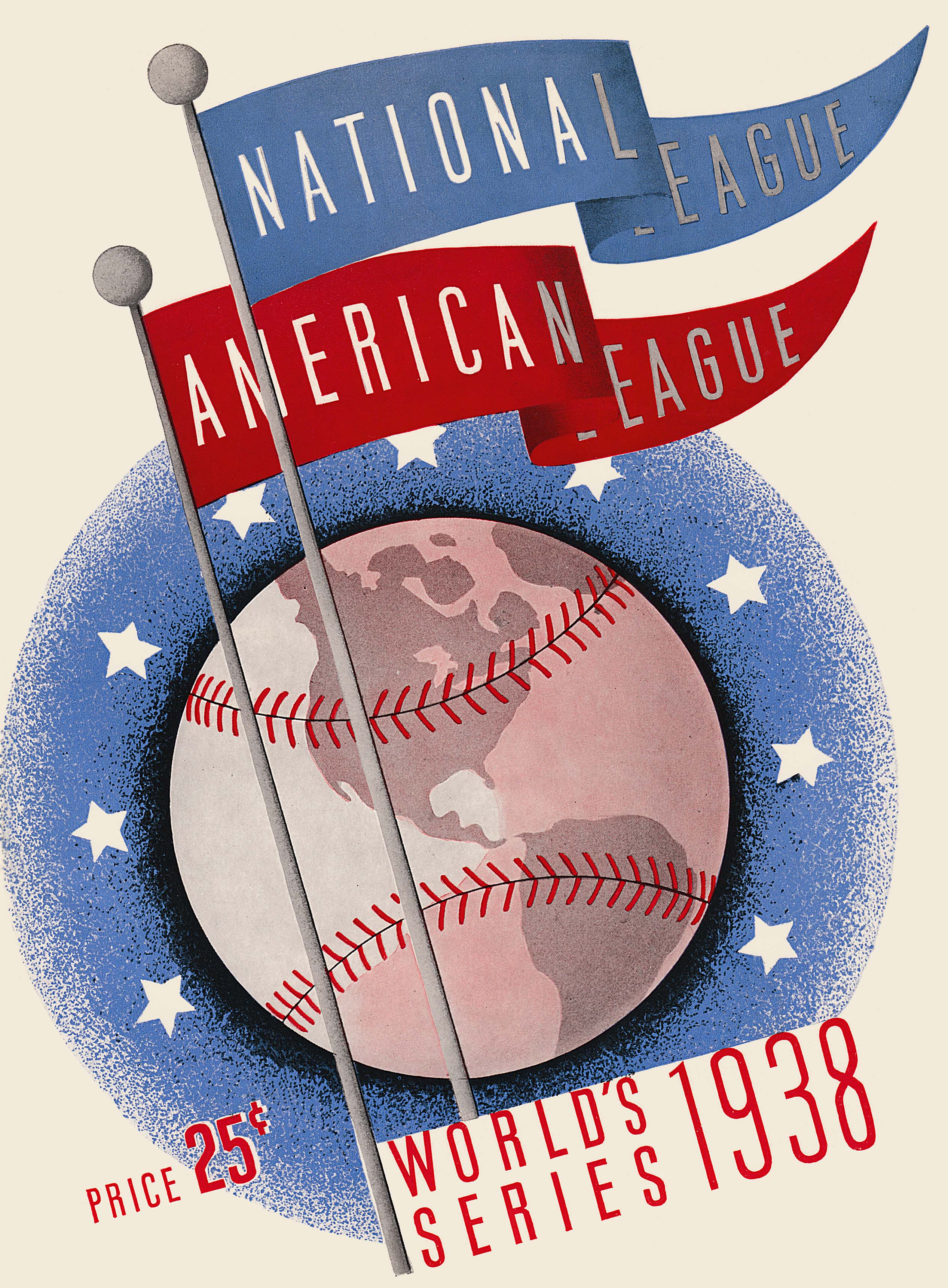
“Here are all the 1938 World Series scorecard images.” This and scorecard scans below via Al Yellon at BleedCubbieBlue
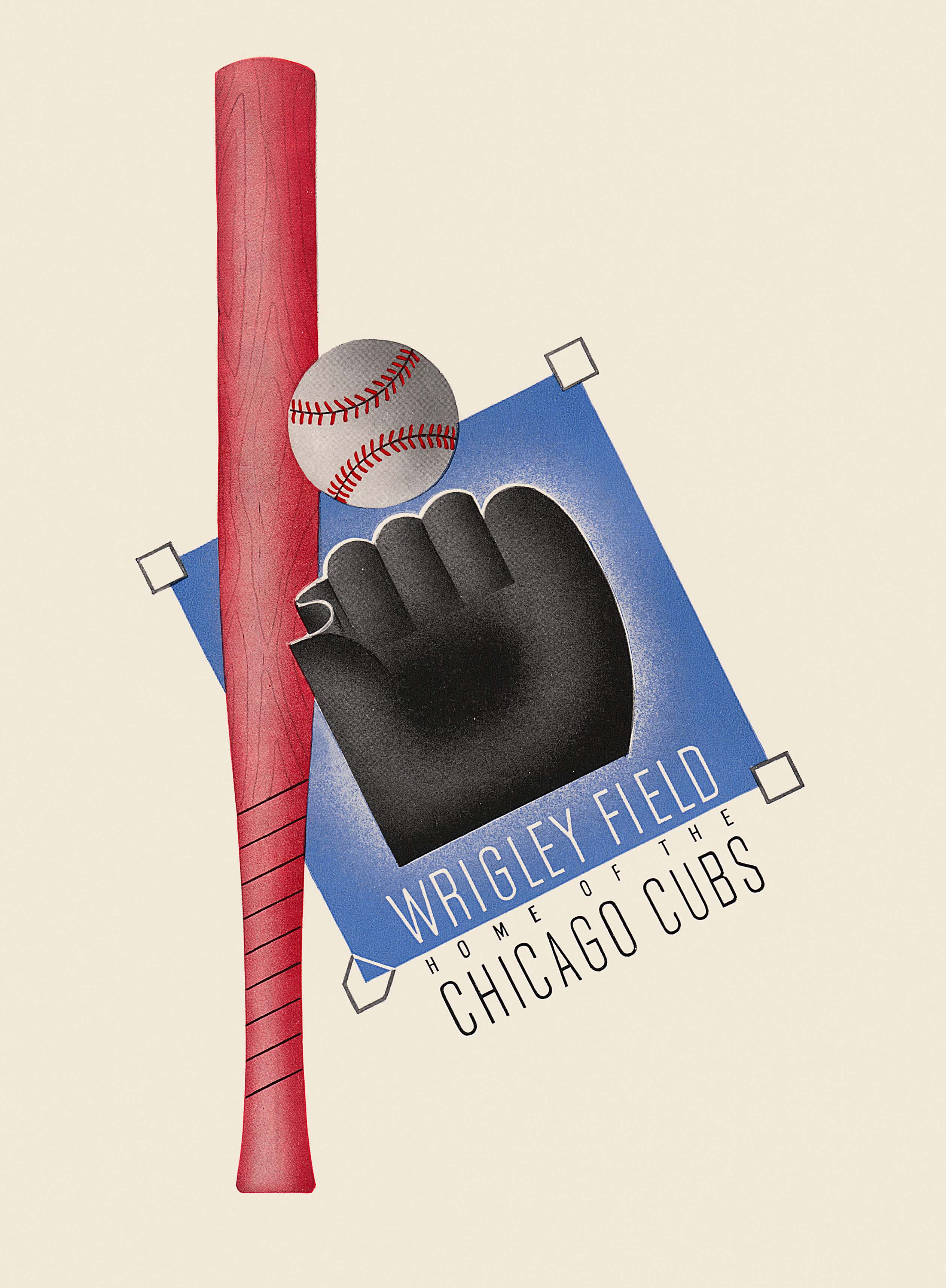 Chicago Cubs New York Yankees October 5, 1938[/caption]
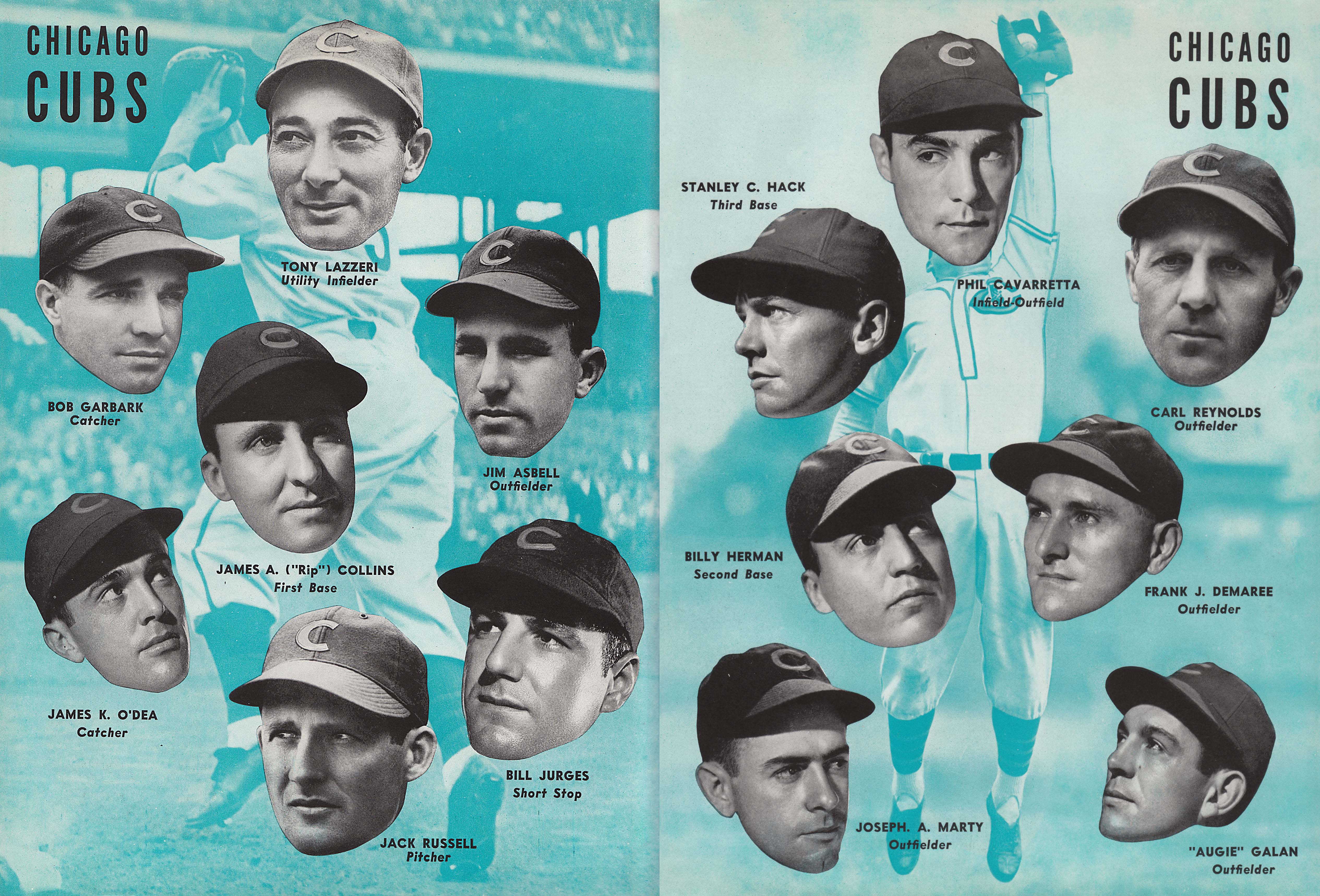 October 5, 1938 Otis Dorothy Shepherd[/caption]
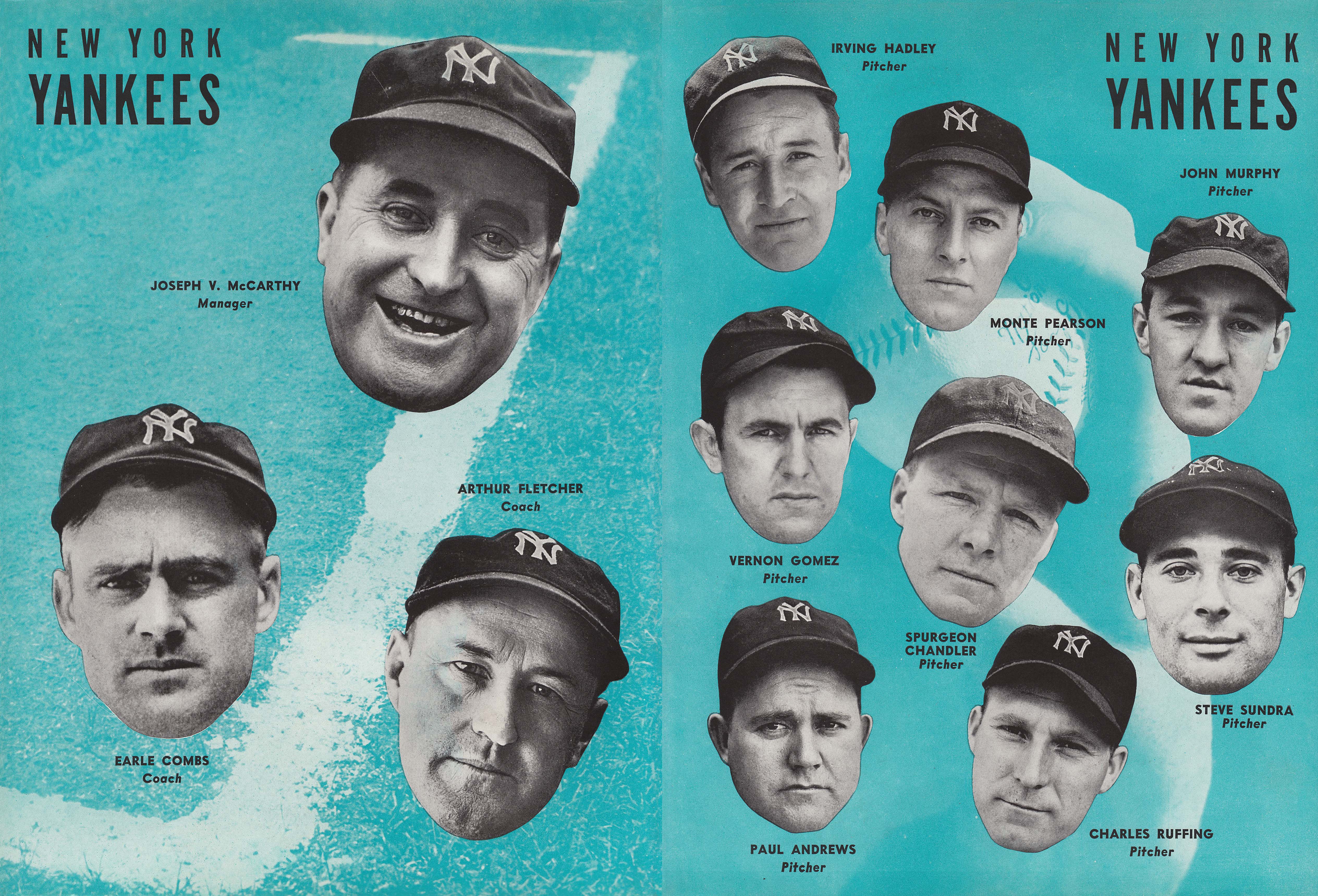
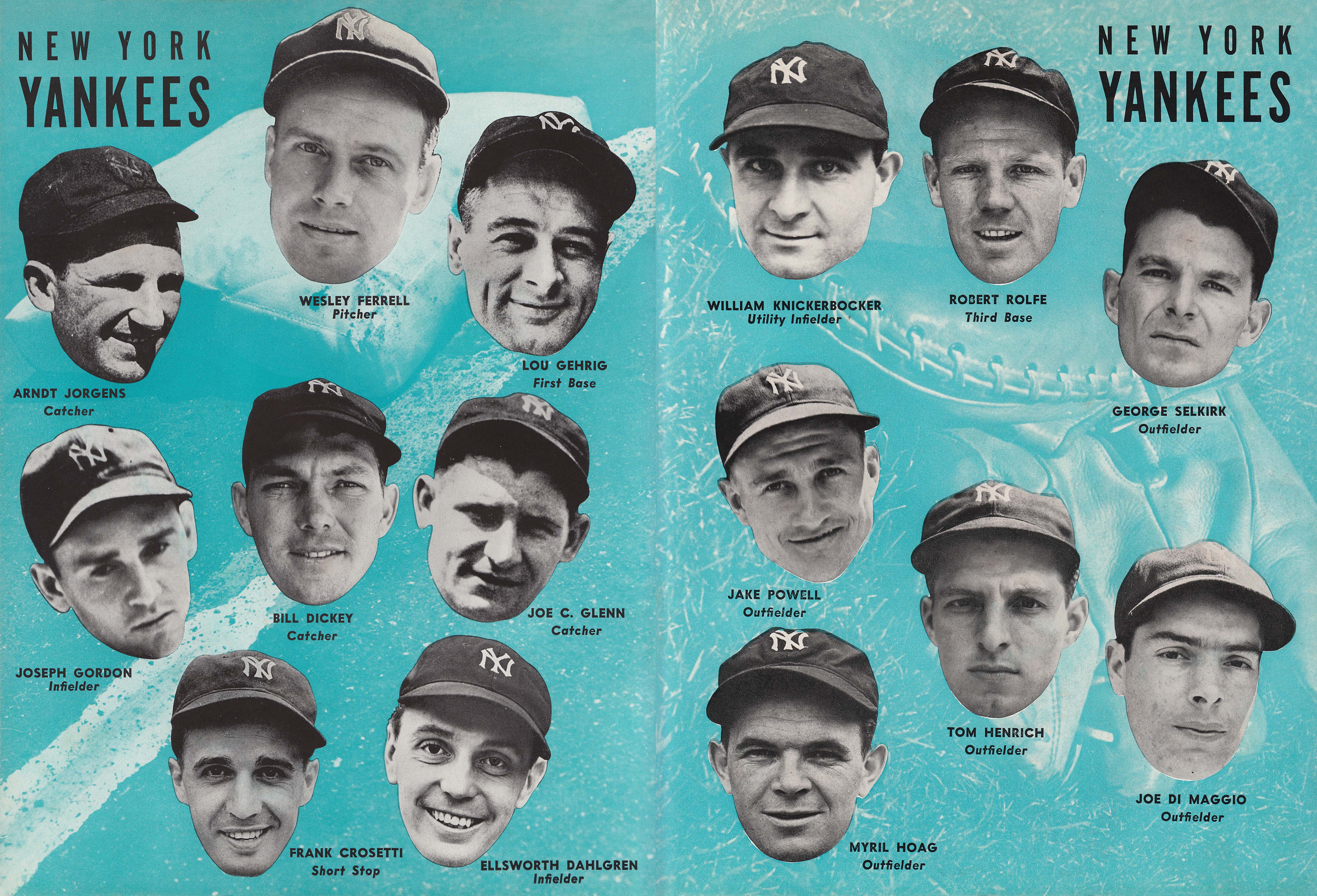
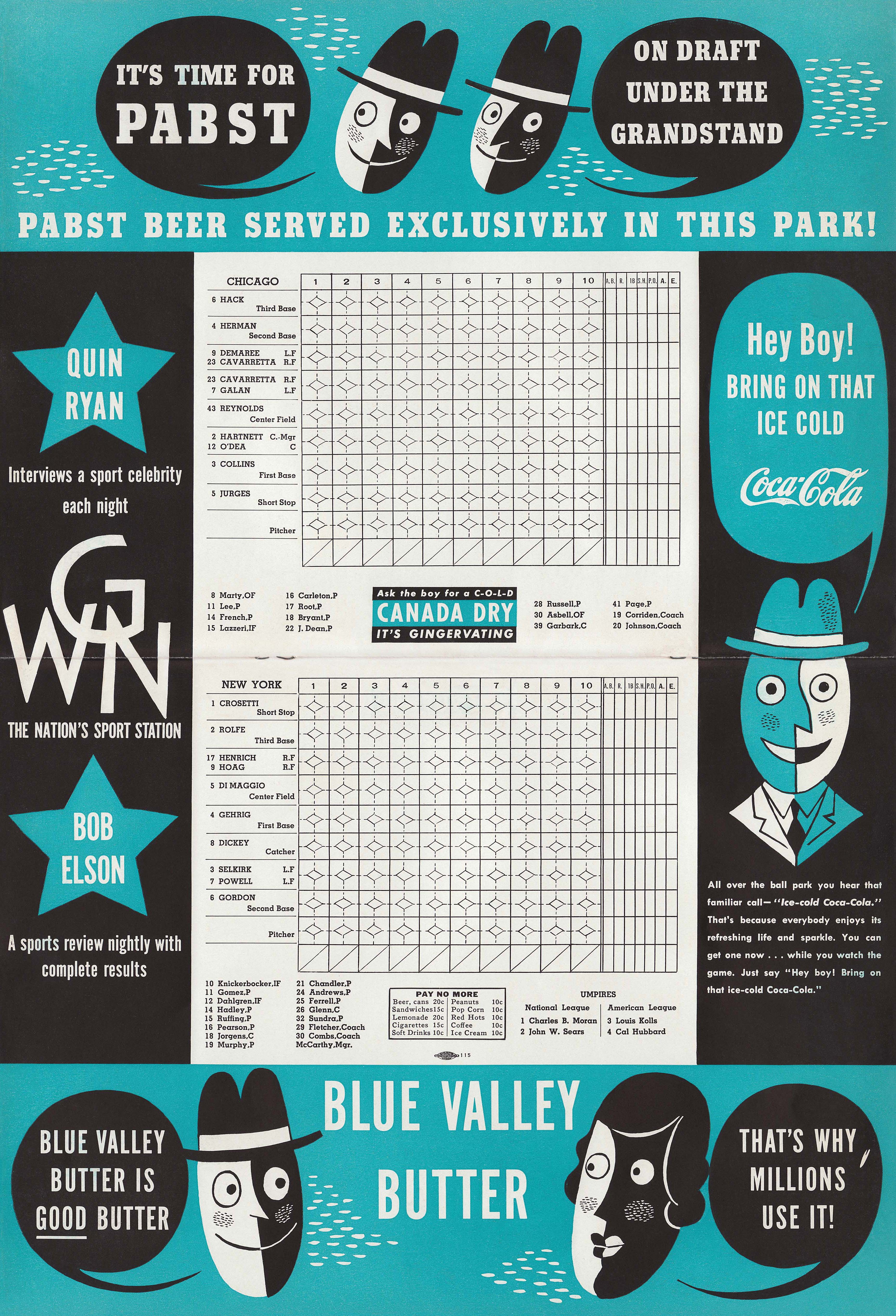
And then, in 1962, Otis retired from Wrigley’s, and with the exception of a few years of freelance work, the career that had begun back in World War I was suddenly over. His relationship with Dorothy, however, wasn’t.
“They had remained connected through their children, of course,” Nadel says of their relationship after their divorce in the early 1950s, “and they had always admired one another. I think that was a big part of what brought them back together, that mutual respect for each other’s talents and personalities. From what I understand, Shep apologized, and they rekindled their romance. And apparently it was a real romance late in life. It wasn’t just for convenience’s sake.”
That same year, Shep moved in with Dorothy, and in 1965, the couple remarried, although Shep would die just four years later from complications brought on by ALS. Dorothy lived for several decades longer, passing away from natural causes at the end of 2010.
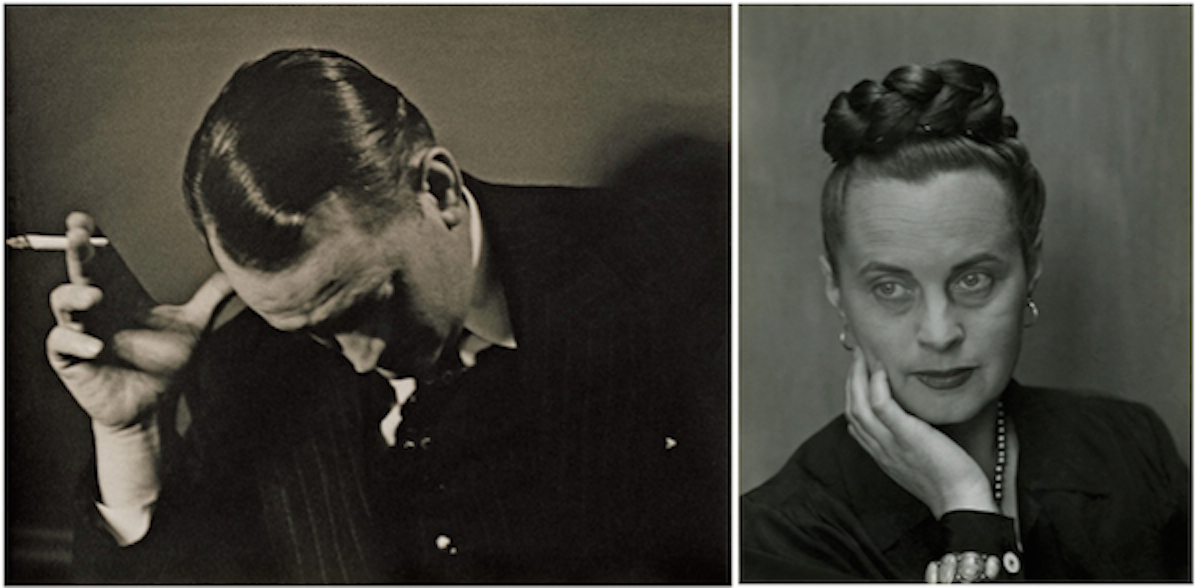 A pair of Edward Weston portraits of the couple from 1945, shortly before they separated. They were divorced in the early 1950s, but got together again in 1962 and remarried in 1965.[/caption]
In the decades after her husband’s death, Dorothy organized their life’s work into the scrapbooks that were the primary sources for Hathaway and Nadel’s book. “I don’t think she had a long-term reason for doing it,” Hathaway says. “I think she just thought they had been doing important work and it should be documented.”
Nadel believes Dorothy may have thought the scrapbooks might go to a museum one day, but, he says, “she was not a boastful person. It wouldn’t have been in her nature to seek out somebody to do anything like what we ended up doing.” Fortunately, somebody did.
Dorothy and Otis: Designing the American Dream by Norman Hathaway and Dan Nadel.
Read more from Ben at Collectors Weekly. We recommend: Hippie Daredevils, Psychedelic Rock Posters and When Pianos Fell From the Sky.
Would you like to support Flashbak?
Please consider making a donation to our site. We don't want to rely on ads to bring you the best of visual culture. You can also support us by signing up to our Mailing List. And you can also follow us on Facebook, Instagram and Twitter. For great art and culture delivered to your door, visit our shop.
