You know the trope: A completely nude character’s “naughty bits” are blocked from view by a convenient prop or oddity of architecture. It’s sometimes amusing, sometimes highly irritating, but always obvious, no matter how clever the artists or directors think they are. The absurdity of this trope was often spoofed on Benny Hill and perfectly captured in the Austin Powers films where, on several occasions, the actors are conveniently censored by various ridiculously placed items.
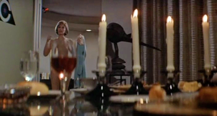
After watching a particularly jarring example in the film Colossus: The Forbin Project (1970), I knew it was time to do an article on this often used device…
In the scene, Susan Clark strips down to her skivvies under the watchful eye of the artificial intelligence. But while the supercomputer gets to see her naughty parts, the viewer is confounded by a conveniently placed wine glass.
The problem is that it completely takes the viewer out of the picture. The fact that a wine glass is perfectly stationed in front of Miss Clark is so obviously an act of censoring by the filmmakers, that the willing suspension of disbelief is momentarily shattered.
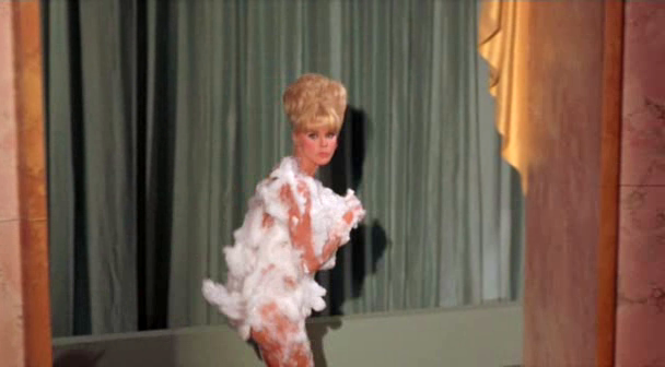
Another glaring example is Boy, Did I Get a Wrong Number! (1966). Elke Sommer emerges from a bubble bath and runs through a movie lot, all the while the strategically placed bubble bath suds stayed in place. It bordered on the absurd. But it’s a Bob Hope film from the Sixties, so it’s not like I expected full frontal…. yet, there it is: an annoying trope that takes the audience right out of the moment.
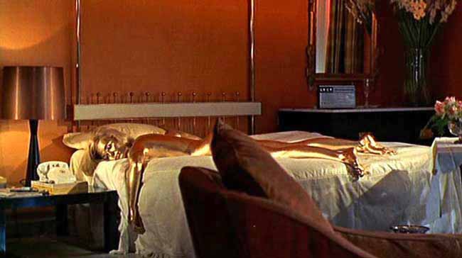
Goldfinger – the strategically placed pillow
Please note that I’m not complaining, so much as making an observation. I completely understand that mermaid boobs would have given Splash an R rating, thus limiting its revenue. However, I will point out that covering up naughty bits doesn’t necessarily have to be done poorly. The shower scene in Psycho, for instance, was deftly handled. There wasn’t an obnoxious bar of soap in the foreground; rather, the scene was cut to where the viewer isn’t really aware that censorship is going on.
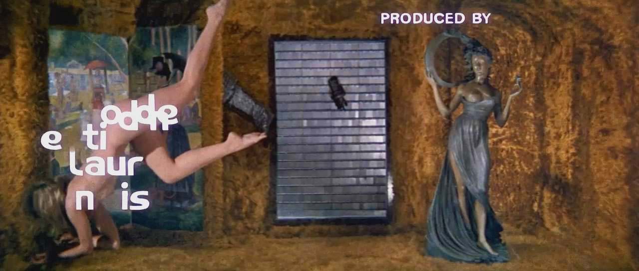
The credits sequence in Barbarella is perhaps the most famous and blatant example in cinema. Completely ridiculous, but the film is so campy it doesn’t really matter. No illusion of realism has been shattered.
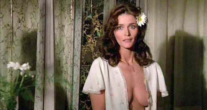
Margot Kidder’s physics defying nightgown in The Amityville Horror is another matter…
Which brings up a reasonable question: If the scene can’t be handled deftly, then is it better to not have the scene at all? In other words, if you’re going to have a wine glass covering all the “scenery”, then perhaps this scene isn’t necessary. It’s not just a tease for the male audience, it can become a distraction of the most overbearing variety.
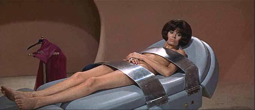
Another example is in Casino Royale (1967) where Daliah Lavi is held captive by Woody Allen. I think it’s pretty obvious these straps are serving more as censors than restrainers.
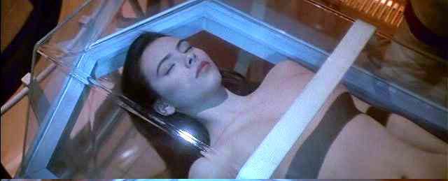
Mathilda May in Tobe Hooper’s Lifeforce (1985). Why the need for the perfectly positioned strip of white tape? Mathilda certainly didn’t have any worries regarding over-exposure in the rest of the film, where she’s pretty much naked throughout. Mark this one as the most senseless act of scenery censorship in cinema history.
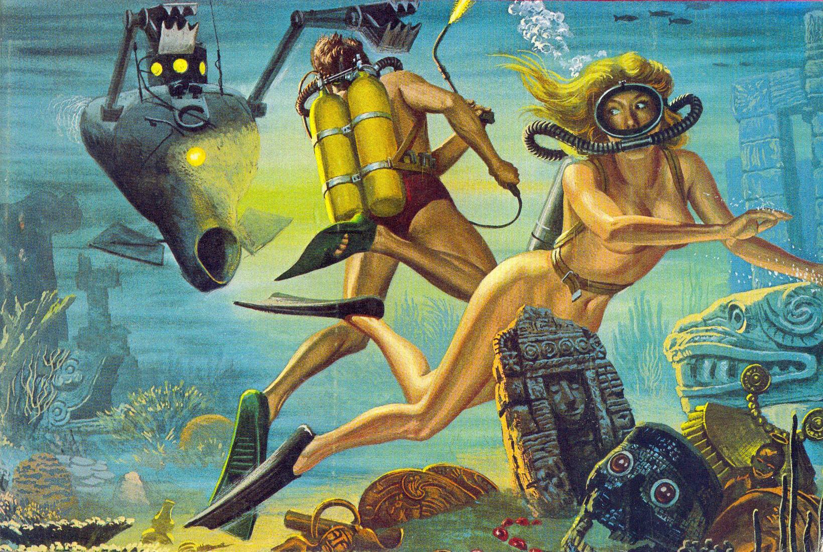
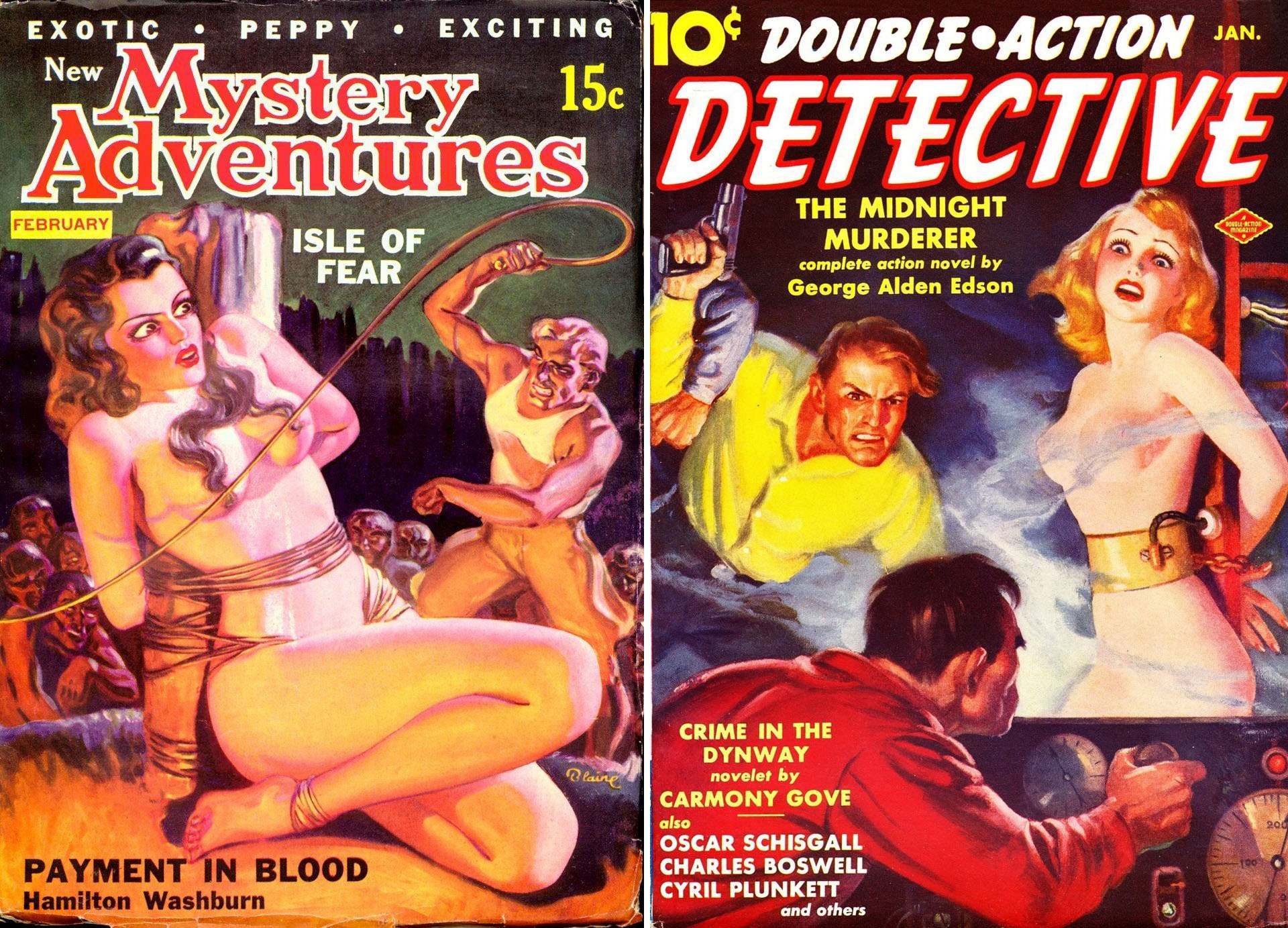
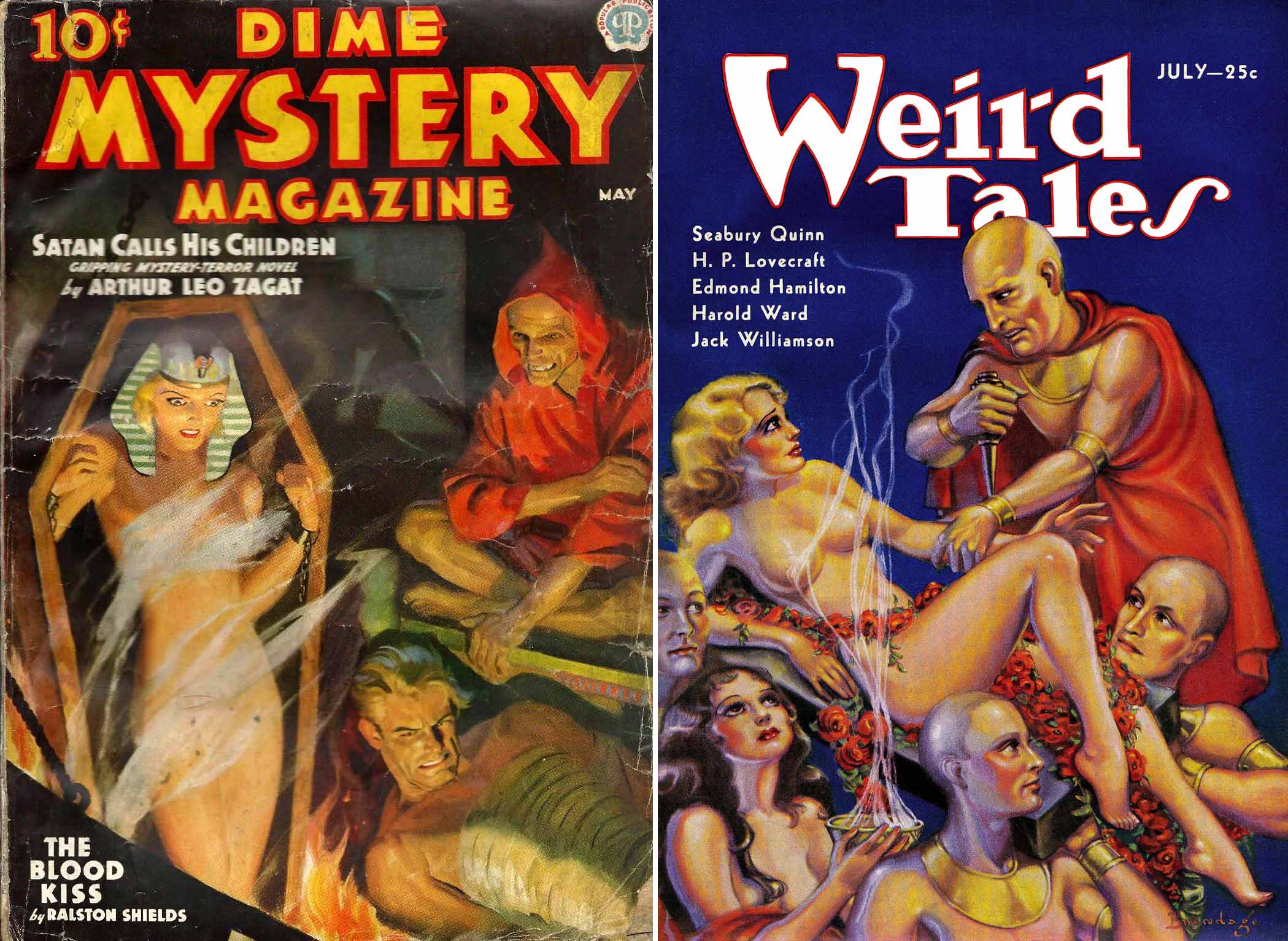
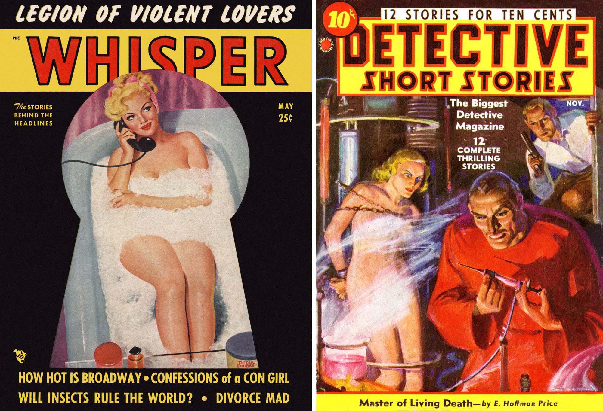
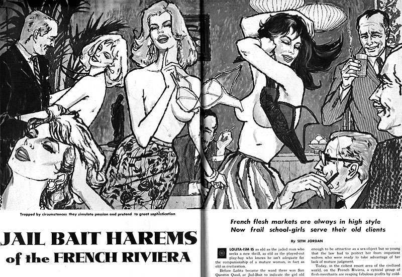
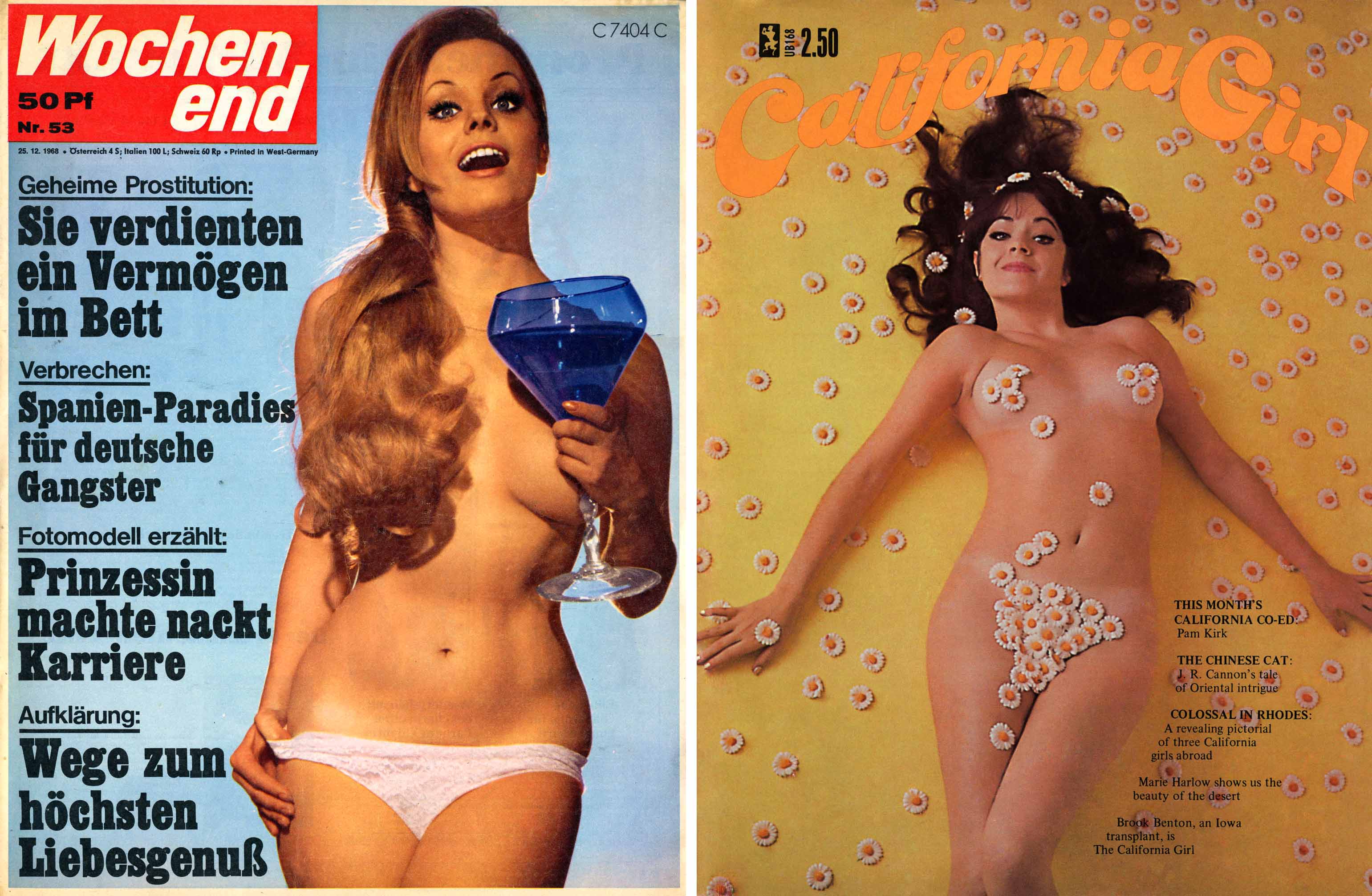
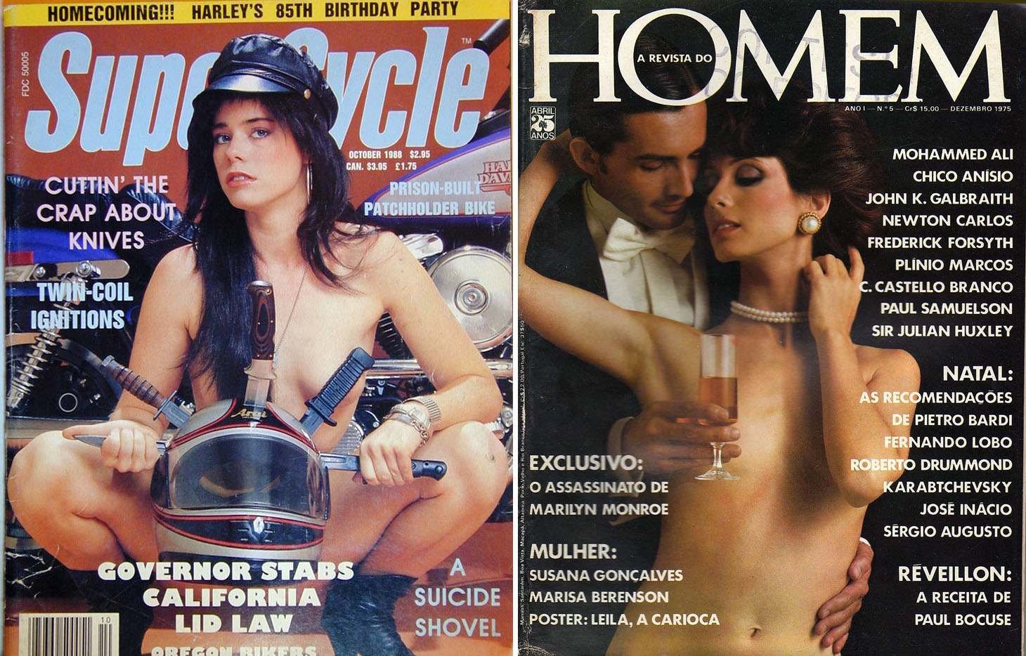
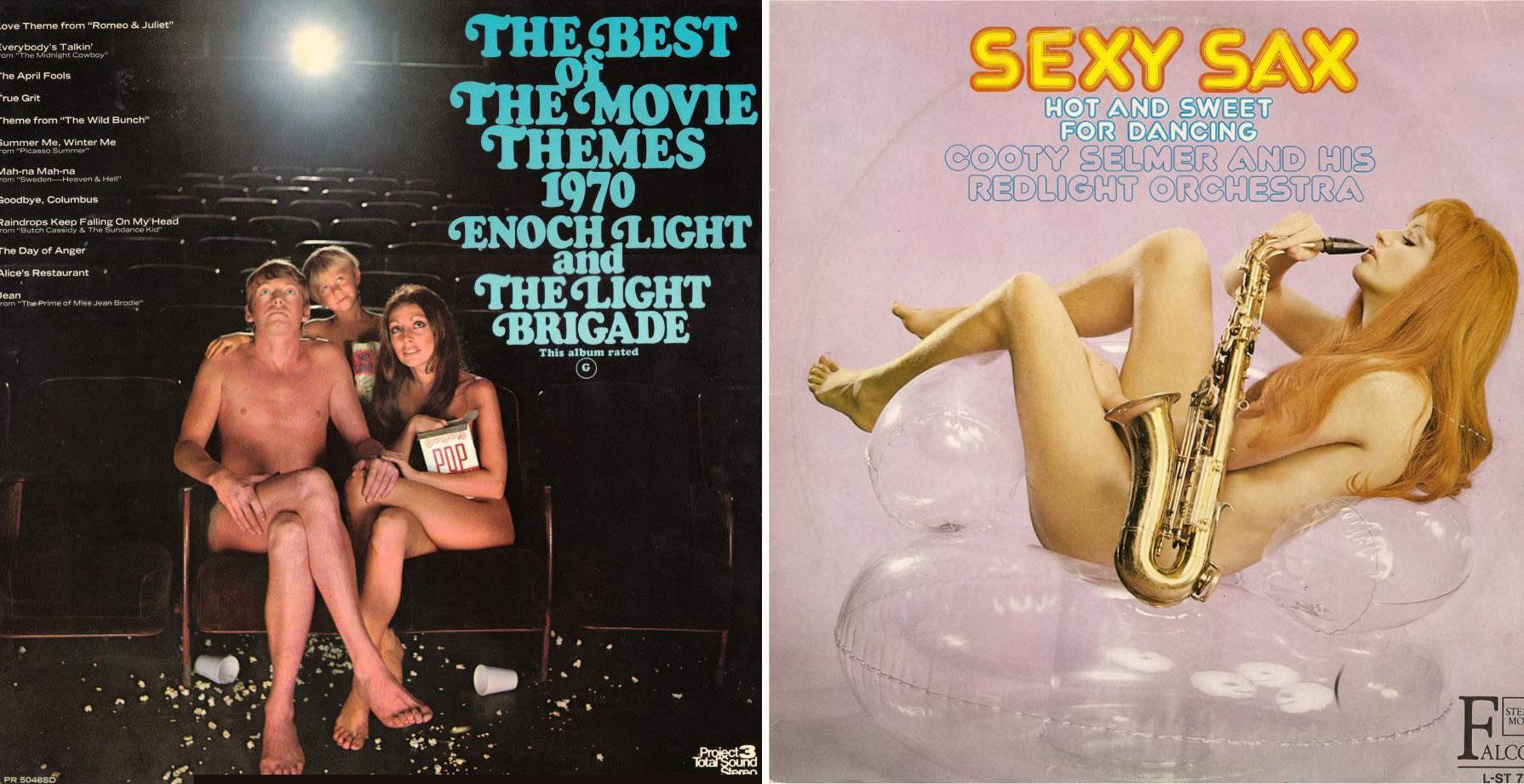
The examples of strategically covered nudity aren’t limited to film – paperback covers, album artwork, pulp magazines, comic books,… the list goes on and on. Indeed, the tradition of covering naughty bits goes back to the ceiling of the Sistine Chapel and beyond. There are probably cave paintings with boobs obscured by conveniently placed stalactites.
But perhaps the biggest perpetrators were the pulp magazines…
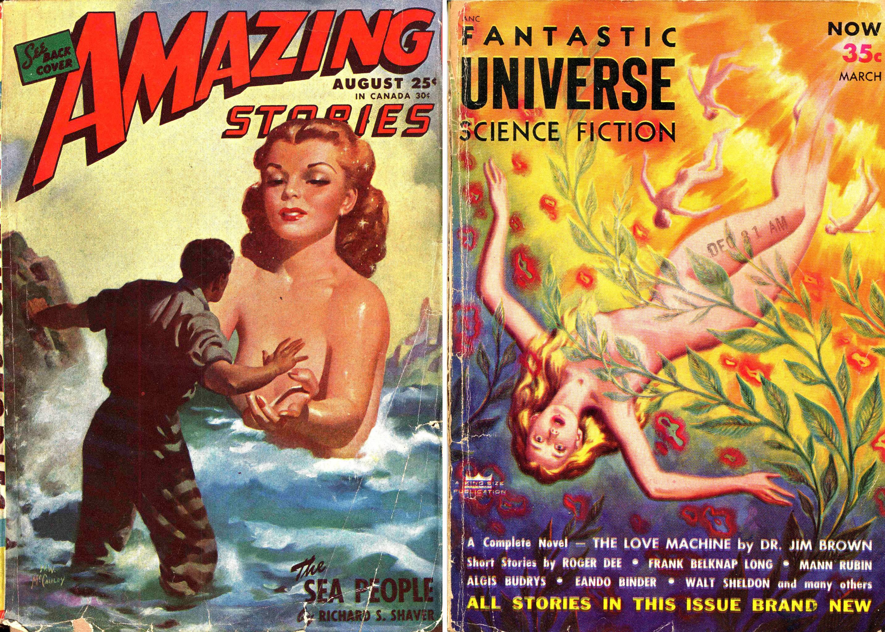
Isn’t it amazing how the wisps of smoke perfectly conceal areolas and pubic regions? Early pulp magazines could never be accused of being humdrum, pushing the envelope at every chance. Nudity was verboten…. but, add a bit of well-placed steam and all is good.
Let it also be said that there’s some value in keeping naughty lady parts obscured. It’s the time-honored Art of the Tease at work. If everything was in-your-face graphic all the time it’d get boring. Leaving at least something to the imagination is a powerful creative choice too.
Notice how clever these artists are. They come oh-so-very close to showing something they shouldn’t. One slight movement of a finger on the Amazing Stories cover or a tiny rustle of a semi-transparent kelp leaf, and we’ve got an exposed nipple on our hands.
The swaying braziers in this pulp illustration are so silly that it comes close being an Austin Powers or Benny Hill parody itself.
Of course, magazines of ill-repute utilized the concealment device thousands of times throughout the 1950s-60s, before they were allowed to bare all in the 70s.
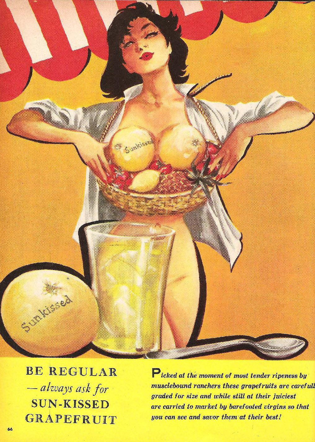
A conveniently placed knife and drinking glass is all you need. Mammary concealment is a success.
In terms of album covers, the ultimate example is without question Herb Alpert’s Whipped Cream and Other Delights. However, there’s been plenty of contenders…
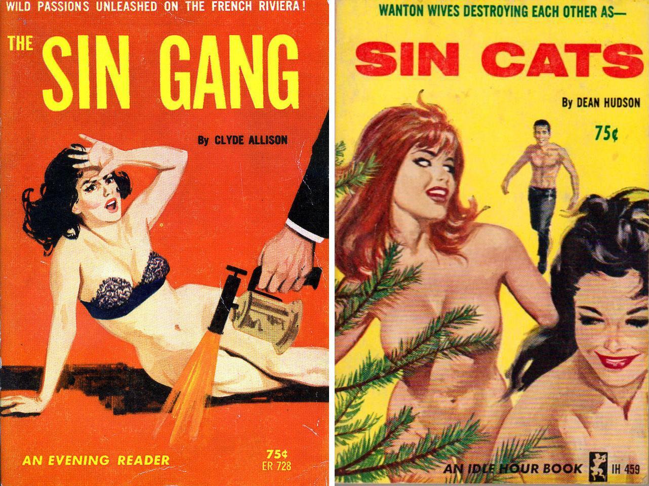
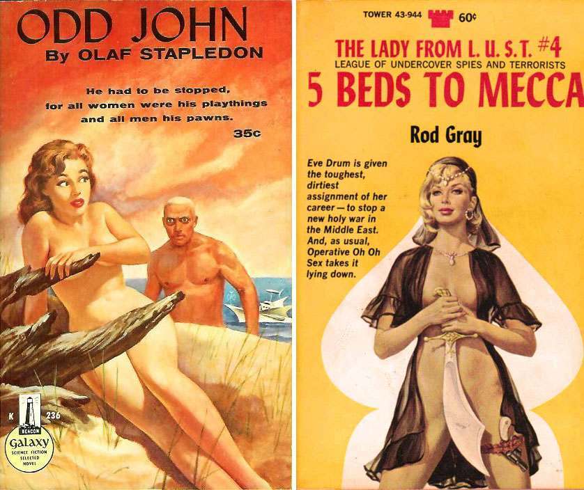
The history of vinyl is brimming with strategically placed saxophones and conveniently positioned bongos. Yet, my favorite medium for spotting egregious examples of prop censorship is vintage paperbacks…
(L) Of all the prop censors I’ve seen, this may be the only one utilizing a blow torch. (R) The evergreen branches are so well placed, it almost looks as though the spruce is groping her.
More unusual props that deserve “props” for creativity: (L) driftwood that magically aligns with the two censor zones and (R) a pubic concealing scimitar.
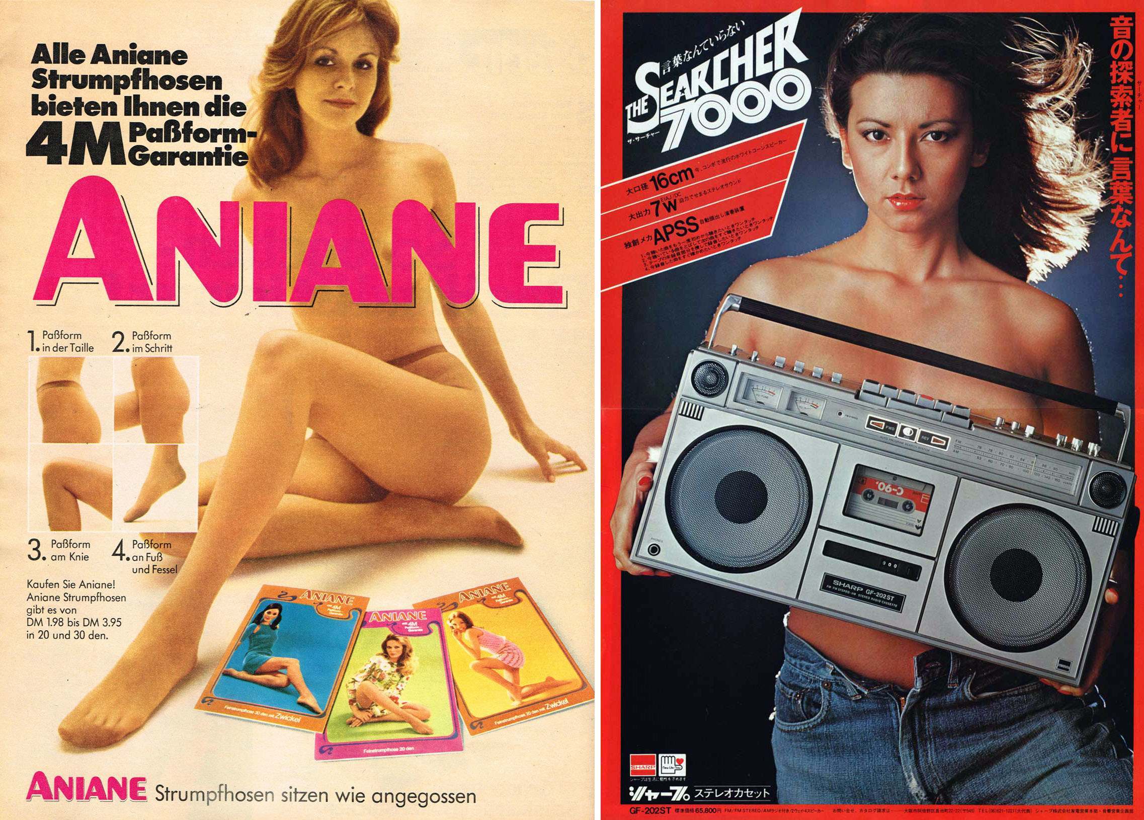
Advertising is another arena for prop censorship, the White Rock Fairy perhaps being the greatest example. As the two adverts above demonstrate, the device knew no geographic bounds. (Although, the Aniane text could’ve been a bit more precise in their text placement.)
Well, we could provide hundreds more examples, but I think we’ve more than demonstrated the frequency and variety of the prop censor. Cheers!
Would you like to support Flashbak?
Please consider making a donation to our site. We don't want to rely on ads to bring you the best of visual culture. You can also support us by signing up to our Mailing List. And you can also follow us on Facebook, Instagram and Twitter. For great art and culture delivered to your door, visit our shop.
