In 1810, German poet, philosopher, artist and scientist Johann Wolfgang von Goethe (August 28, 1749–March 22, 1832) published Zur Farbenlehre (Theory of Colors), his systematic study on optics, the psychology of colors and the emotions they stir. It’s complicated. The human eye functions to see colors both separately and in combination. And there are just three primary colors (red, yellow, blue). As one writer noted:
We are able to see mixtures of two-color rays as one color. We don’t need green light in order to see green, and we don’t need orange light to make us see orange. Mixtures of blue and yellow light and yellow and red light will create green and orange for us. To make the eyes see all color, then, only the three primaries — red, yellow, and blue — need be used. From these primaries, a complete color circle can be created. That is why it is possible to reproduce the brilliant colors of nature, faithfully, with just three primary colors in modern color reproducing processes.
And color itself is a degree of darkness, an idea that refutes Isaac Newton (25 December 1642 – 20 March 1726) and Light and Refraction (1704), the hymned scientist’s study of the interactions between sunlight and prisms. Newton considered colors in isolation as existing exclusively in light. He taught us that clear white light was composed of seven visible colors – a number rooted in his rather mystical views on the importance of the number seven – establishing the visible spectrum (the colors we see in a rainbow: ROYGBIV colors on a scale from the longest wavelength to the shortest (red, orange, yellow, green, blue, indigo, and violet)). (Factoid: the world’s oldest color is pink.) Goethe threw in elements Newton overlooked: human perception and subjectivity.
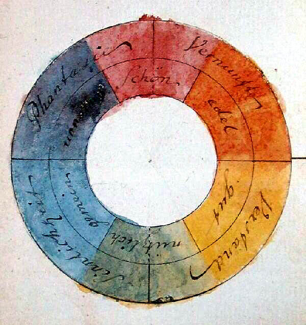
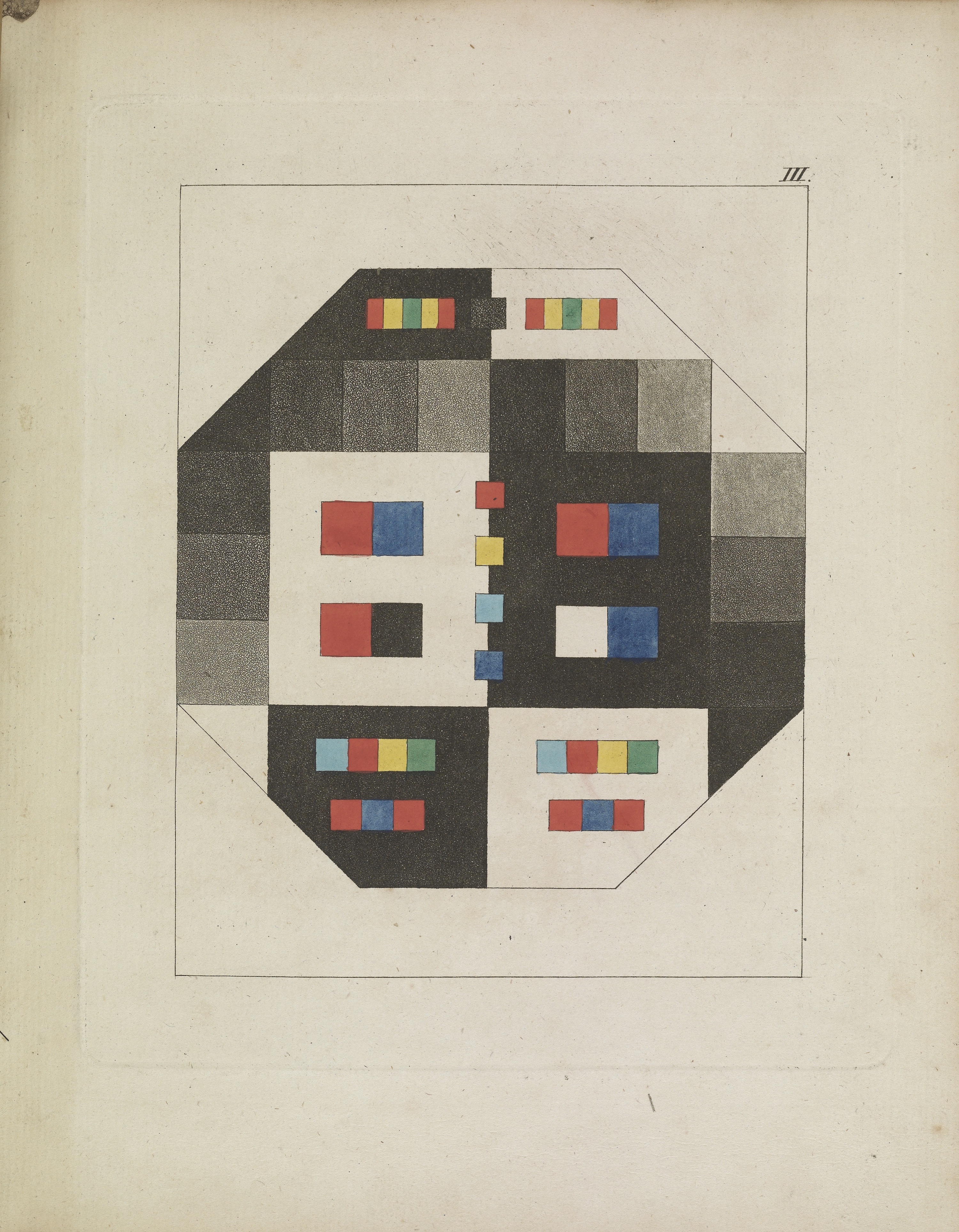
Goethe’s symmetric colour wheel with associated symbolic qualities, 1809
“Along with the rest of the world I was convinced that all the colors are contained in the light; no one had ever told me anything different, and I had never found the least cause to doubt it, because I had no further interest in the subject.
“But how I was astonished, as I looked at a white wall through the prism, that it stayed white! That only where it came upon some darkened area, it showed some color, then at last, around the window sill all the colors shone… It didn’t take long before I knew here was something significant about color to be brought forth, and I spoke as through an instinct out loud, that the Newtonian teachings were false.”
– Goethe, Theory of Colours
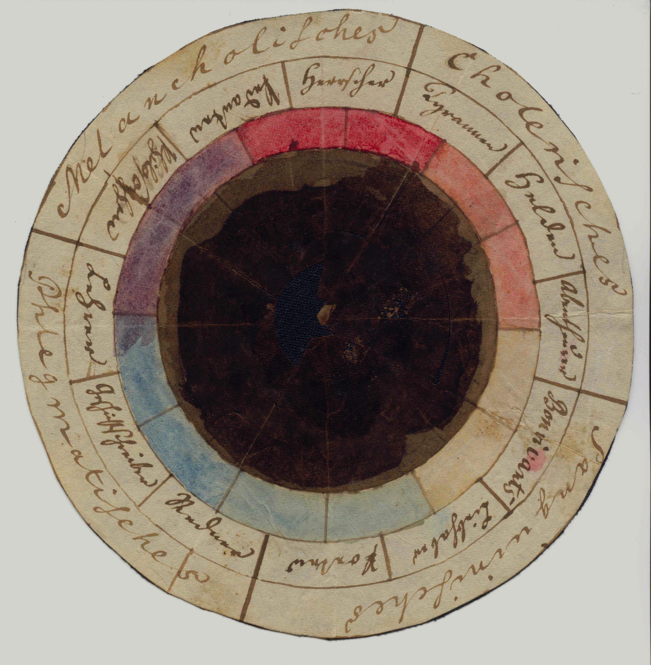
The “rose of temperaments” (Temperamentenrose), a study from 1798/9 by Goethe and Schiller, matching twelve colours to human occupations and character traits (tyrants, heroes, adventurers, hedonists, lovers, poets, public speakers, historians, teachers, philosophers, pedants, rulers), grouped in the four temperaments.
Goethe located more colors in the edges between light and darkness, his “light – darkness polarity”. Newton was measuring how light worked physically – he sought the tangible; his original color wheel included “musical notes correlated with color” – while Goethe was beginning to record how humans perceive colour. Color could be deployed as an emotional force.
And the more Goethe looked, the more he saw. You see the after-images, those coloured spots produced in the eye by staring directly at the sun? Goethe considered after-images proof that “the eye was not simply a passive receiver of light rays, as common logic of the time had it. There were subtle eccentricities to the sense of sight; the eye was even capable of generating its own internal lighting and colour effects.”
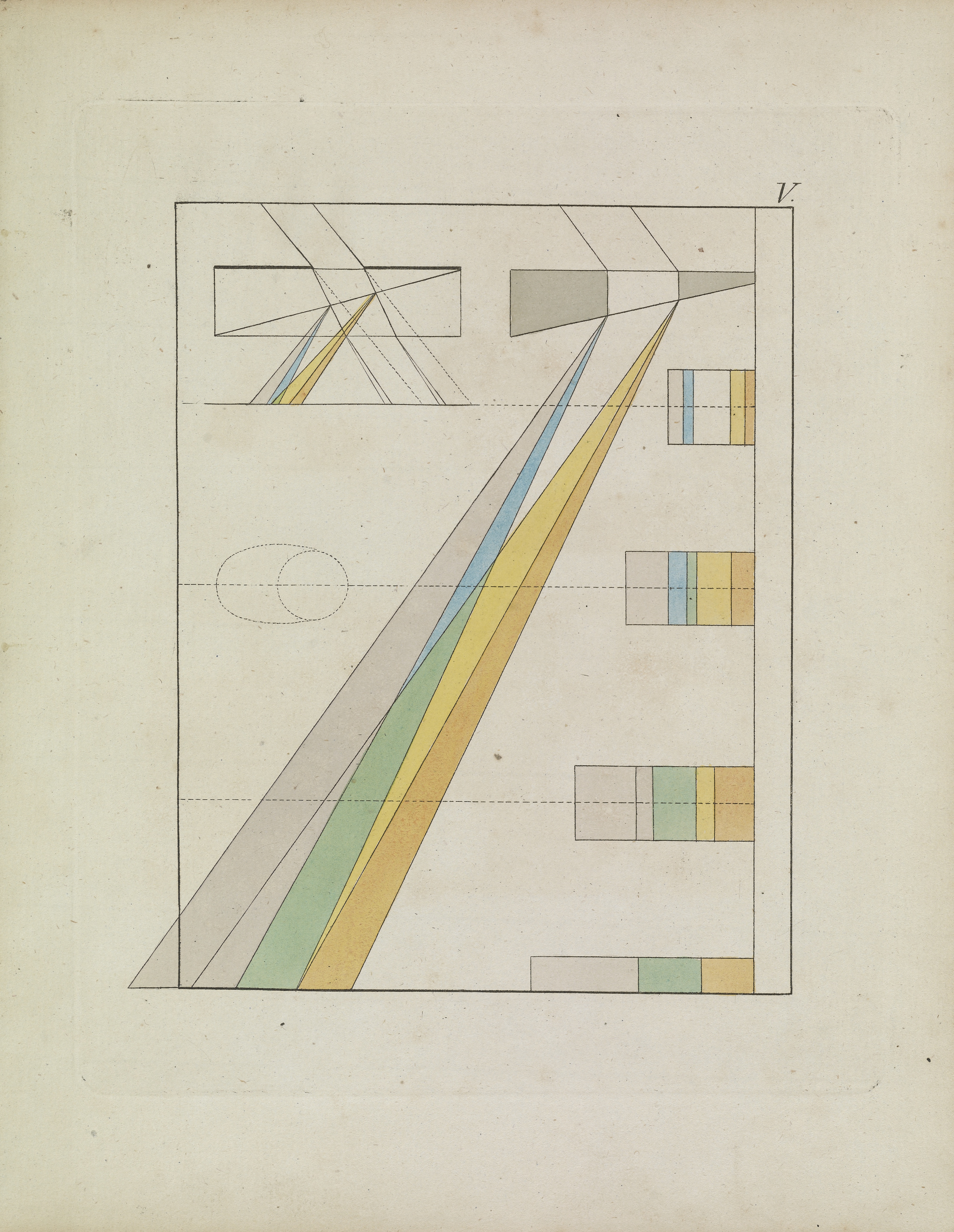
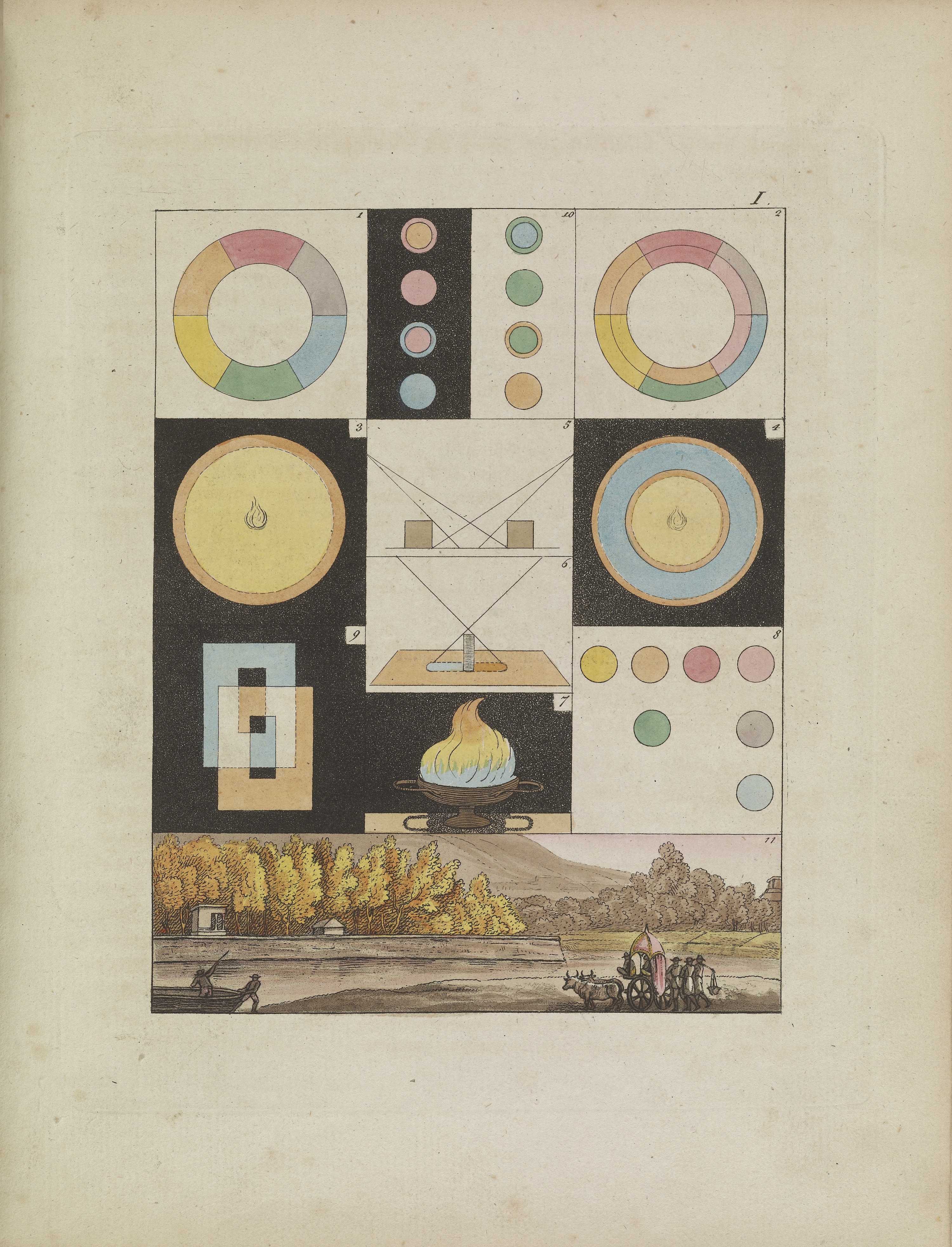
Goethe illustrated his thoughts. Some of his colorful and abstract diagrams and wheels are shown here.
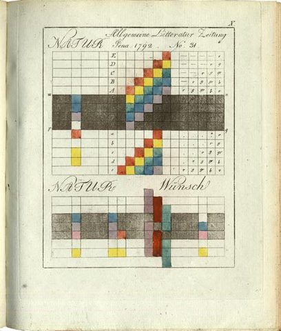
From Goethe, Theory of Colours 1810
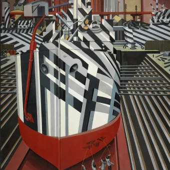
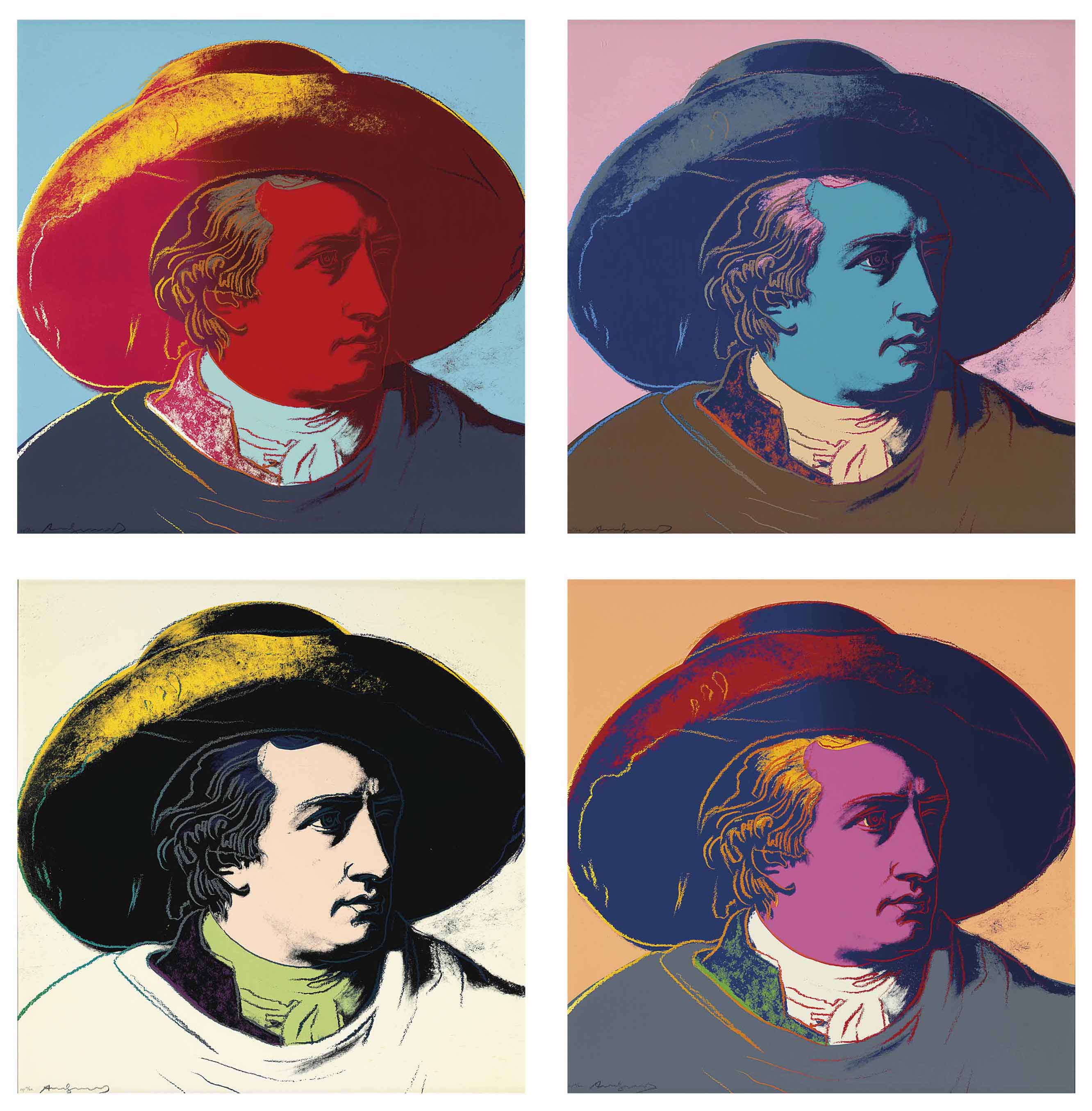
Goethe’s thinking influenced painters then and now. In the 1980s, Andy Warhol updated Johann Tischbein’s most famous painting, Goethe in the Roman Campagna (see lead image above), turning the subject into a pop icon; Joseph Turner’s painting Light and Colour (Goethe’s Theory) – the Morning after the Deluge – Moses Writing the Book of Genesis (1843) pays tribute to Goethe; and Wassily Kandinsky produced his own “schematic outline” of the psychological effects of the world’s oldest colors titled Concerning the Spiritual in Art (1911).
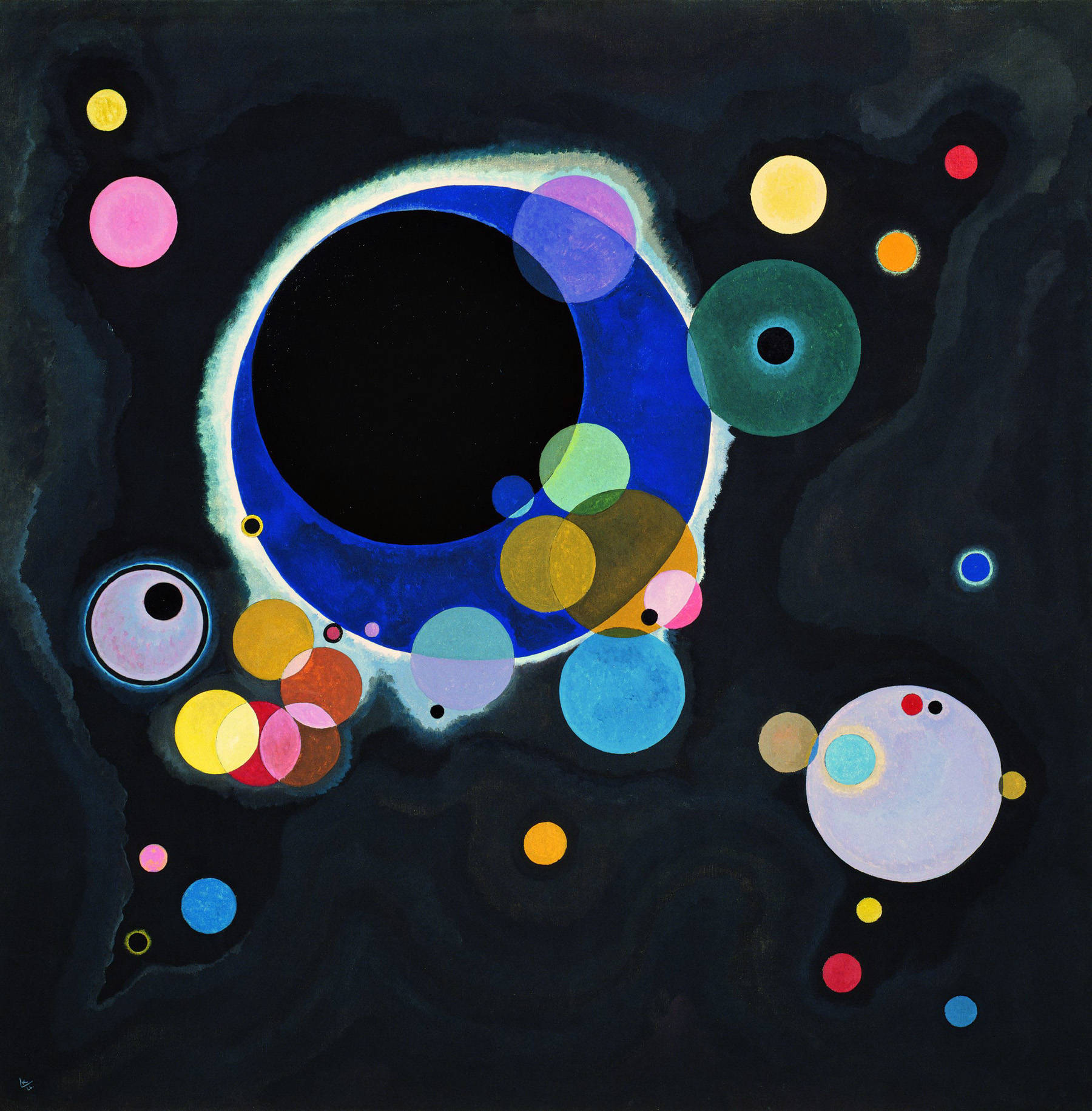
Several Circles, 1926 – Wassily Kandinski
“Whether the psychic effect of colour is a direct one, as these last few lines imply, or whether it is the outcome of association, is perhaps open to question. The soul being one with the body, the former may well experience a psychic shock, caused by association acting on the latter. For example, red may cause a sensation analogous to that caused by flame, because red is the colour of flame. A warm red will prove exciting, another shade of red will cause pain or disgust through association with running blood. In these cases colour awakens a corresponding physical sensation, which undoubtedly works upon the soul.”
– Wassily Kandinsky, Concerning the Spiritual in Art
Johann Wolfgang von Goethe Zur Farbenlehre Theory of Colors
“The highest degree of light, such as that of the sun… is for the most part colourless. This light, however, seen through a medium but very slightly thickened, appears to us yellow. The density of such a medium be increased, or if its volume become greater, we shall see the light gradually assume a yellow-red hue, which at last deepens to a ruby colour.”
– Goethe, Theory of Colours
Goethe, Theory of Colours 1810
“In travelling over the Harz in winter, I happened to descent from the Brocken towards evening: the wide slopes extending above and below me, the heath, every insulated tree and projecting rock, and all masses of both, were covered with snow or hoar frost. The sun was sinking towards the Oder ponds. During the day, owing to the yellowish hue of the snow, shadows tending to violet had already been observable: these might now be pronounced to be decidedly blue, as the illuminated parts exhibited a yellow deepening to orange.”
– Goethe, Theory of Colours
Johann Wolfgang von Goethe Zur Farbenlehre Theory of Colors
‘”I had entered an inn towards evening, and, as a well-favoured girl, with a brilliantly fair complexion, black hair, and a scarlet bodice, came into the room, I looked attentively at her as she stood before me at some distance in half shadow. As she presently afterwards turned away, I saw on the white wall, which was now before me, a black face surrounded with a bright light, while the dress of the perfectly distinct figure appeared of a beautiful sea-green.”
– Goethe, Theory of Colours
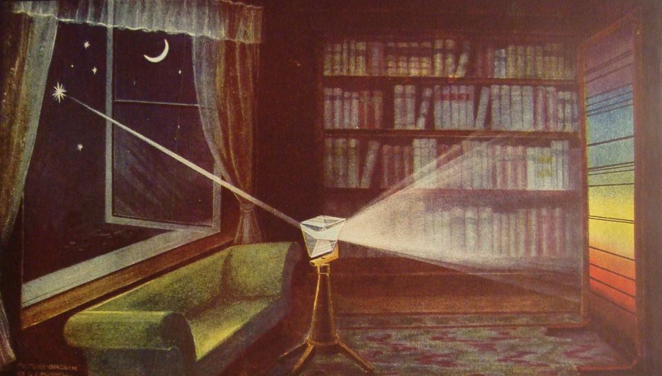
Starlight through a prism. Illustration by G.F. Morrell, 1922 (via Stephen Ellcock)
RED
Whoever is acquainted with the prismatic origin of red will not think it paradoxical if we assert that this color partly actu, partly potentia, includes all the other colors.
We have remarked a constant progress or augmentation in yellow and blue, and seen what impressions were produced by the various states; hence it may naturally be inferred that now, in the junction of the deepened extremes a feeling of satisfaction must succeed ; and thus, in physical phenomena, this highest of all appearances of color arises from the junction of two contrasted extremes which have gradually prepared themselves for a union.
As a pigment, on the other hand, it presents itself to us already formed, and is most perfect as a hue in cochineal ; a substance which, however, by chemical action may be made to tend to the plus or the minus side, and may be considered to have attained the central point in the best carmine.
The effect of this color is as peculiar as its nature. It conveys an impression of gravity and dignity, and at the same time of grace and attractiveness. The first in its dark deep state, the latter in its light attenuated tint; and thus the dignity of age and the amiableness of youth may adorn itself with degrees of the same hue.
History relates many instances of the jealousy of sovereigns with regard to the quality of red. Surrounding accompaniments of this color have always a grave and magnificent effect. The red glass exhibits a bright landscape in so dreadful a hue as to inspire sentiments of awe.
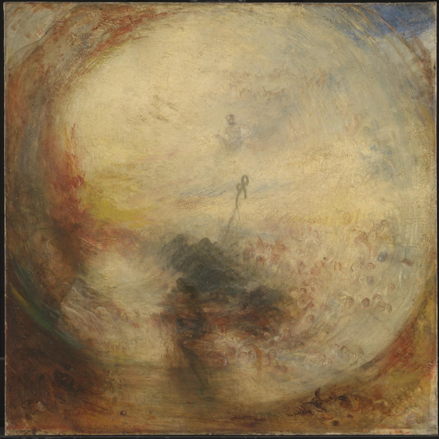
Light and Colour (Goethe’s Theory) – the Morning after the Deluge – Moses Writing the Book of Genesis exhibited 1843 Joseph Mallord William Turner 1775-1851
YELLOW
This is the color nearest the light. It appears on the slightest mitigation of light, whether by semi-transparent mediums or faint reflection from white surfaces. In prismatic experiments it extends itself alone and widely in the light space, and while the two poles remain separated from each other, before it mixes with blue to produce green it is to be seen in its utmost purity and beauty. How the chemical yellow develops itself in and upon the white, has been circumstantially described in its proper place.
In its highest purity it always carries with it the nature of brightness, and has a serene, gay, softly exciting character.
State is agreeable and gladdening, and in its utmost power is serene and noble, it is, on the other hand, extremely liable to contamination, and produces a very disagreeable effect if it is sullied, or in some degree tends to the minus side. Thus, the color of sulphur, which inclines to green, has a something unpleasant in it.
When a yellow color is communicated to dull and coarse surfaces, such as common cloth, felt, or the like, on which it does not appear with full energy, the disagreeable effect alluded to is apparent. By a slight and scarcely perceptible change, the beautiful impression of fire and gold is transformed into one not undeserving the epithet foul; and the color of honour and joy reversed to that of ignominy and aversion. To this impression the yellow hats of bankrupts and the yellow circles on the mantles of Jews, may have owed their origin.
RED-YELLOW
As no color can be considered as stationary, so we can very easily augment yellow into reddish by condensing or darkening it. The color increases in energy, and appears in red-yellow more powerful and splendid.
All that we have said of yellow is applicable here, in a higher degree. The red-yellow gives an impression of warmth and gladness, since it represents the hue of the intenser glow of fire.
YELLOW-RED
As pure yellow passes very easily to red-yellow, so the deepening of this last to yellow-red is not to be arrested. The agreeable, cheerful sensation which red-yellow excites increases to an intolerably powerful impression in bright yellow-red.
The active side is here in its highest energy, and it is not to be wondered at that impetuous, robust, uneducated men, should be especially pleased with this color. Among savage nations the inclination for it has been universally remarkedy and when children, left to themselves, begin to use tints, they never spare vermilion and minium.
In looking steadfastly at a perfectly yellow-red surface, the color seems actually to penetrate the organ. It produces an extreme excitement, and still acts thus when somewhat darkened. A yellow-red cloth disturbs and enrages animals. I have known men of education to whom its effect was intolerable if they chanced to see a person dressed in a scarlet cloak on a grey, cloudy day.
The colors on the minus side are blue, red-blue, and blue-red. They produce a restless, susceptible, anxious impression.
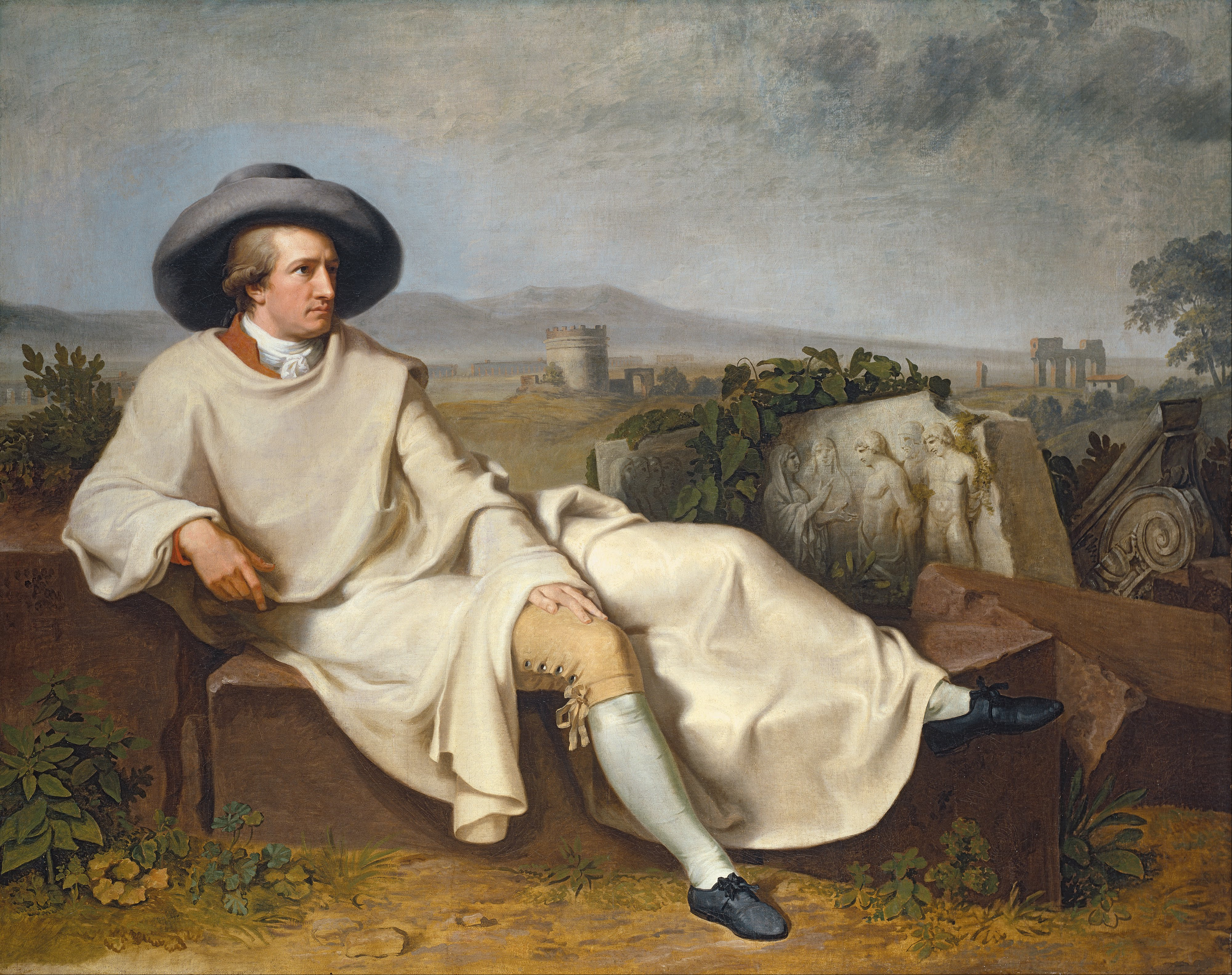
Tischbein’s most famous painting: Goethe in the Roman Campagna
BLUE
As yellow is always accompanied with light, so it may be said that blue still brings a principle of darkness with it.
This color has a peculiar and almost indescribable effect on the eye. As a hue it is powerful — but it is on the negative side, and in its highest purity is, as it were, a stimulating negation. Its appearance, then, is a kind of contradiction between excitement and repose.
As the upper sky and distant mountains appear blue, so a blue surface seems to retire from us.
But as we readily follow an agreeable object that flies from us, so we love to contemplate blue — not because it advances to us, but because it draws us after it.
Blue gives us an impression of cold, and thus, again, reminds us of shade. We have before spoken of its affinity with black.
Rooms which are hung with pure blue, appear in some degree larger, but at the same time empty and cold.
The appearance of objects seen through a blue glass is gloomy and melancholy.
When blue partakes in some degree of the plus side, the effect is not disagreeable. Sea-green is rather a pleasing color.
RED-BLUE
We found yellow very soon tending to the intense state, and we observe the same progression in blue.
Blue deepens very mildly into red, and thus acquires a somewhat active character, although it is on the passive side. Its exciting power is, however, of a different kind from that of the red-yellow. It may be said to disturb, rather than enliven.
As augmentation itself is not to be arrested, so we feel an inclination to follow the progress of the color, not, however, as in the case of the red-yellow, to see it still increase in the active sense, but to find a point to rest in.
In a very attenuated state, this color is known to us under the name of lilac; but even in this degree it has a something lively without gladness.
BLUE-RED
This unquiet feeling increases as the hue progresses, and it may be safely assumed, that a carpet of a perfectly pure deep blue-red would be intolerable. On this account, when it is used for dress, ribbons, or other ornaments, it is employed in a very attenuated and light state, and thus displays its character as above defined, in a peculiarly attractive manner.
As the higher dignitaries of the church have appropriated this unquiet color to themselves, we may venture to say that it unceasingly aspires to the cardinal’s red through the restless degrees of a still impatient progression.
GREEN
If yellow and blue, which we consider as the most fundamental and simple colors, are united as they first appear, in the first state of their action, the color which we call green is the result.
The eye experiences a distinctly grateful impression from this color. If the two elementary colors are mixed in perfect equality so that neither predominates, the eye and the mind repose on the result of this junction as upon a simple color. The beholder has neither the wish nor the power to imagine a state beyond it. Hence for rooms to live in constantly, the green color is most generally selected.
Via: Open Culture, The Tate, Bain Pickings.
Would you like to support Flashbak?
Please consider making a donation to our site. We don't want to rely on ads to bring you the best of visual culture. You can also support us by signing up to our Mailing List. And you can also follow us on Facebook, Instagram and Twitter. For great art and culture delivered to your door, visit our shop.