Wavelengths of light between 400 and 700 nanometers on the electromagnetic spectrum (EM) are known as visible light, or light that can be processed and seen by the human eye. It’s a little fraction of all the EM radiation around us. There are many other parts of the EM spectrum that we cannot see. The colours of light we can see are: red, orange, yellow, green, blue, indigo and violet.
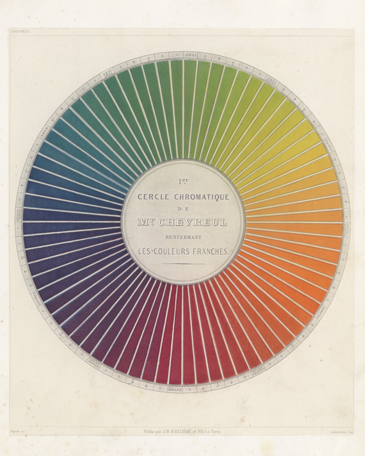
Des couleurs et de leurs applications Plate from aux arts industriels à l’aide des cercles chromatiques, 1864
Interaction of Colour
In the introduction tp his book Interaction of Color (1963), Josef Albers writes: “In visual perception a color is almost never seen as it really is – as it physically is. This fact makes color the most relative medium in art.” Colours are mutable. We do not all see the same.
Albers continues:
“In order to use color effectively it is necessary to recognize that color deceives continually. To this end, the beginning is not a study of color systems.
First, it should be learned that one and the same color evokes innumerable readings. Instead of mechanically applying or merely implying laws and rules of color harmony, distinct color effects are produced-through recognition of the interaction of color-by making, for instance, two very different colors look alike, or nearly alike.”
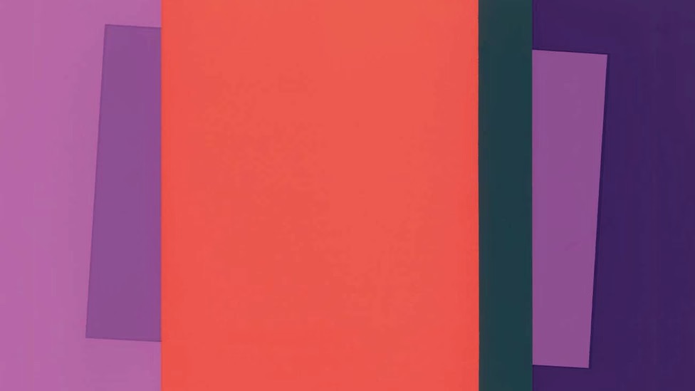
In the image above, Albers demonstrates the relativity of color and how hard it can be to pin a colour down. Incredibly, the inner violets are alike. But the one to the right appears to match the outer violet on the left, which is actually lighter.
And what of this image below? Read this and then take a look:
The ‘afterimage effect’ demonstrates the interaction of color caused by interdependence of color: On the left are yellow circles of equal diameter which touch each other and fill out a white square. There is a black dot in its center. On the right is an empty white square, also with a centered black dot. Each is on a black background. After staring for half a minute at the left square, shift the focus suddenly to the right square. Instead of the usual color-based afterimage that would complement the yellow circles with blue, their opposite, a shape-based afterimage is manifest as diamond shapes — the ‘leftover’ of the circles — are seen in yellow. This illusion double, reversed afterimage is sometimes called contrast reversal.
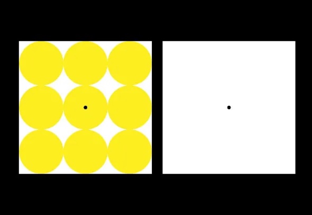
Organising Colour
Although we can’t see everything that exists, what we can see matters. And for centuries, scientists and artists have been working out how to visually organise colour to better understand it.
Isaac Newton was the first to arrange colors into a wheel; the illustration appeared first in his 1704 book Opticks: or, A Treatise of the Reflexions, Refractions, Inflexions, and Colours of Light.
In 1810, German poet, philosopher, artist and scientist Johann Wolfgang von Goethe (August 28, 1749–March 22, 1832) published his Zur Farbenlehre (Theory of Colors), a systematic study on optics, the psychology of colours and the emotions they stir. It’s complicated. The human eye functions to see colours both separately and in combination.
Andy Warhol played with colour when he updated Johann Tischbein’s most famous painting, Goethe in the Roman Campagna, turning the subject into a pop icon; Joseph Turner’s painting Light and Colour (Goethe’s Theory) – the Morning after the Deluge – Moses Writing the Book of Genesis (1843) pays tribute to Goethe; and Wassily Kandinsky produced his own “schematic outline” of the psychological effects of the world’s oldest colours titled Concerning the Spiritual in Art (1911).
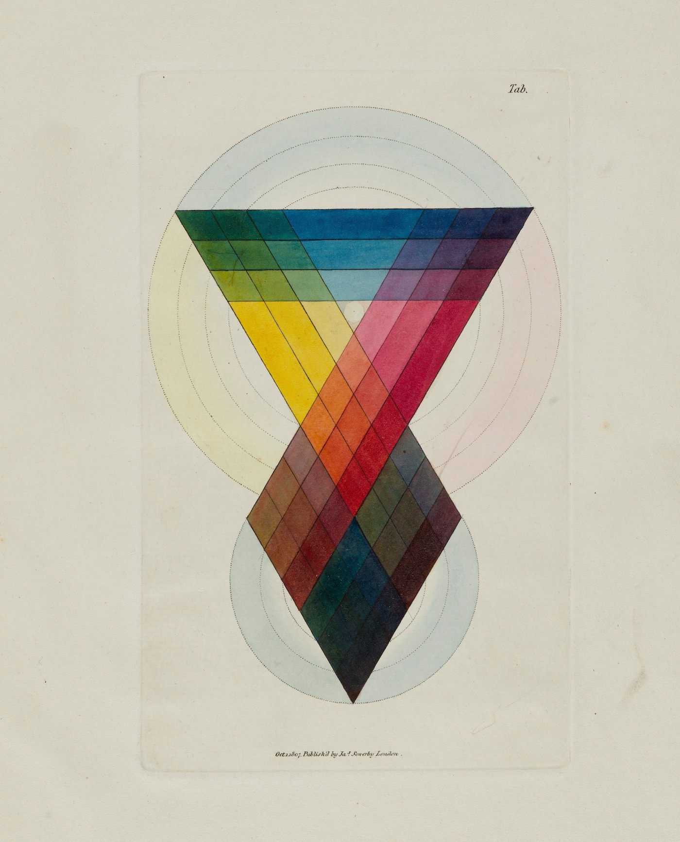
The Chromatic Scale , Table 5 , from A New Elucidation of Colour by James Sowerby, etching , watercolour and gum Arabic. London, 1809. Buy the print.
As Frida Kahlo says in The Diary of Frida Kahlo: An Intimate Self-Portrait: “Colours are not possessions; they are the intimate revelations of an energy field… They are light waves with mathematically precise lengths, and they are deep, resonant mysteries with boundless subjectivity.”
Man of these illustration are from the digital collection at the Science History Institute. From the organisations archive, we’ve found some ilustrations colorimetry and color theory – as well as the science and practice of applying color via dyeing or painting.
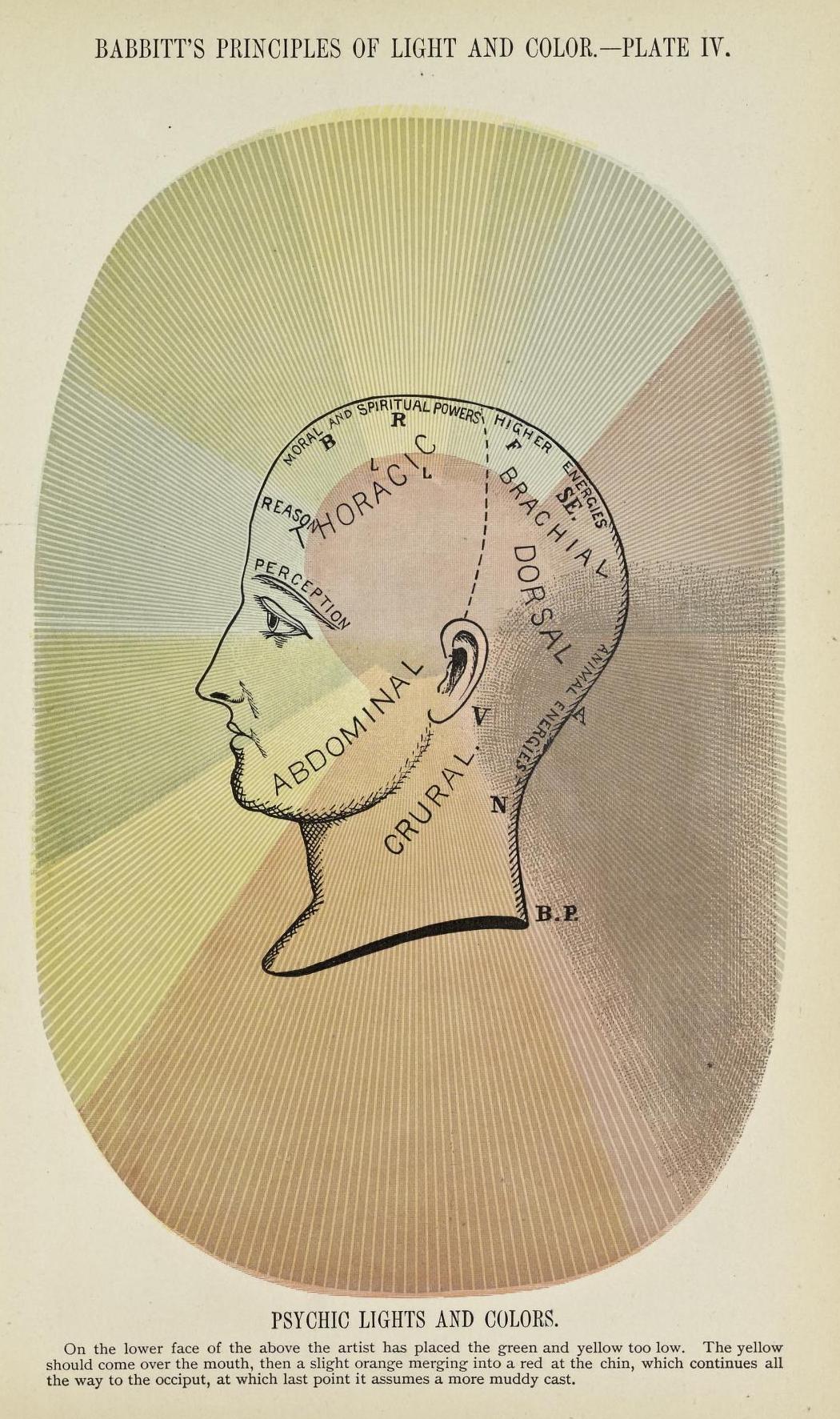
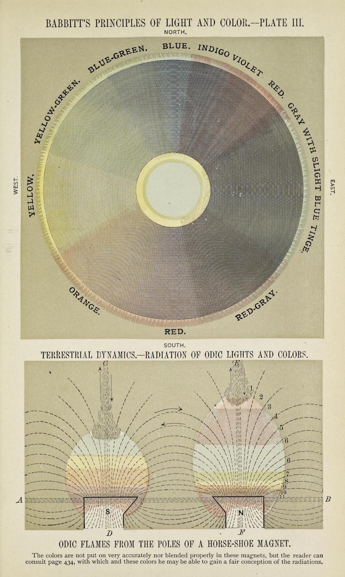
The Principles of Light and Color: including among other things the harmonic laws of the universe, the etherio-atomic philosophy of force, chromo chemistry, chromo therapeutics, and the general philosophy of the fine forces, together with numerous discoveries and practical applications (1878)
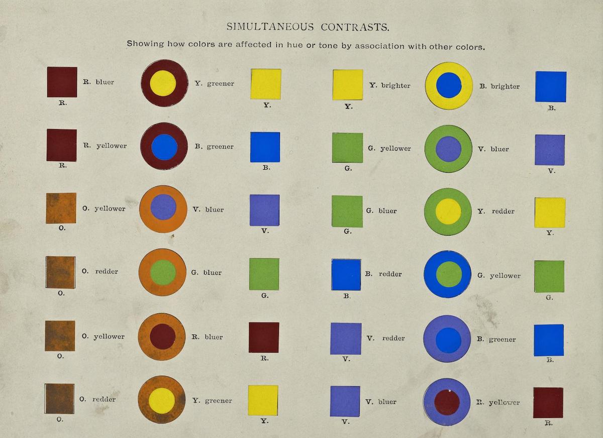
Chart showing “simultaneous contrasts” from A Class-Book of Color: including color definitions, color scaling, and the harmony of colors (1895) by Mark Maycock
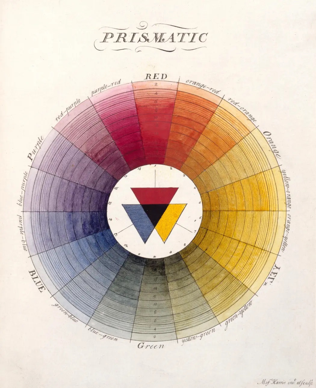
Moses Harris, Prismatic Colour Wheel, ‘The Natural System of Colours’ (1766).
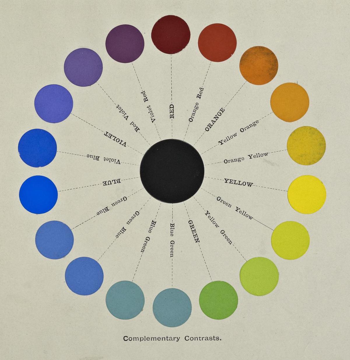
A Class-Book of Color: including color definitions, color scaling, and the harmony of colors (1895)
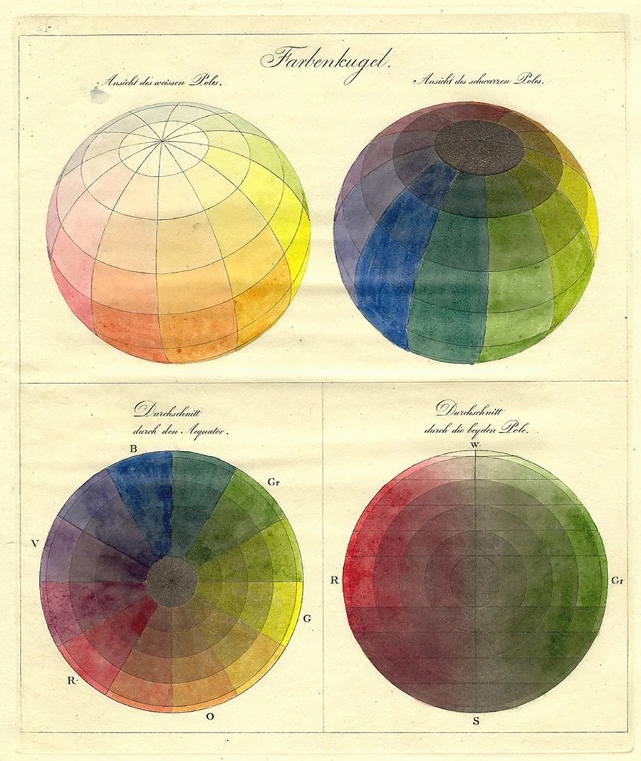
Page from Priced catalogue of artists’ materials : supplies for oil painting, water color painting, china painting … and drawing materials for architects and engineers, manual training schools and colleges (1914)
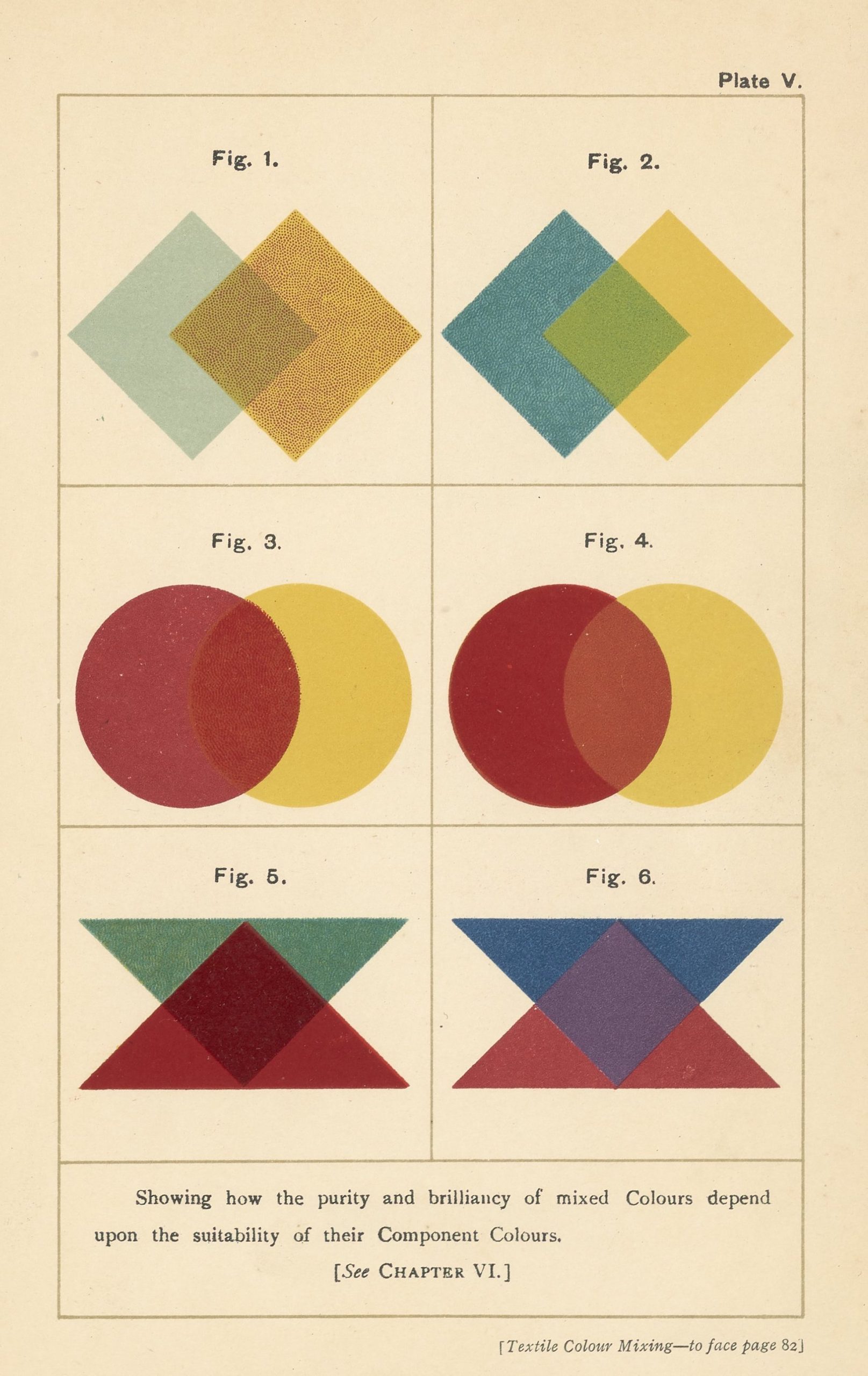
Textile Colour Mixing; A Manual Intended for the Use of Dyers, Calico Printers, and Colour Chemists, 1915

Richard Waller’s “Tabula Colorum Physiologica”, from “A Catalogue of Simple and Mixt Colours with a Specimen of Each Colour Prefixt Its Properties,” in Philosophical Transactions of the Royal Society of London, vol. 6 for the years 1686 and 1687 (1688)
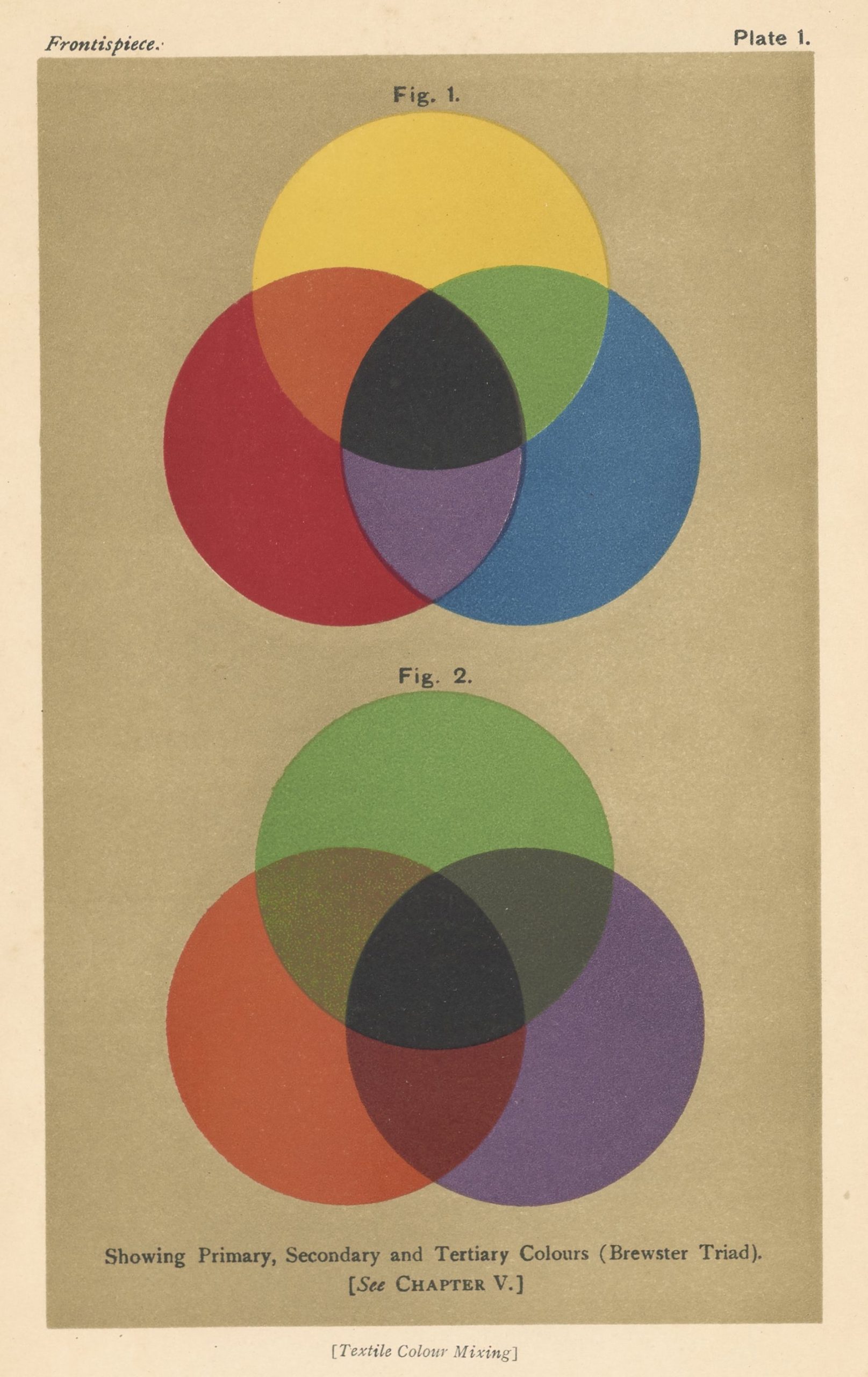
Textile Colour Mixing; A Manual Intended for the Use of Dyers, Calico Printers, and Colour Chemists
1915
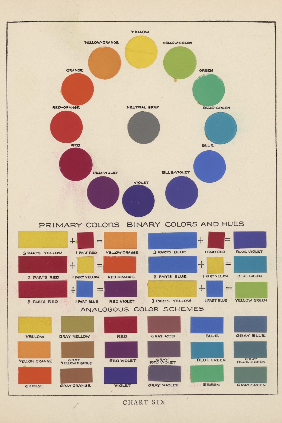
The Theory and Practice of Color, 1918 Snow, Bonnie E., and Hugo B. Froehlich. The Theory and Practice of Color. New York, New York: L. Prang & Co.

The Comico color chart, 1980s
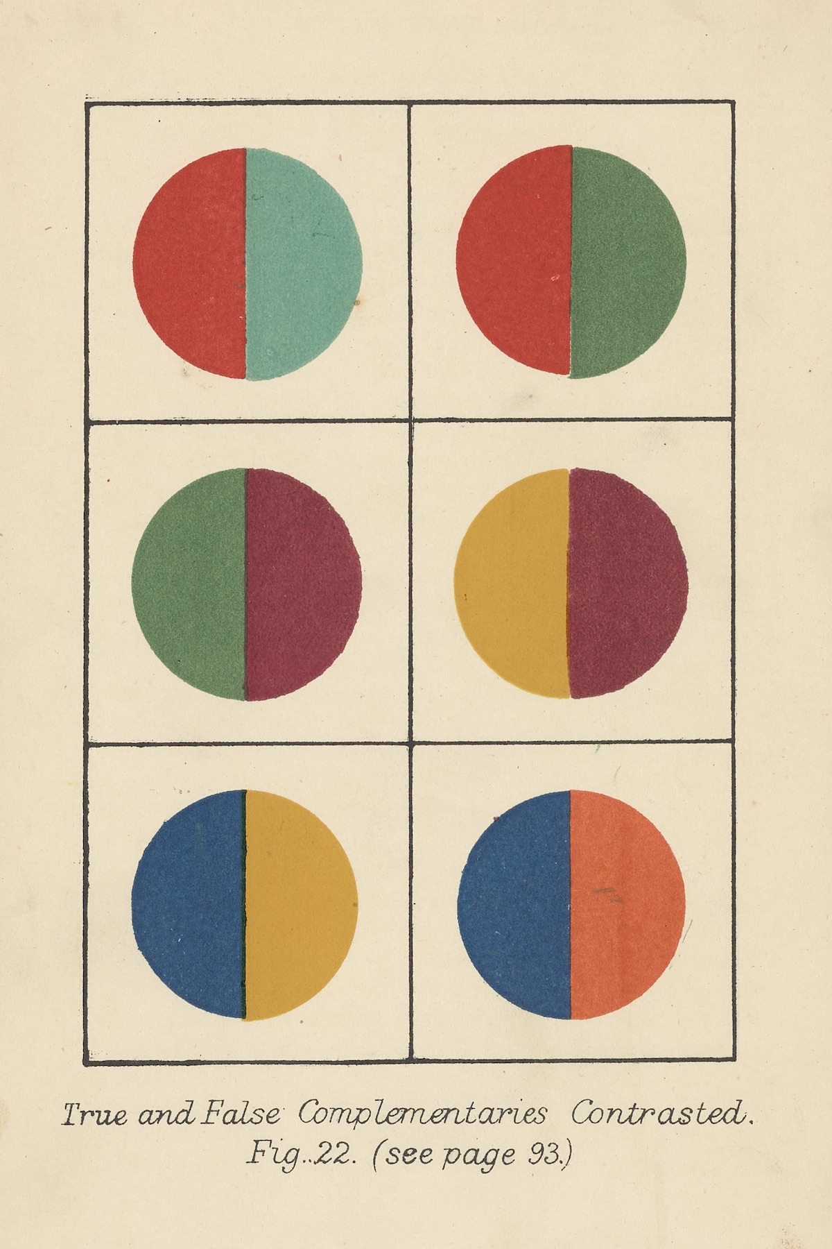
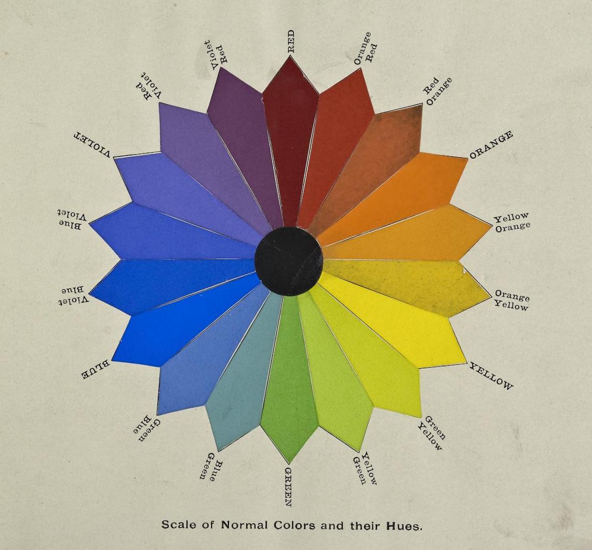
Colour, An Elementary Manual for Students
1911
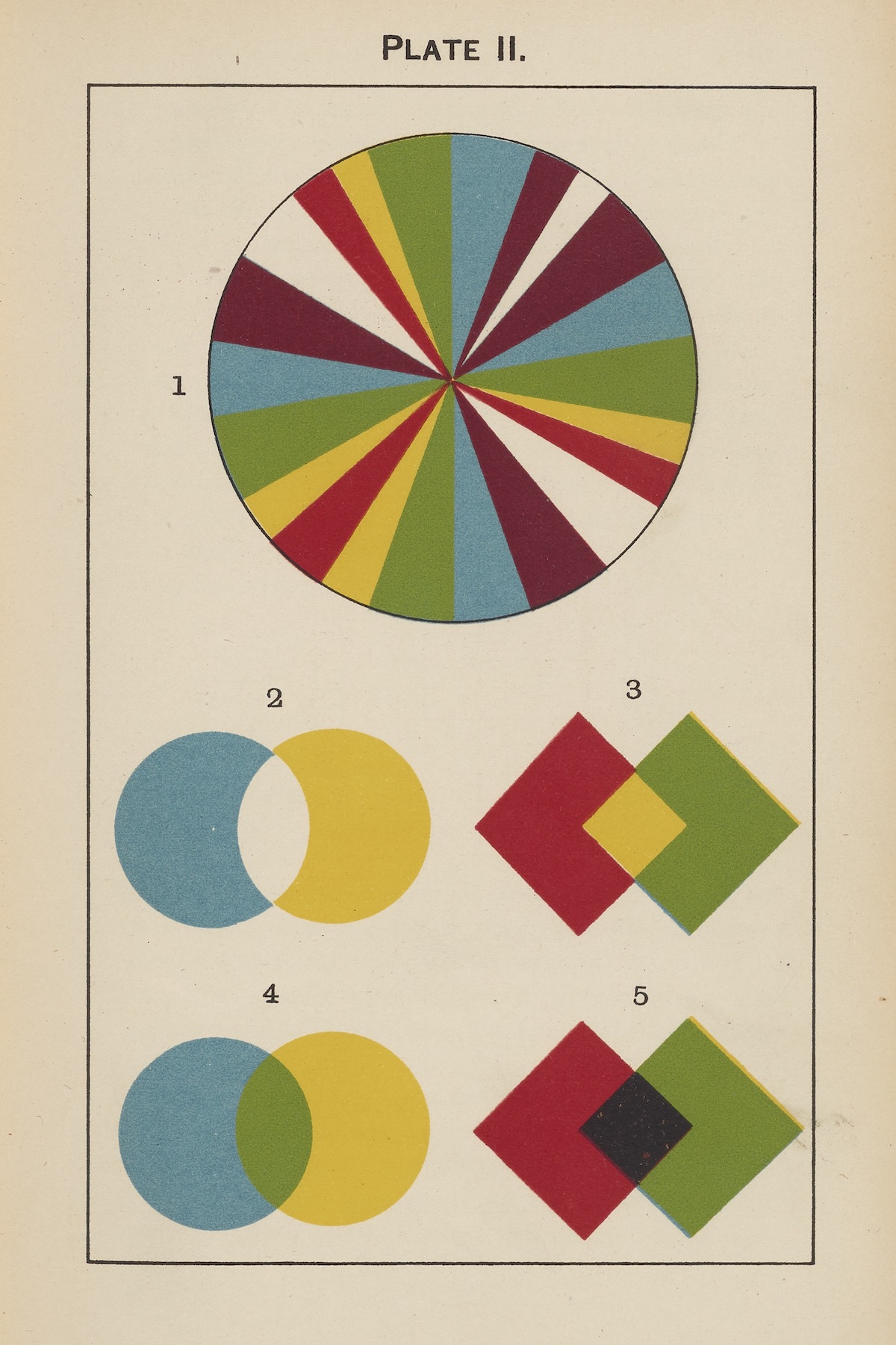
Colour : A Handbook of the Theory of Colour
1900
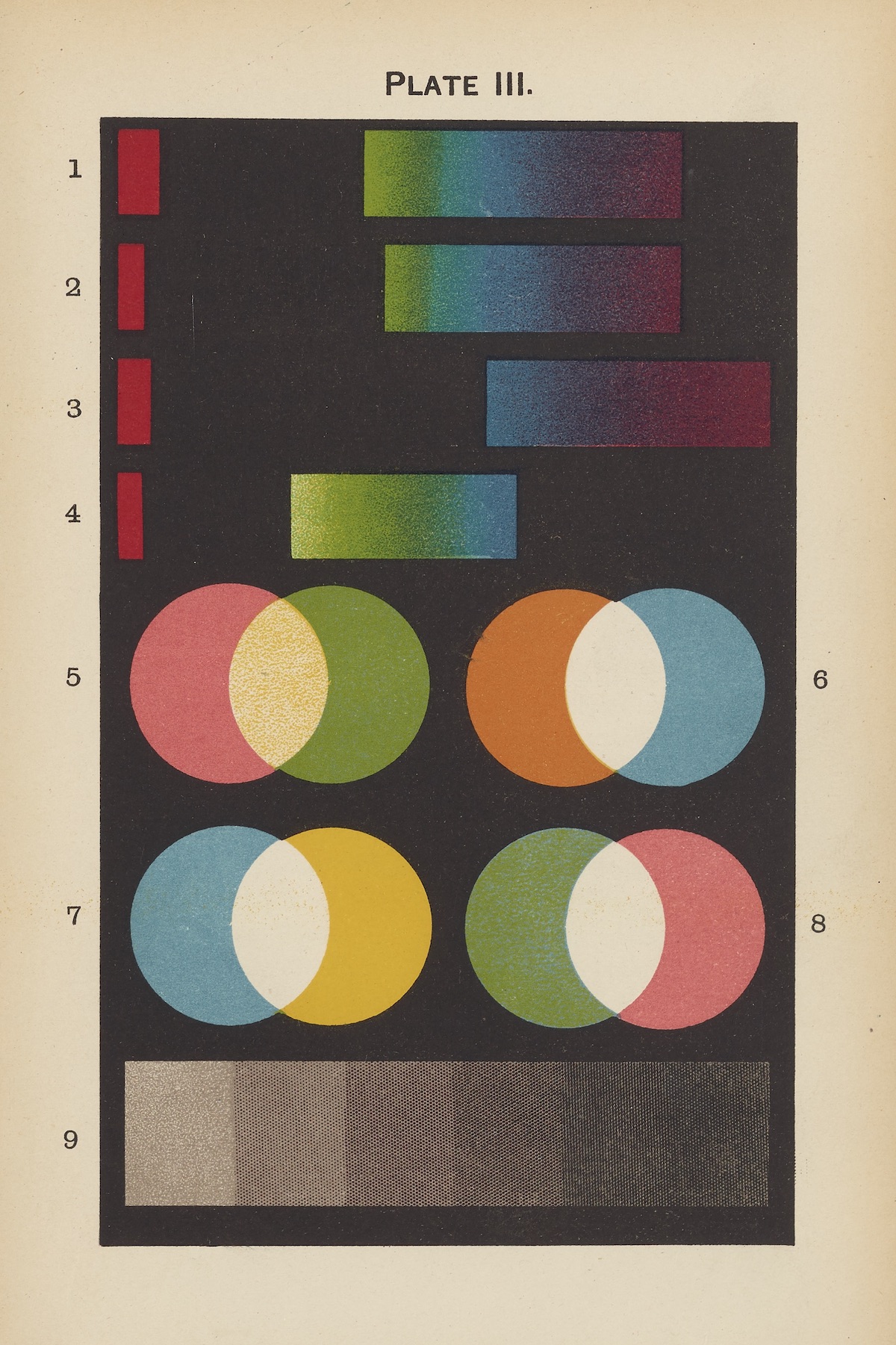
Colour : A Handbook of the Theory of Colour, 1900
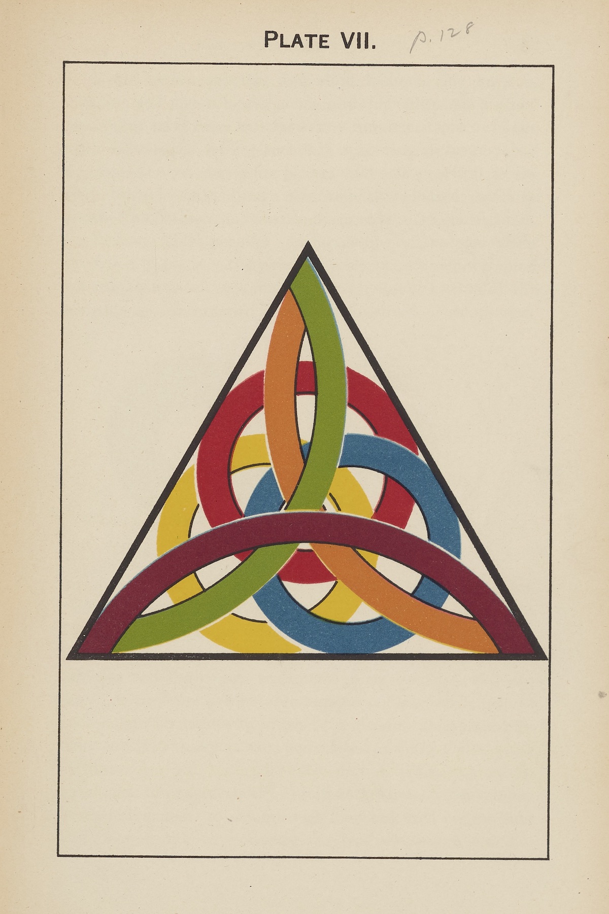
Colour : A Handbook of the Theory of Colour, 1900
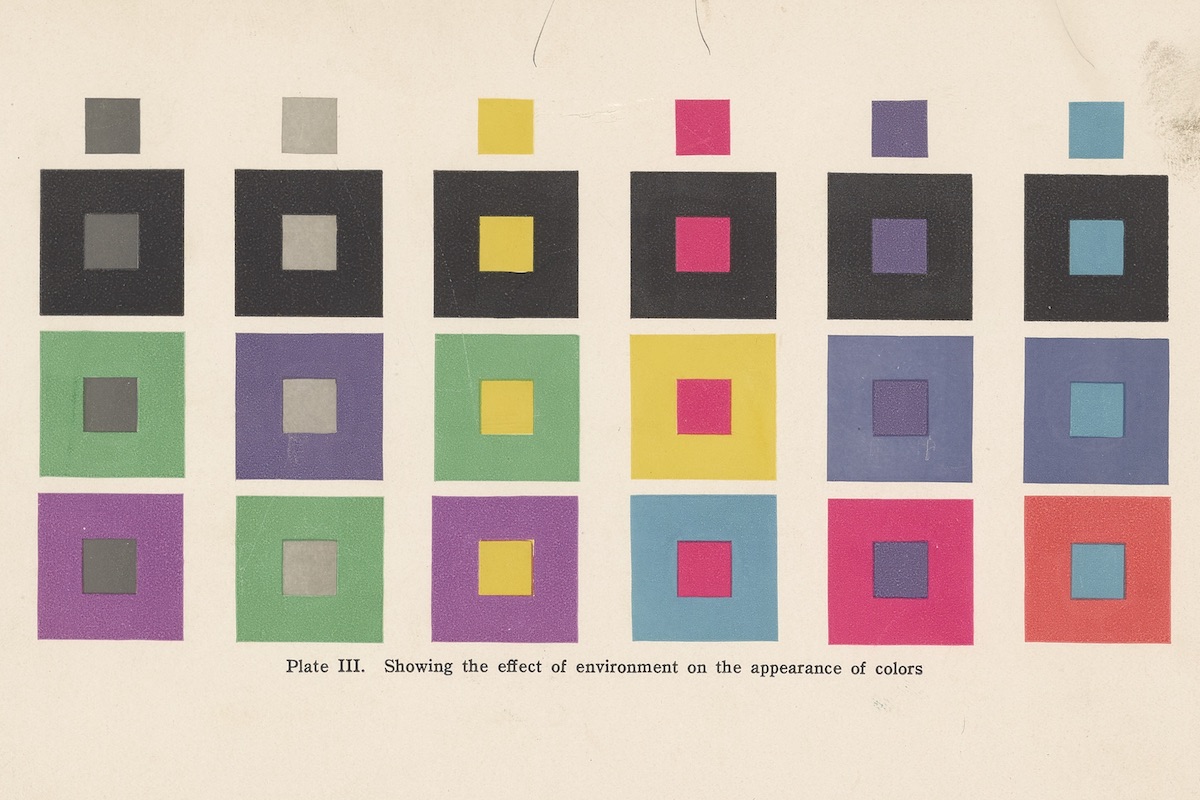
Color and its Applications, 1915
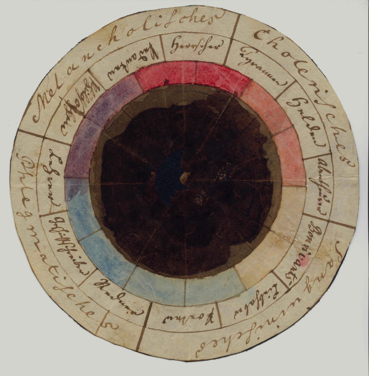
The “rose of temperaments” (Temperamentenrose), a study from 1798/9 by Goethe and Schiller, matching twelve colours to human occupations and character traits (tyrants, heroes, adventurers, hedonists, lovers, poets, public speakers, historians, teachers, philosophers, pedants, rulers), grouped in the four temperaments.
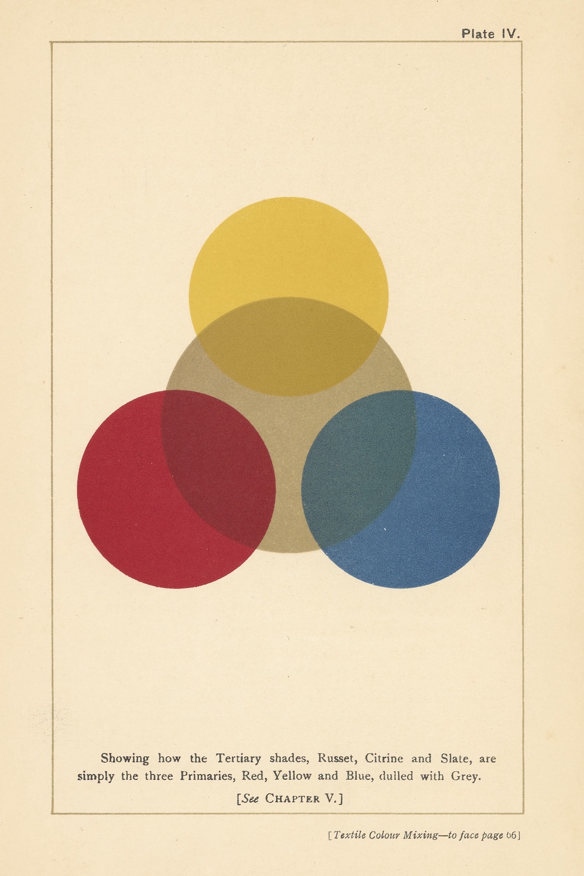
Textile Colour Mixing; A Manual Intended for the Use of Dyers, Calico Printers, and Colour Chemists, 1915
Lead Image from Michel Eugène Chevreul’s Des couleurs which presents the French chemist’s colour classification system distinguishing 14,400 hues and tones. The book’s plates, illustrating various tonal scales and colour wheels, were produced in collaboration with René Henri Digeon by means of “chromochalcography,” an intaglio colour printing technique using multiple steel plates.
Would you like to support Flashbak?
Please consider making a donation to our site. We don't want to rely on ads to bring you the best of visual culture. You can also support us by signing up to our Mailing List. And you can also follow us on Facebook, Instagram and Twitter. For great art and culture delivered to your door, visit our shop.

