“While historical texts have long been subject to critical analysis, the formal and historical problems posed by graphic representations of time have largely been ignored. This is no small matter; graphic representation is among our most important tools for organizing information.
“Yet, little has been written about historical charts and diagrams. And, for all of the excellent work that has been recently published on the history and theory of cartography, we have few examples of what Eviatar Zerubavel has called ‘time maps’. This book is an attempt to address that gap.”
– From the Introduction to: Cartographies of Time – A History of the Timeline, 2010, by Daniel Rosenberg and Anthony Grafton, published by Princeton Architectural Press
Beginning in the second half of the 17th century, some chronologers concentrated their efforts on simply producing educational material rather than trying to chase down perennially elusive dates such as the great flood and the founding of Rome, writes Paul Pecay. Historical dates that school children were expected to master were compiled into evocative graphic chronologies by way of memory aids.
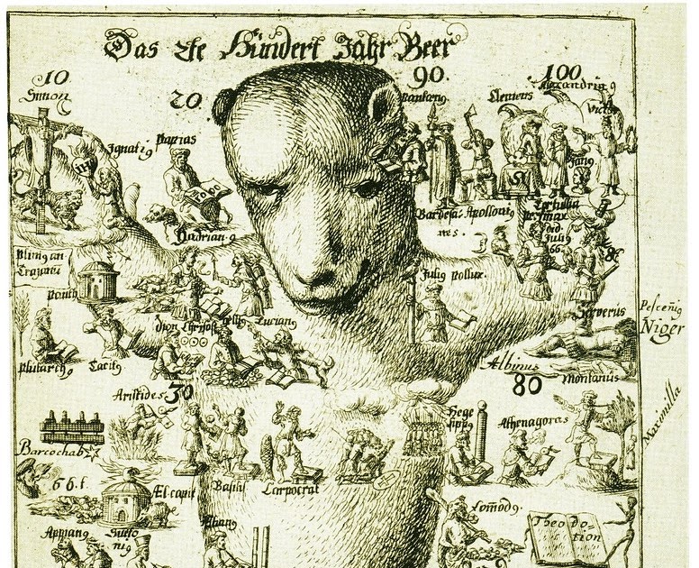
Prints featuring novel allegorical figures appear in Johannes Bruno’s 1672 ‘Universal History’. They represent the seventeen centuries of the common era (AD), and the four millennia stretching from creation to the birth of Christ. The bear above corresponds to the 1st century AD, and other era/epoch prints were based on a camel (signifying the Exodus), oil bottle, eagle and dragon, for example.
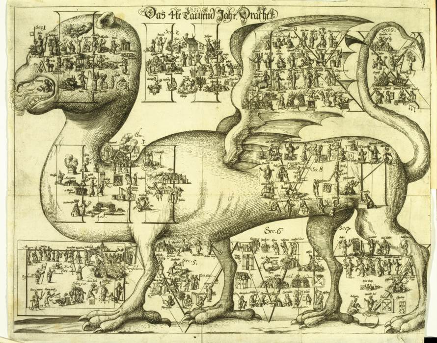
The print field includes small drawings of important people from history performing tasks that hint at why they were famous. Sometimes these drawings are accompanied by a rebus or riddle, along with the date in a logical chronological progression. In this way, the student was given a range of historical data in an attractive format intended to promote retention and recall. But, as some contemporary critics noted, with the important facts actually bound up in secondary, superfluous elaborations, the amount of useful information remembered was debatable.
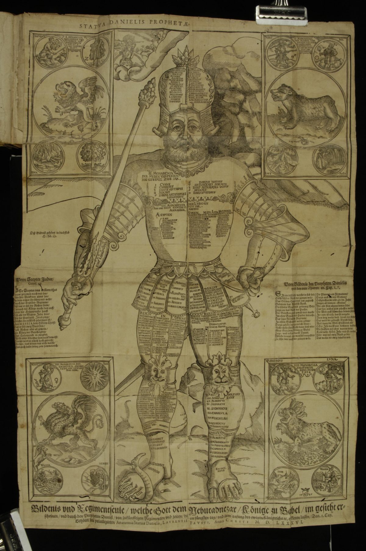
The unknown artist who illustrated Lorenz Faust’s 1585 ‘Anatomia Statuae Danielis’ did a brilliant job of locating the rulers of the four great world monarchies on appropriate parts of the statue’s armour. By doing so, the artist gave vivid expression to Daniel’s prophecy and provided students with a splendid memory aid. His accompanying text identified all the rulers listed in the image and explained exactly why their names were placed where they were.
[The Old Testament figure of Daniel revealed that four empires would rule the world by turns. He wrote that a statue of an enormous human appeared in a vision to the Babylonian king, Nebuchadnezzar, which serves here as an ingenious graphical device for recording a biblical world chronology. As an example of the layers of detail and symbolism presented, the Persian Darius was assigned to the lungs because the Jews could ‘breathe easy’ during his reign.]

Small detail from a monumental multi-woodblock print


Albrecht Dürer, The Triumphal Arch of Maximilian, 1515 (1799 edition) – 42 woodcuts and 2 etchings on laid paper assembled to form one image, overall size: 354 x 298.5 cm (139 3/8 x 117 1/2 in.), Gift of David P. Tunick and Elizabeth S. Tunick, in honor of the appointment of Andrew Robison as Andrew W. Mellon Senior Curator, 1991.200.
The wall-sized triumphal arch by Albrecht Dürer was produced in 1516 for the Hapsburg Emperor Maximilian I. He used arresting printed materials like this to establish the genealogy of his house and the authority of his imperial throne, both of which were actually newer and shakier than he was willing to admit.
Maximilian’s courtiers were charged with researching the Hapsburg ancestry and they were able to demonstrate a lineage that included the Trojan warrior Hector, the Egyptian God Osiris and even Noah himself. The triumphal arch (which was never intended as an actual building design) verified for anyone who viewed it that Maximilian I was not only a great man, but the culmination of all world history.
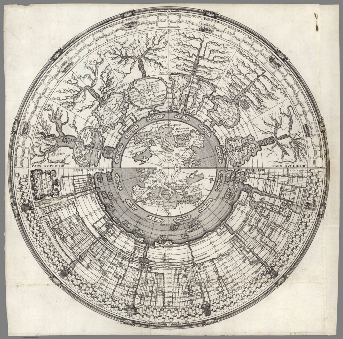
‘Spiegazione della Carta Istorica dell’Italia’
(Historical map of Italy) by Girolamo Andrea Martignoni – via David Rumsey
In several finely engraved charts published in 1721, Martignoni made a striking visual analogy between geographic space and historical time. Though he calls them maps, Martignoni’s works are not historical maps in the conventional sense of geographical snapshots from different moments in history: they are chronological charts presented in cartographic form.
While at first glance, the map seems to depict a circular territory with a great lake in the centre and rivers running outwards, a closer inspection reveals that the landforms and rivers aren’t actually geographical features as we usually know them; rather, they’re temporal metaphors: territories of history and rivers of time.
The streams at the top of the chart represent the nations conquered by the Roman Empire; those at the bottom, the nations that emerged from it; and the great central lake as the Empire itself. Martignoni’s influential work offered one of the first systematic visualisations of the ‘stream-of-time’ metaphor.
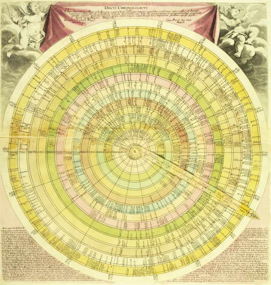
The aptly named ‘Discus Chronologicus’, published in the early 1720s by the German engraver Christoph Weigel, is a volvelle*: a paper chart with a pivoting central arm. The basic organisation of data is inherited from Eusebius (4th cent. scholar who established sophisticated table structures to present and reconcile historical chronologies), but here the layout is circular with rings representing kingdoms and radial wedges representing centuries. The names of the kingdoms are printed on the moveable arm. Although graphically attractive, Weigel’s volvelle left little room for any handwritten additions of new information, in contrast to a tabular format.
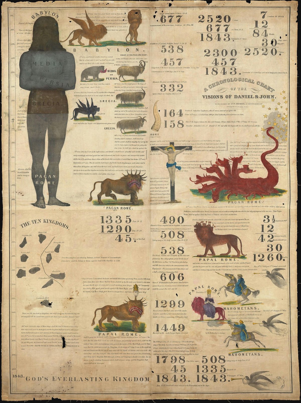

‘A Chronological Chart of the Visions of Daniel and John’, printed by Joshua Himes in 1842, integrates the visual logic of the timeline, chronological calculus and apocalyptic symbolism in a single scheme. The final date in the left-hand column, 1843, indicates the coming of the end of the world.
This infographic is based on the religious revivalist predictions of the New England minister, William Miller. From the 1830s, Miller’s followers produced stirring books, pamphlets, broadsides and innovative graphics to spread the word of the coming apocalypse, often displayed and distributed at popular camp meetings.
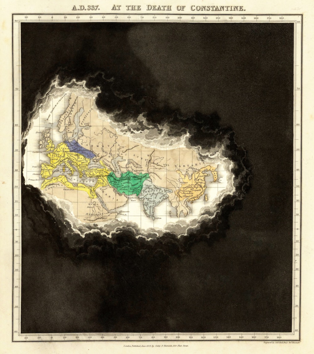
A.D. 337 At The Death of Constantine
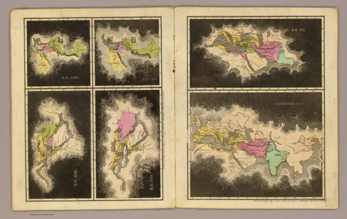
The concept of an historical atlas as a collection of geographical maps showing snapshots of the world at different dates in history is exemplified in Edward Quin’s ‘An Historical Atlas’, first published in 1828.
Quin’s book of maps demonstrated the divisions of the global political landscape at different moments in history, with the receding clouds device indicating the extent of the world known to the West at each particular point in time. The series begins in near darkness and, as we move through history (page through the atlas), the clouds roll back to reveal more and more of the known world.
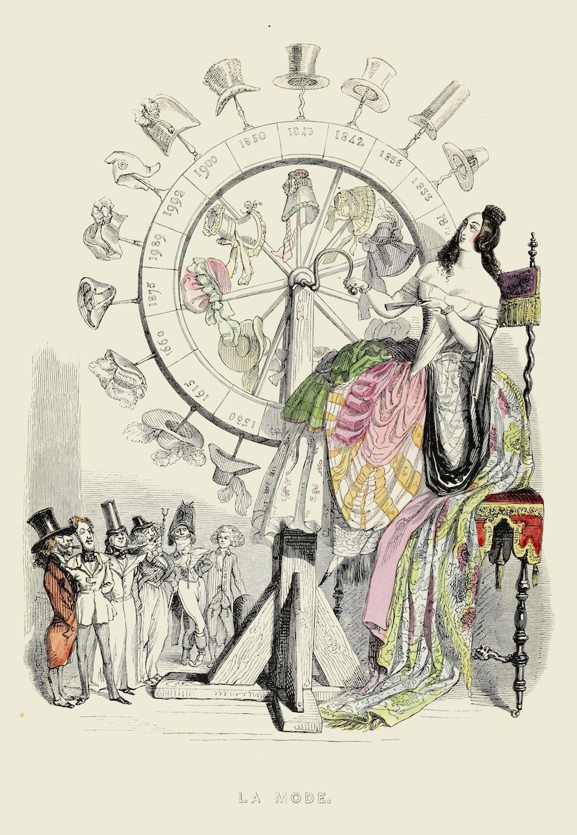
‘The Wheel of Fashion’ by JJ Grandville
IN: ‘Un Autre Monde: Transformations, Visions … et Autre Choses’, 1844.
Since the 18th century, the timeline has become such a commonplace expression of historical relationships that it blends into the cultural background. But what is notable about the function of the timeline in modernity is that it operates so seamlessly in the graphic background, organising and structuring other forms of graphic representation, as if it weren’t even there.
In the modern historical imagination, the timeline plays a special role: it appears as a graphic instantiation of history itself.
Our attention is really only drawn to the timeline form when ingenious artists, such as Grandville, subvert and mock our presuppositions about graphic representation of historical time. Works such as these point to both change and persistence in the problem of chronological representation – to the vitality of the forms created by pioneering chronologists and to the conceptual difficulties that they continue to present.
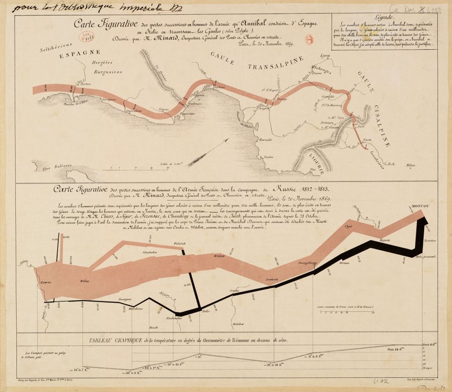
In the 1860s, the French engineer Charles Joseph Minard devised a number of new and influential infographic techniques. Among the most famous of his charts from this period is the 1869 ‘Carte Figurative des Pertes Successives en Hommes de l’Armée Française dans les Campagne de Russie 1812-1813 Comparées à celle d’Hannibal durant la 2ème Guerre Punique’.
The two diagrams, published together, show the size and attrition of the armies of Hannibal in his expedition across the Alps during the Punic wars and of Napoleon during his assault on Russia. The coloured band in the diagrams indicates the the army’s strength in numbers – in both charts, one millimetre in thickness represents ten thousand men. The chart of Napoleon’s march includes an indication of temperature as well.
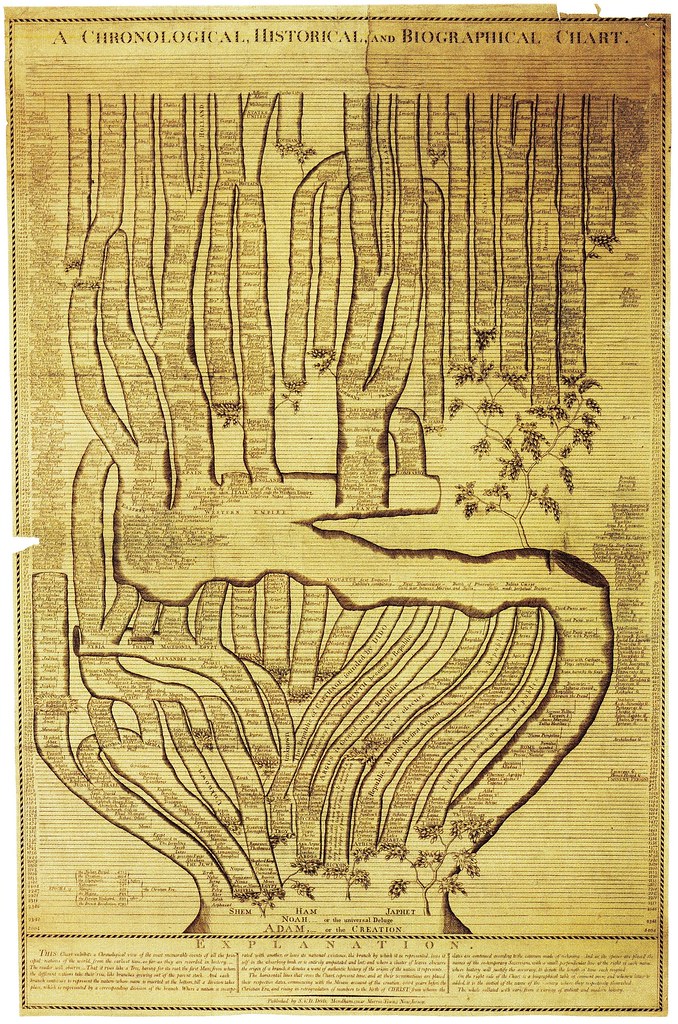
‘A Chronological, Historical and Biographical Chart’ (1807) by Stephen and Daniel Dod takes the form of a tree growing up. This (and also the image below) is a variation on a very influential graphic style of chronology devised in 1804 by the Austrian Friedrich Strass. His ‘Strom der Zeiten’ (Stream of Time) originates with a storm at the top [see the image below] and events through history ebb and flow, twist and fork to form an immense and flexible visual metaphor.
“EXPLANATION – This Chart exhibits a Chronological view of the most memorable events of all the principal nations of the world, from the earliest times, as far as they are recorded in history. The reader will observe – That it rises like a Tree, having for its root, the first Man from whom the different nations take their rise, like branches growing out of the parent stock. And each Branch continues to represent the nation whose name is inserted at the bottom, till a division takes place, which is represented by a corresponding division of the branch.
Where a nation is incorporated with another, or loses its national existence, the branch by which it is represented loses itself in the absorbing limb, or is entirely amputated and lost; and where a cluster of leaves obscures the origin of a branch, it denotes a want of authentic history of the origin of the nation it represents. The horizontal lines that cross the Chart represent time, and at their terminations are placed their respective dates, commencing with the Mosaic account of the creation, 4004 years before the Christian Era, and rising in retrogradation of numbers to the birth of CHRIST: from where the dates are continued according to the common reckoning.
And in the [?]species/aspect are placed the names of the contemporary Sovereigns, with a small perpendicular line at the right of each name where history will justify the accuracy to denote the length of time each reigned. On the right side of the Chart is a biographical table of eminent men; and where a letter is added, it is the initial of the name of the country where they respectively flourished. The whole collated with care, from a variety of ancient and modern history.” [text from bottom of print]
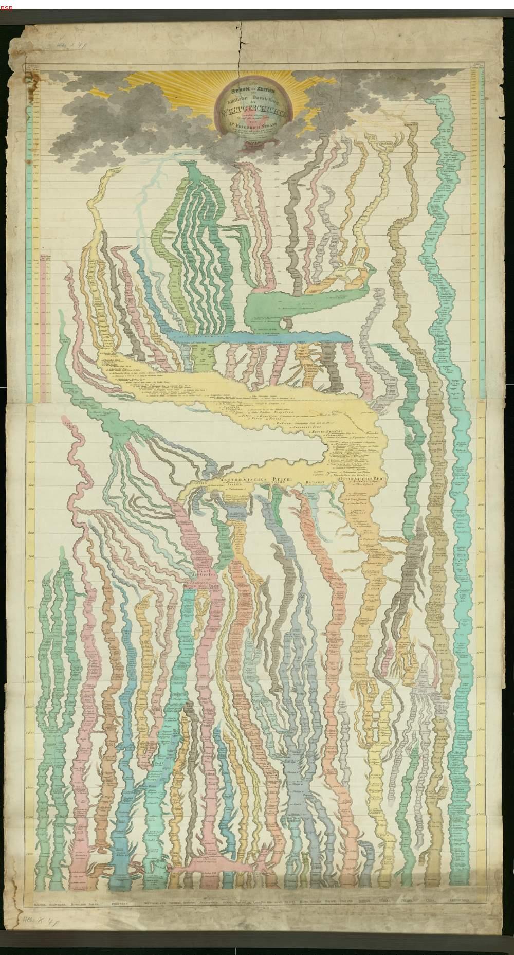
William Bell’s translation of Friedrich Strass’s ‘Strom der Zeiten’
(Stream of Time), this copy published in 1849.
Bell shared Strass’s belief that the previous geometrical and regular organisation of linear chronological charts implied a uniformity in the processes of history that was misleading:
“However natural it may be to assist the perceptive faculty, in its assumption of abstract time, by the idea of a line … it is astonishing that … the images of a Stream should not have presented itself to any one … The expressions of gliding, and rolling on; or of the rapid current, applied to time, are equally familiar to us with those of long and short. Neither does it require any great discernment to trace … in the rise and fall of empire, an allusion to the source of a river, and to the increasing rapidity of its current, in proportion with the declivity of their channels towards the engulfing ocean.
Nay, this metaphor … gives greater liveliness to the ideas, and impresses events more forcibly upon the mind, than the stiff regularity of the straight line. It’s diversified power likewise of separating the various currents into subordinate branches, or of uniting them into one vast ocean of power … tends to render the idea by its beauty more attractive, by its simplicity more perspicuous, and by its resemblance more consistent.” [William Bell]
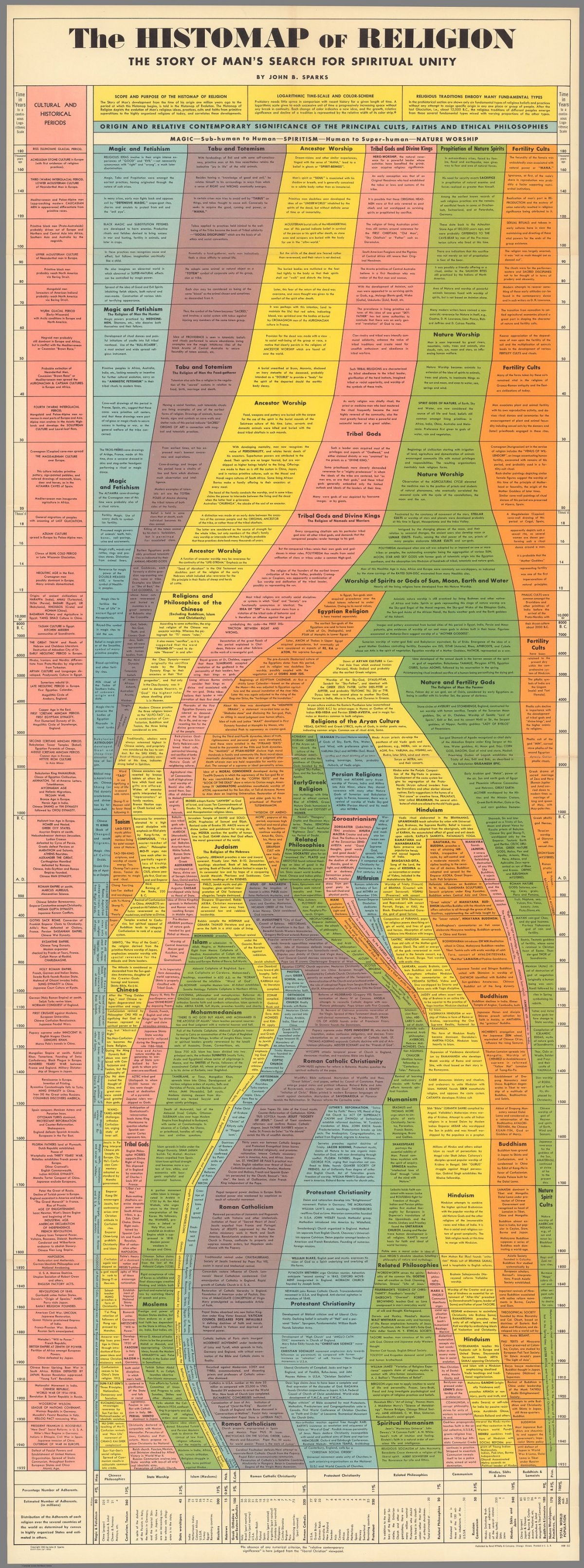
Many of the most appealing chronological charts come from amateurs, trained in neither chronology nor art. The beautiful ‘Histomap’, for example, a strong seller for Rand McNally for over fifty years after its debut in 1931, was not the creation of a trained historian.
Its author, John Sparks, was the American plant manager for the Swiss-owned Nestlé Corporation during the inter-war period. He was a history buff, and because his work required that he travel long distances by train, he always carried with him a history book and a blank note pad. While he travelled, he filled his pads with names and dates scrawled in ballpoint. When he returned home, he cut his notes into slips and pasted them onto a massive chart for his own reference.
Explaining his efforts, Sparks cited the philosophers Alfred North Whitehead and Herbert Spencer as influences. From the first, he drew the notion that graphic methods offered a means of integrating quantitative and qualitative studies; from the second, the credo that modern life requires even more strenuous efforts at managing information. “When a man’s knowledge is not in order,” Spencer wrote, “the more of it he has, the greater will be his confusion of thought.”
The notion that someone else might be interested in Sparks’ homemade chart came as a happy surprise, as did the strong visual effect of its published version. Once he had the taste for charts, he never lost it. He eventually published two further charts: ‘Histomap of Religion’ and the more ambitious ‘Histomap of Evolution: Earth, Life and Mankind for Ten Thousand Million Years’.
Lead Image: Six engraved maps on 2 facing pages by Emma Willard showing the development of Earth and Christianity, 1836
‘Cartographies of Time: A History of the Timeline’ 2010 by Daniel Rosenberg and Anthony Grafton.
Via: Bibliodyssey
Would you like to support Flashbak?
Please consider making a donation to our site. We don't want to rely on ads to bring you the best of visual culture. You can also support us by signing up to our Mailing List. And you can also follow us on Facebook, Instagram and Twitter. For great art and culture delivered to your door, visit our shop.