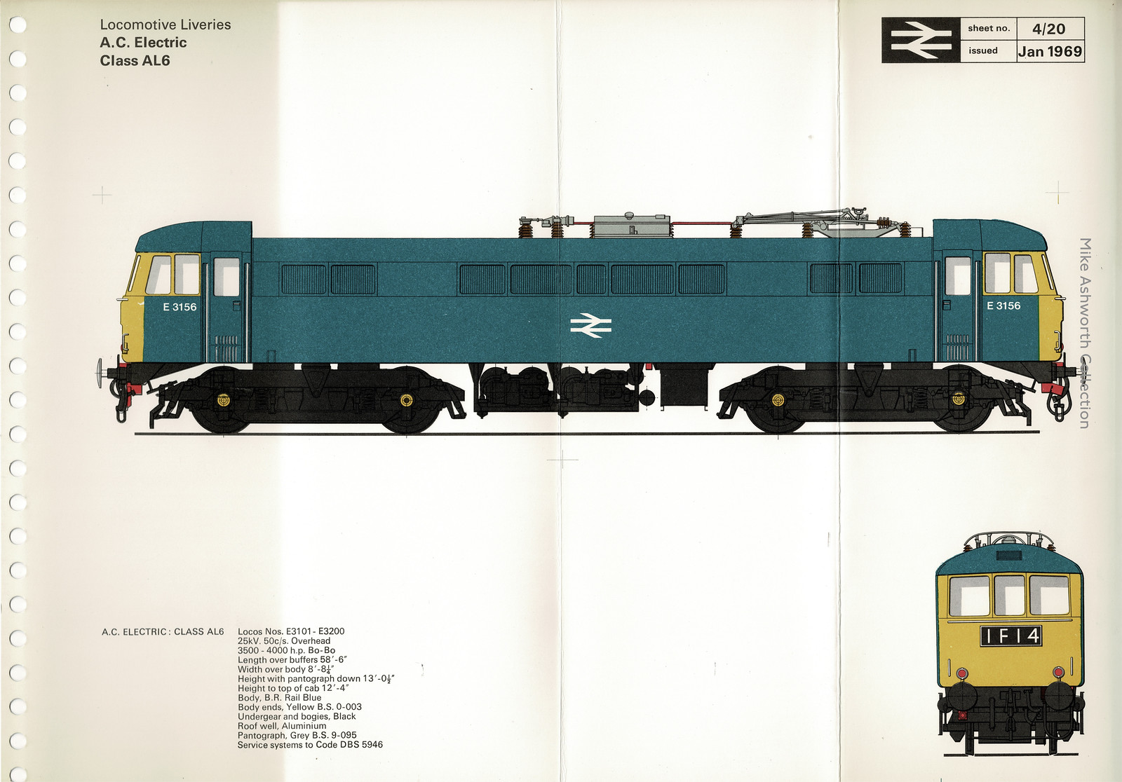
As the British cooled their heels on railway platforms in the mid-1960s, they might have stared at the signs for the state-run company operating train services: British Rail.
Created in 1965, the design manual was conceived in 1964 and finished in July 1965 by British Rail’s Design Research Unit, which aimed to merge art and industry into a cohesive design for the benefit of all architecture, graphics and industrial design.
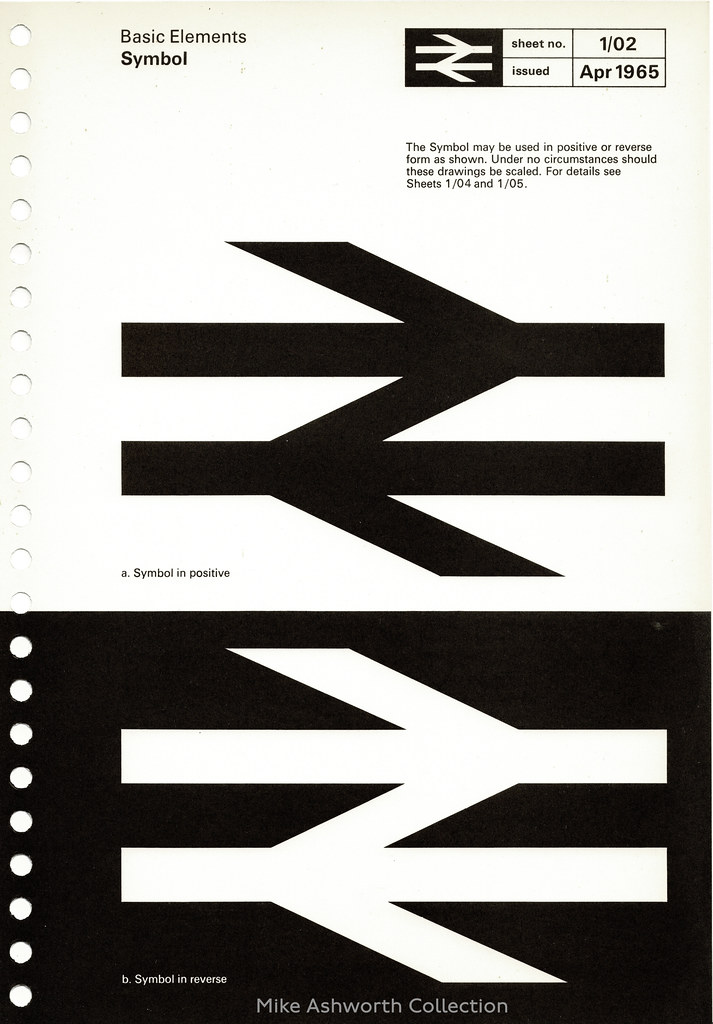
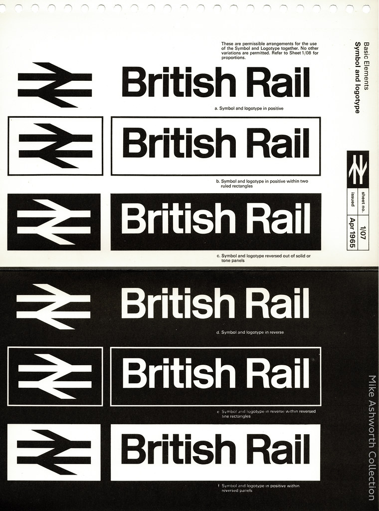
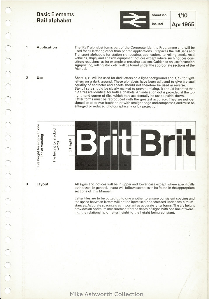
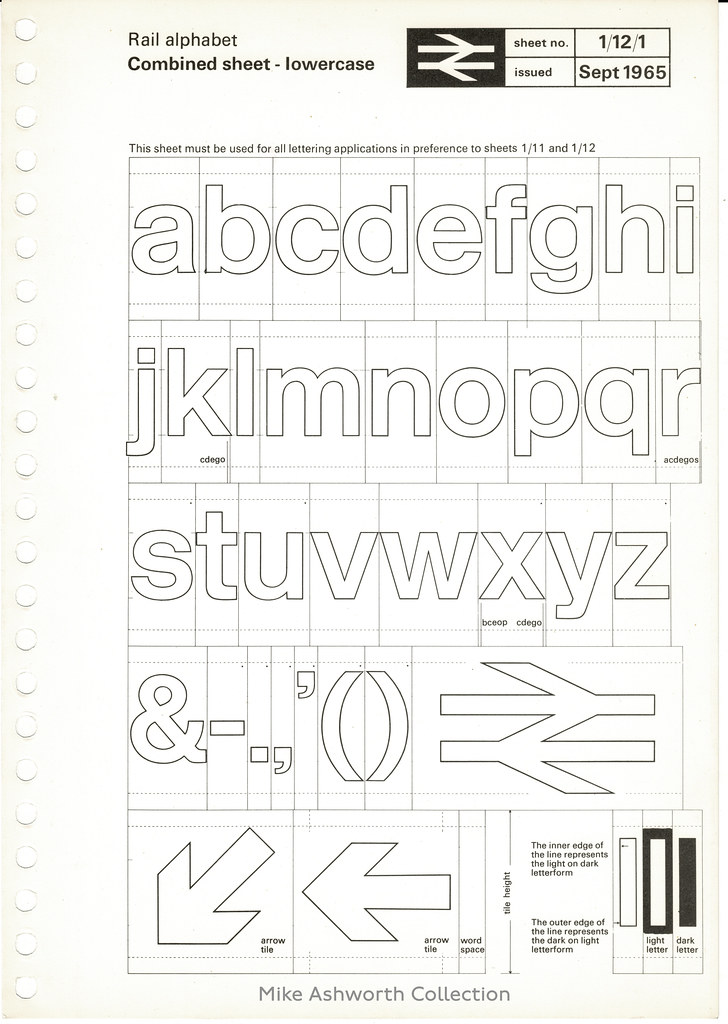
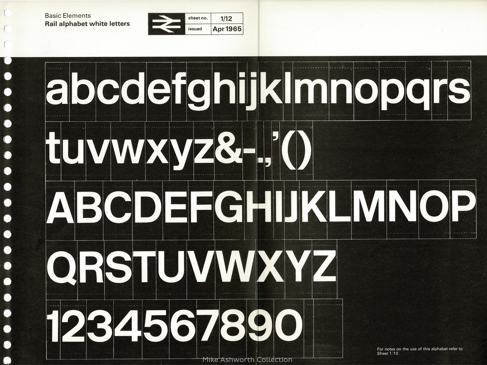
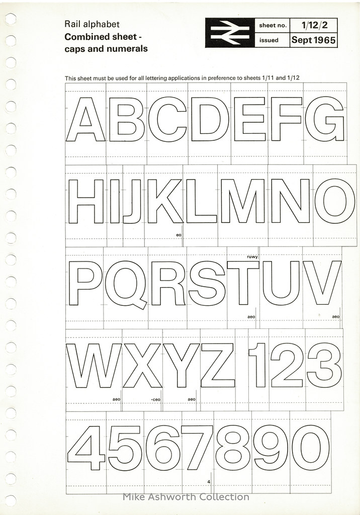
The manual specified the standard colour scheme for all rolling stock, delivered the Rail Alphabet as the standard corporate typeface (designed by Jock Kinneir and Margaret Calvert to replace Eric Gill’s Gill Sans typeface that had been primarily used since 1948) and introduced the Double Arrow logo. Created by Gerald Barney, the symbol of two interlocked arrows across two parallel lines symbolised a double-track railway.
The manual was an important plank of the modernisation and rebranding of British Railways overseen by Dr. Richard Beeching, chairman of the British Railways Board from 1961 – 1965. Beeching is best known for his pruning of the unprofitable and sprawling national railway network which paved the way for the modern InterCity services.
As part of the marketing of this new corporate identity an exhibition was held at the Design Centre in London in January 1965. The poster and the accompanying leaflet.
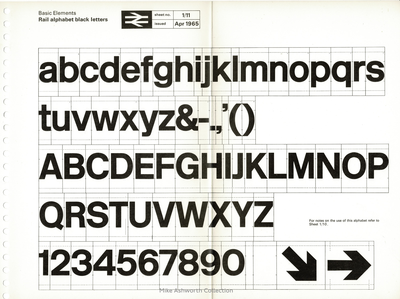
The Manual was issued in four volumes, each in a ring binder, and introduced the basic elements of the identity; the double arrow symbol, the British Rail logotype, the Rail Alphabet and the corporate colours. The manuals then also show how and where these elements were to be applied, displayed and used. The elements are to be seen not individually but part of a highly crafted system and the manual shows how important the relationship is between each element and its design.
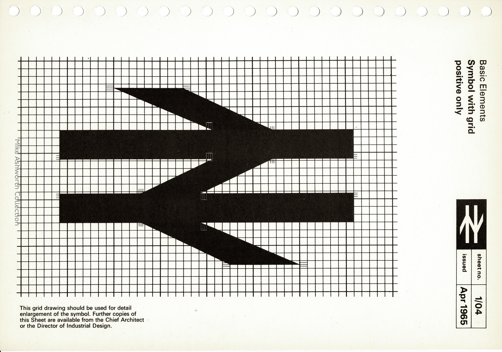

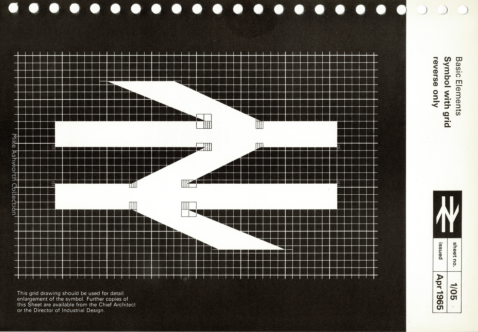
“I seriously did do it on the back of an envelope. When I got to the office I drew it up. It’s exactly how I drew it the first time, with straighter lines. I just had to formalise it.”
– Gerald Barney
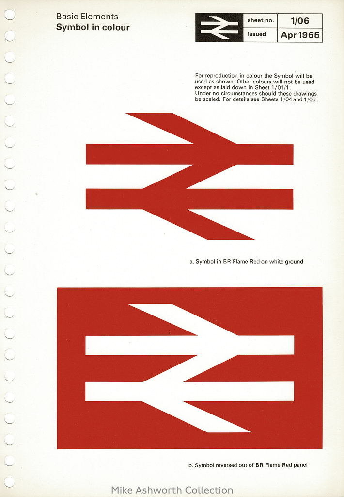

“When you do a line of lettering with the characters the same height, the ‘o’s can look too small, so they’re always made a bit bigger,” he explains. “In the BR symbol the lines aren’t all the same thickness. Where the angled bars meet the horizontal ones they will appear thicker at the join, so they actually widen slightly going out. But that comes from lettering, where you have to pay attention to the counters; the spaces that are left, not the thing you’re drawing. They work together.”
– Gerald Barney
“The first designs I did for putting the symbol on a train,” he recalls, “I had it covering practically the whole engine. It looked bloody great, but they wouldn’t do it.”
– Gerald Barney
Quotes via Creative Review; British Rail Design Manual via: Mikey Ashworth
Would you like to support Flashbak?
Please consider making a donation to our site. We don't want to rely on ads to bring you the best of visual culture. You can also support us by signing up to our Mailing List. And you can also follow us on Facebook, Instagram and Twitter. For great art and culture delivered to your door, visit our shop.