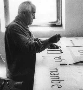
What did the Olympics ever do for you? Otl Aicher was the true star of the 1972 Olympics? Who he? Was he member of Black September, the murderers who attacked the Israeli team? No. Was he seven-time gold medalist Mark Spitz’s coach, the man who swam just in front of the Californian dipper, a gold medal pinned to his trunks beneath the hand-stitched legend “C’mon Mark, Reach for the prize”? No.
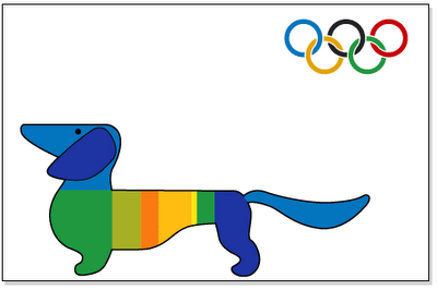
Otl Aicher designed these, the Games’ pictograms, the figures that pointed the way to the Games’ events, told you where smoking was forbidden and where the toilets were located. His simplistic design would become the universal standard.
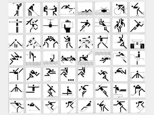
Aicher had no small task. As Michael Burke, a designer who worked on the project with Aicher, tells it:
…they wanted it to become much more open. The problem was that in the 1930s, the last time Germany had held the Games – obviously, the wanted to develop a completely new feel to it. Although it’s very typically German, in the sense that it’s very rationalised and very structured it’s got a soul to it. If you notice, there’s no red or black used.

No red or black. When the Germans had last hosted the Olympics, red and black had been very much in vogue:
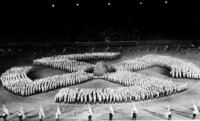
This Associated Press photo shows the Swastika, during rehearsals at Berlins stadium, June 20, 1938, Berlin, Germany. The stadium will again will be filled to capacity when the Hitler Youth and the SA are celebrating summer solstice day in the Olympic Stadium, June 21, 1938, Berlin, Germany. Hundreds of SA men will form a torchlight sun wheel in Germany on June 28, 1938. (AP Photo)
Was Aicher chosen to lead the design team by accident? He had considerable talent, having co-founded the Ulm School of Design (Hochschule für Gestaltung Ulm) and worked for German mega-companies Braun and Lufthansa. But better than that, in 1937 Aicher had been arrested for refusing to join the Hitler Youth. He was not one of them. He was one of the winners. He had said ‘no’.

Blood stains and bullet holes mark the place where the Israeli weightlifter Moshe Romano was killed Sept.7, 1972 by Arab commandos inside the Israeli Olympic team’s quarters at the Olympic Vilalge in Munich,West Germany. Photo shows the room where eight Israeli athletes were kept hostage for 18 hours. (AP Photo/str)
And then…the massacre?
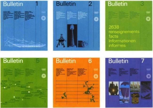
One of the brochures was the break out point where it all started to move into the rainbow colours. I can remember very vividly, after the Arab attack on the Israeli’s, where we all felt totally shattered – we’d seen all the police around – the decision was, what should we do, should we carry on at all? It was then decided that the colours would be used even more so – one discussion was that we used black, or that we stopped – then the idea was that the Rainbow Games would suggest an optimism…
The pictograms were used everywhere in Germany – at sports complexes, in schools and that was the objective. Normally all the marks are copywrited and such but these could be used by different people.
Cycling Inquisition realises how right it all feels:
Like a paperclip, we don’t think of Aicher’s pictograms as designed objects per se, but rather as the objects themselves. The chairs we own are someone’s take on a chair. That’s not the case with the average, everyday paperclip. It is what it is, a paperclip. That’s it. Objects at this level of comprehension are simply there. They feel as though they have always been there, and did so from the moment they were presented to the masses. In every country, in every city, they are simply there. In the case of Aicher’s icons they’ve become shorthand that everyone can understand, a set of simple shapes that successfully tells us where to go when we need to use a bathroom.
Burke again:
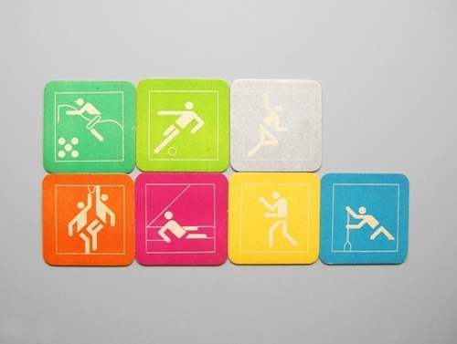
The thing Aicher was really interested in, in the whole of the Olympics, aside from the products we see here, was the souvenirs. He said we must get control of these souvenirs – so that was the big problem; how to structure them so that there wasn’t all the usual kitsch coming out. The mascot, Waldi, is very typical design approach and there’s even a cuddly toy version! But you remember those Bauhaus toys? Well that’s the link through again.

So. Typography and design matters.
Beatrice Warde addressed the British Typographers’ Guild
Imagine that you have before you a flagon of wine. You may choose your own favorite vintage for this imaginary demonstration, so that it be a deep shimmering crimson in color. You have two goblets before you. One is of solid gold, wrought in the most exquisite patterns. The other is of crystal-clear glass, thin as a bubble, and as transparent. Pour and drink; and according to your choice of goblet, I shall know whether or not you are a connoisseur of wine. For if you have no feelings about wine one way or the other, you will want the sensation of drinking the stuff out of a vessel that may have cost thousands of pounds; but if you are a member of that vanishing tribe, the amateurs of fine vintages, you will choose the crystal, because everything about it is calculated to reveal rather than to hide the beautiful thing which it was meant to contain.
Bear with me in this long-winded and fragrant metaphor; for you will find that almost all the virtues of the perfect wine-glass have a parallel in typography. There is the long, thin stem that obviates fingerprints on the bowl. Why? Because no cloud must come between your eyes and the fiery hearth of the liquid. Are not the margins on book pages similarly meant to obviate the necessity of fingering the type-pages? Again: The glass is colorless or at the most only faintly tinged in the bowl, because the connoisseur judges wine partly by its color and is impatient of anything that alters it. There are a thousand mannerisms in typography that are as impudent and arbitrary as putting port in tumblers of red or green glass! When a goblet has a base that looks too small for security, it does not matter how cleverly it is weighted; you feel nervous lest it should tip over. There are ways of setting lines of type which may work well enough, and yet keep the reader subconsciously worried by the fear of “doubling” lines, reading three words as one, and so forth.
Printing demands a humility of mind, for the lack of which many of the fine arts are even now floundering in self-conscious and maudlin experiments. There is nothing simple or dull in achieving the transparent page. Vulgar ostentation is twice as easy as discipline. When you realise that ugly typography never effaces itself, you will be able to capture beauty as the wise men capture happiness by aiming at something else. The “stunt typographer” learns the fickleness of rich men who hate to read. Not for them are long breaths held over serif and kern, they will not appreciate your splitting of hair-spaces. Nobody (save the other craftsmen) will appreciate half your skill. But you may spend endless years of happy experiment in devising that crystalline goblet which is worthy to hold the vintage of the human mind.
The trick is to be seamless…
Would you like to support Flashbak?
Please consider making a donation to our site. We don't want to rely on ads to bring you the best of visual culture. You can also support us by signing up to our Mailing List. And you can also follow us on Facebook, Instagram and Twitter. For great art and culture delivered to your door, visit our shop.


