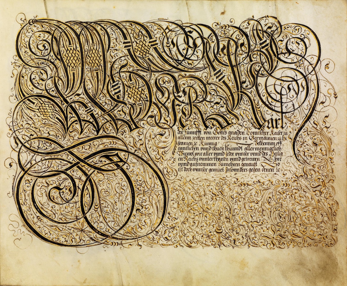
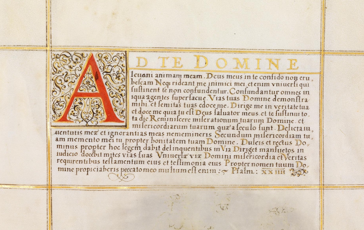
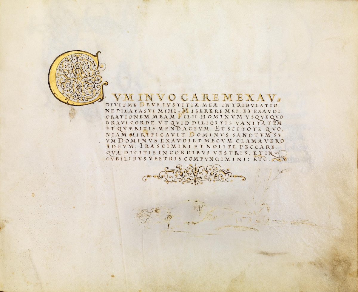
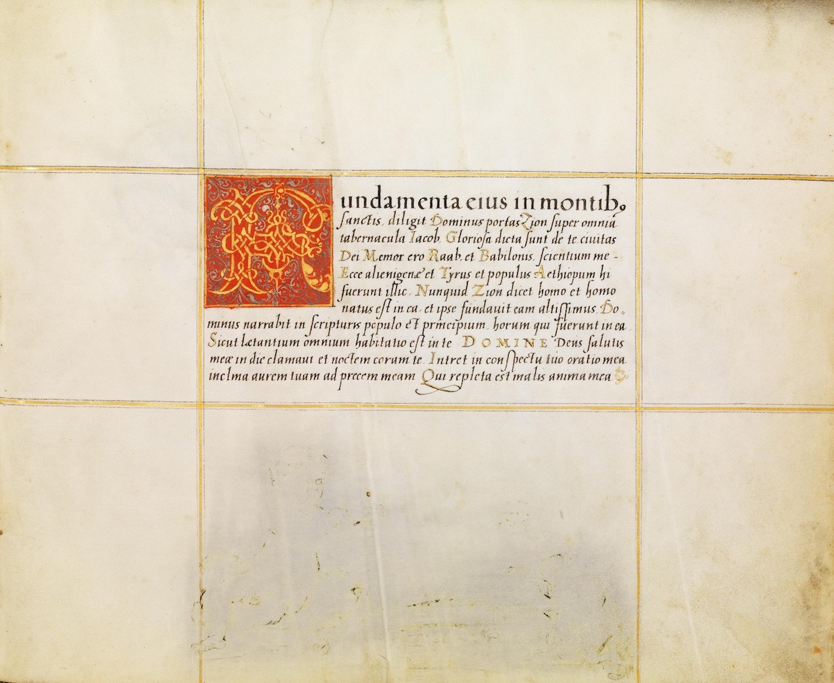
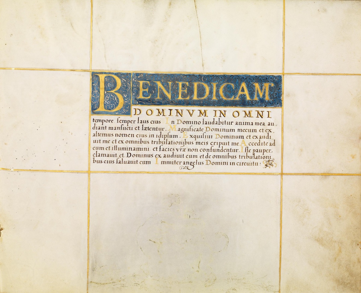
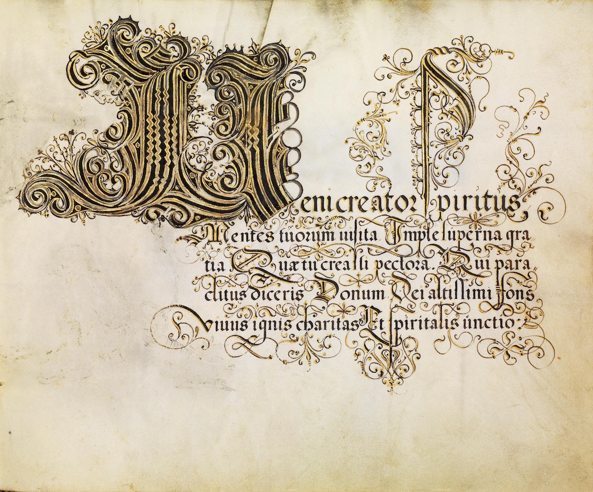
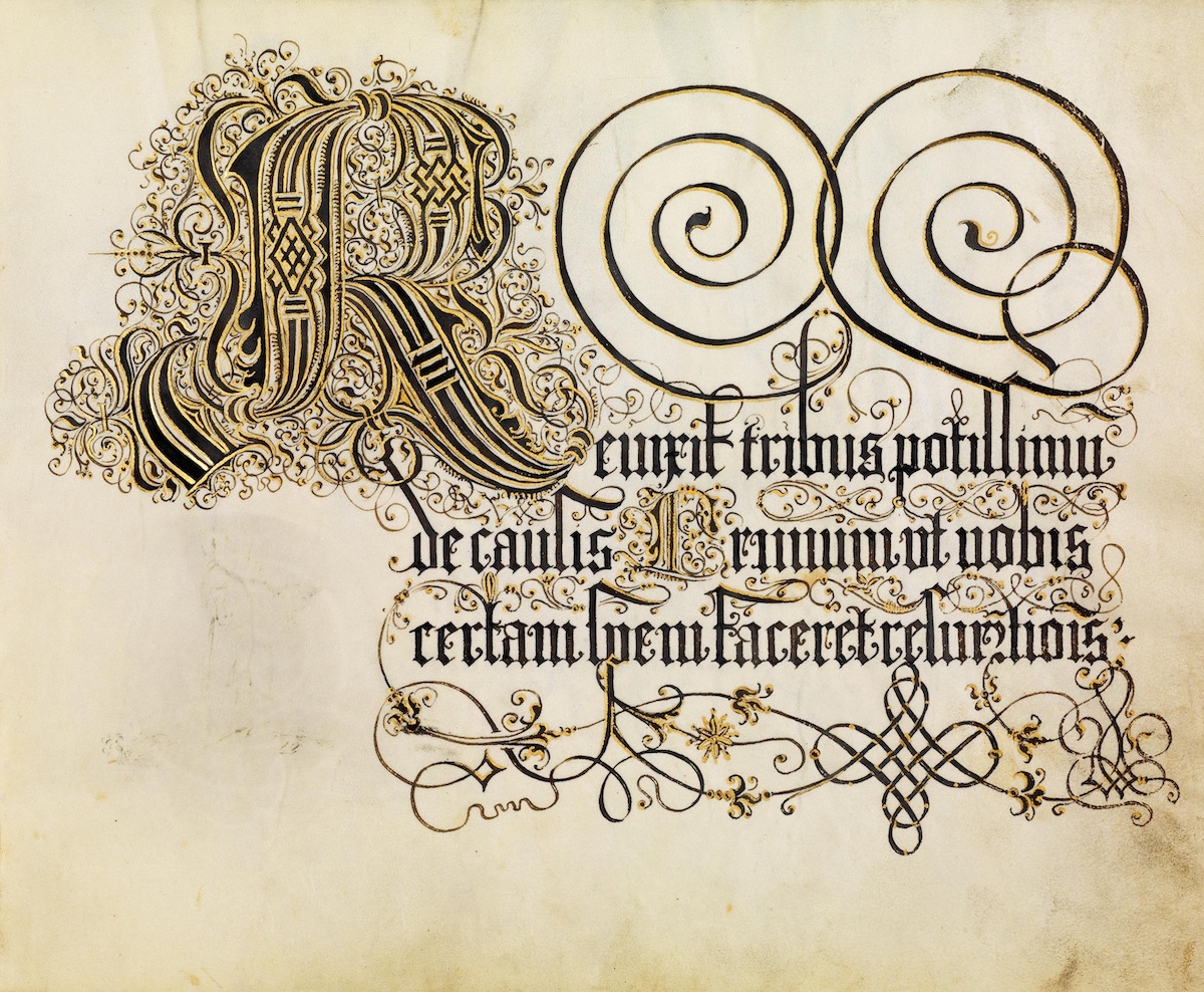
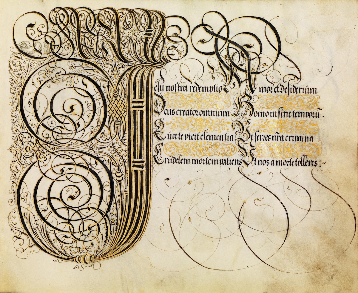
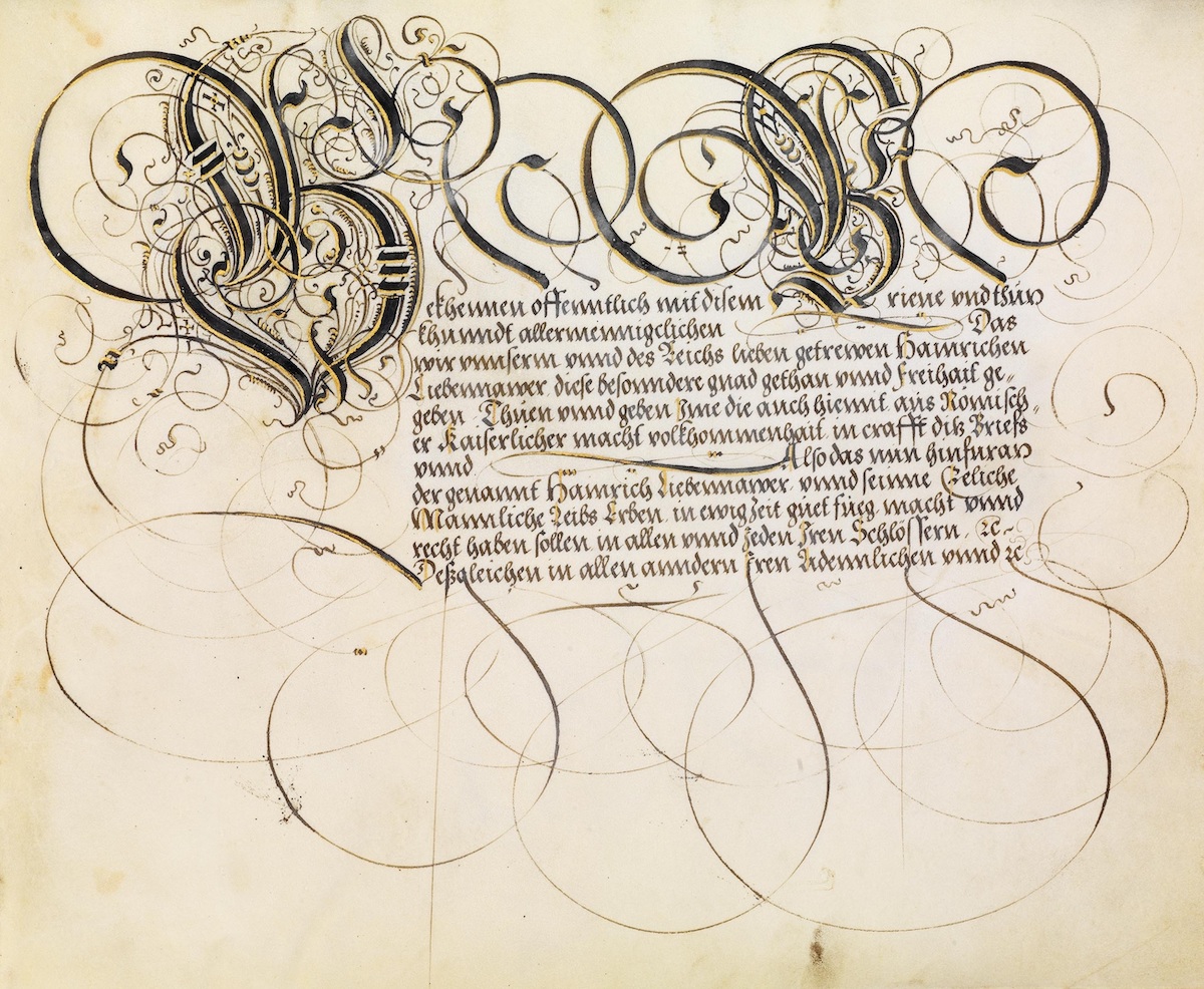
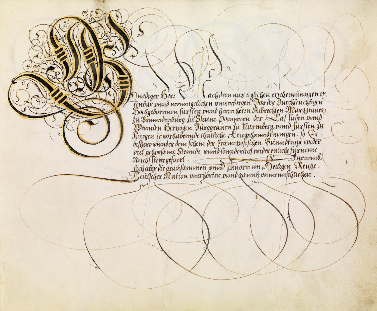
The 24 page paper manuscript is dominated by Middle German blackletter scripts with extravagant embellishment, and a minority of the pages contain ‘less’ ornamental writing in Latin.
The manuscript appears to be a compilation of calligraphic examples by one of the originators of early fraktur scripts, Johann Neudörffer the Elder (1497-1563), to whom this album is dedicated. The manuscript’s title – something like: The Works of the Master Scribes – is also suggestive of Franz Joachim Brechtel having assembled a set of Neudörffer’s calligraphy output, rather than his presenting an adaptation or transformation from the originals.
Neudörffer was an important educator and he published text books in Nuremberg on writing which dominated teaching curriculums for a couple of centuries; and his calligraphy endeavours were similarly admired. Neudörffer is also honoured as the first biographical historian of German artists, though his ‘Nachrichten’ (1547) wasn’t published until the 1800s.

Portrait of the Nuremberg master scribe Johann Neudörffer and a student , by Nicolas Neufchâtel , Nuremberg around 1561
He was lucky enough to have counted Albrecht Dürer as a friend and neighbour. He also designed the type face for Dürer’s maths book “Underweysung der messung mit dem zirckel und richtscheyt in Linien ebnen unnd gantzen corporen”, Nürnberg 1525.
There is not a lot of information about Franz Joachim Brechtel (that I can find) online. It would appear that his main claim to fame and employment stems from music sheets that he printed. I’m unsure whether he was the composer or simply the designer/publisher of the sheet music. In either case, his name is associated today with more than a hundred pieces of music that I – just – randomly found on the internet (so a role as composer seems more likely, though I didn’t dig into it).
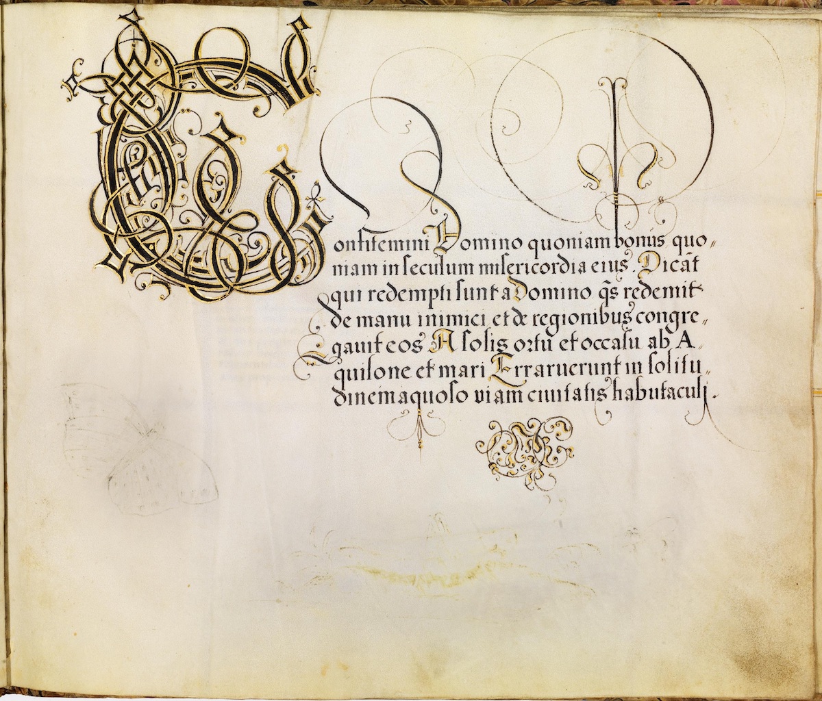
The Fraktur (from Latin fractura “break”, since the mid-15th century also “broken writing” ) is a font. From the middle of the 16th to the beginning of the 20th century, it was the most widely used typeface in the German-speaking world, as well as – in competition with Antiqua – also in northern European countries.
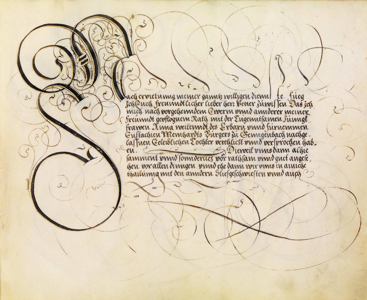
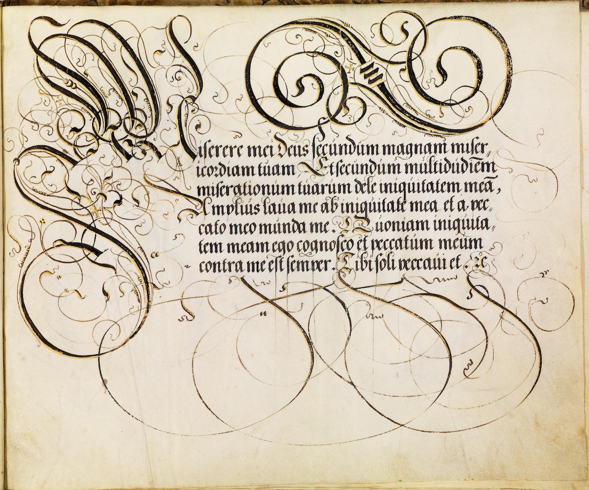
By Paul K at Bibliodyssey.
‘Werke der Schönschreibmeister’ by FH Brechtel (1573) is available from Bamberg State Library in Germany.
Via: Dictionary of Art Historians, Musicalis, The Renaissance Mathematicus
Would you like to support Flashbak?
Please consider making a donation to our site. We don't want to rely on ads to bring you the best of visual culture. You can also support us by signing up to our Mailing List. And you can also follow us on Facebook, Instagram and Twitter. For great art and culture delivered to your door, visit our shop.


