“Color is your choice, but be sure it compliments the furnishings you already have. Select a tone from your drapery fabric, or a light blending of your floor covering. It’s easy to find just the tone you want, selected from one of the paint manufacturers’ color systems” – Better Homes and Gardens Decorating Book, 1956
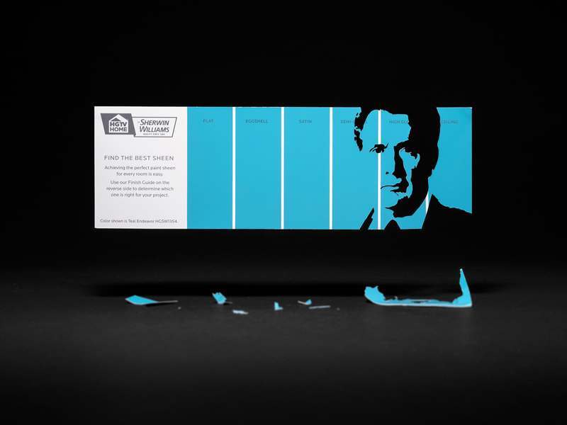
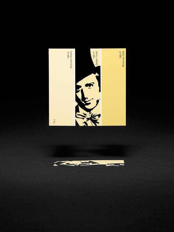
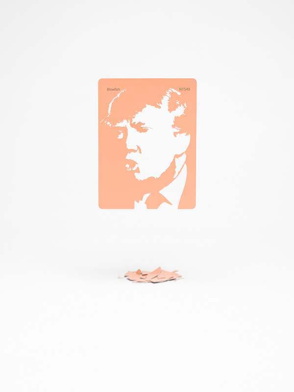
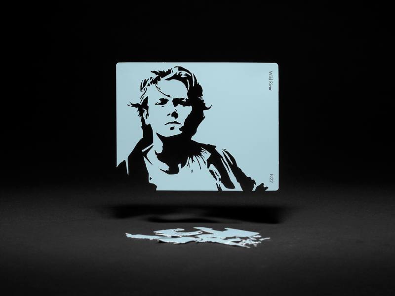
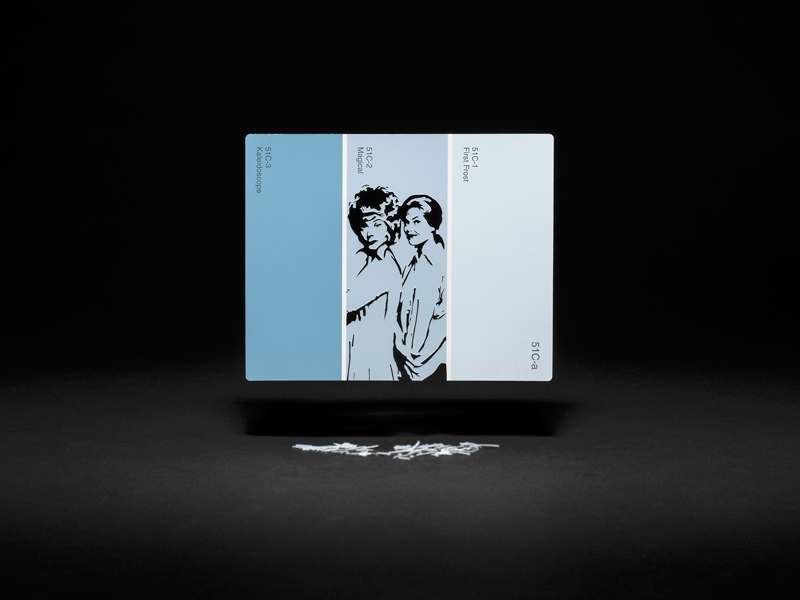
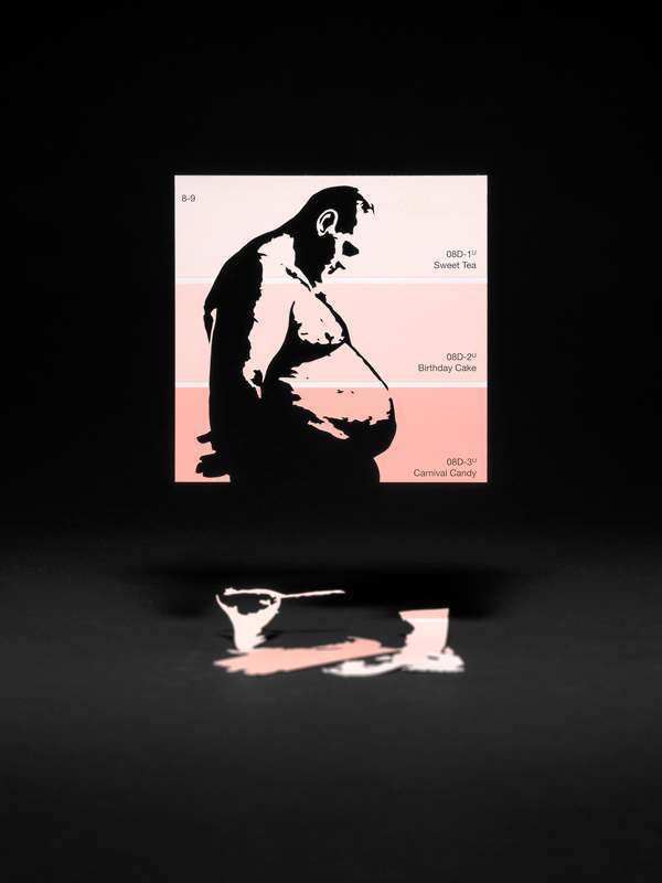
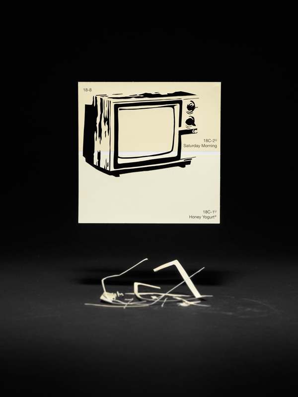
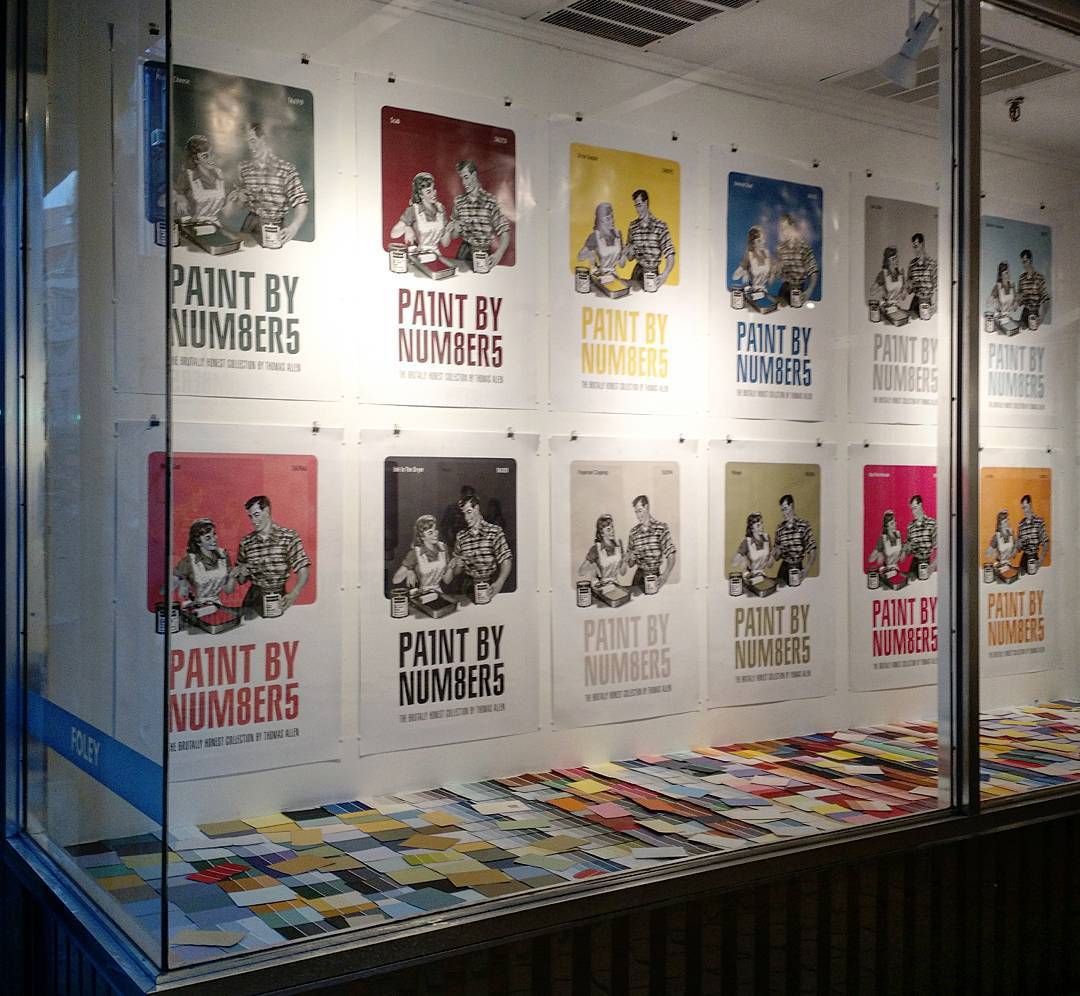
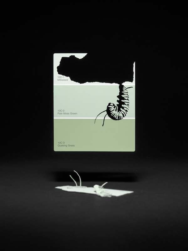
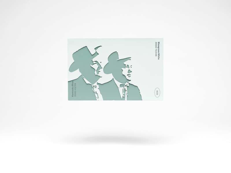
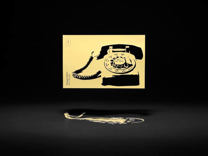
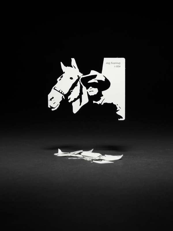
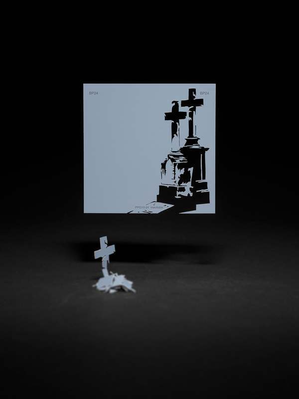
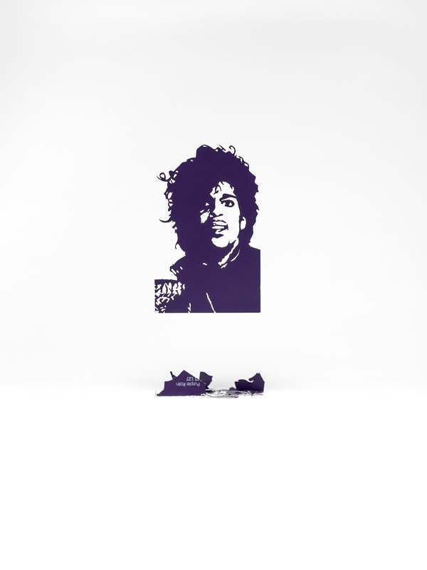
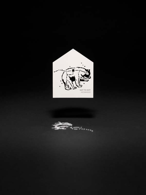
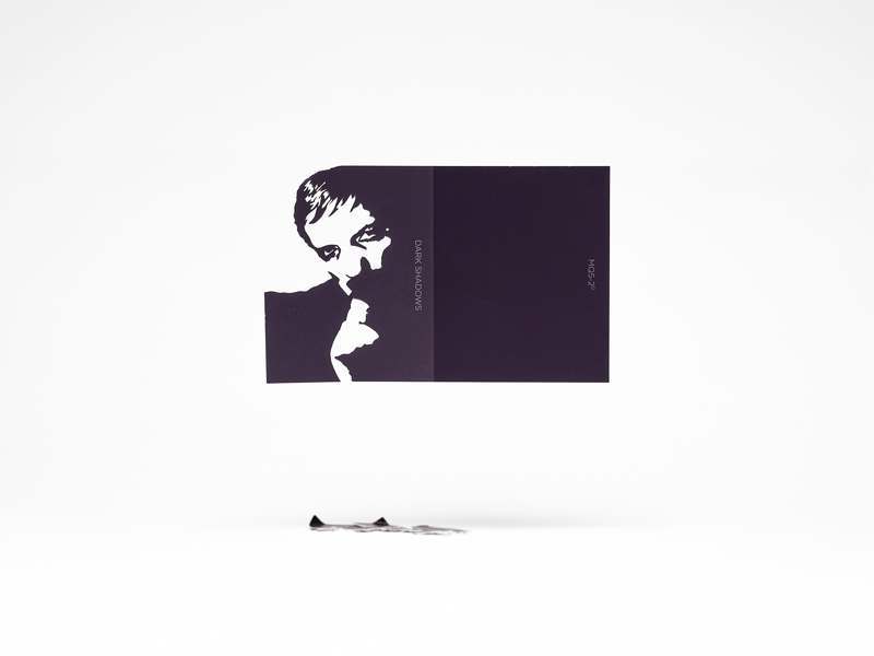
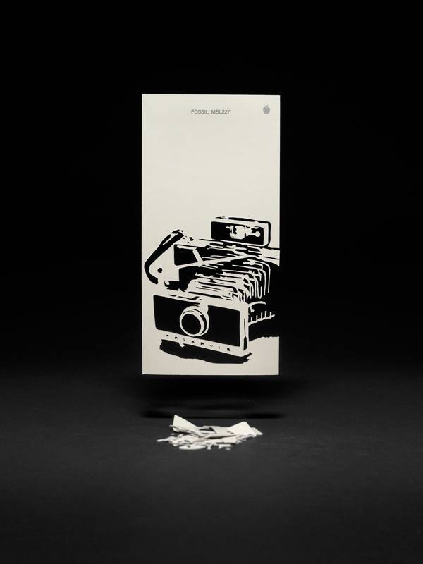
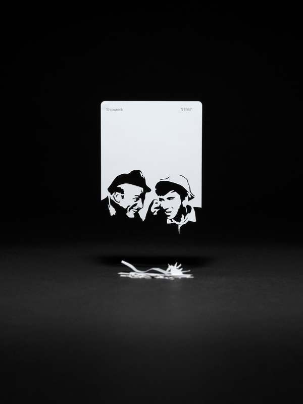
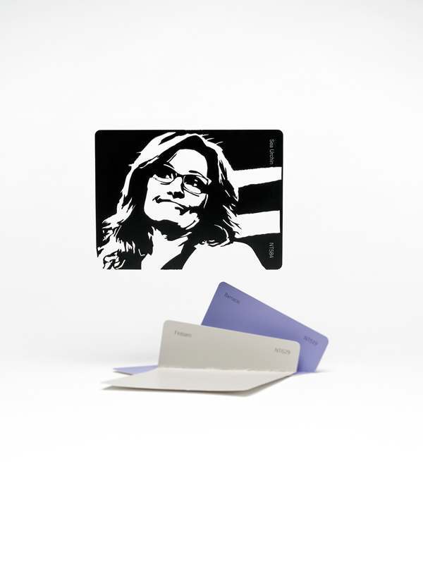
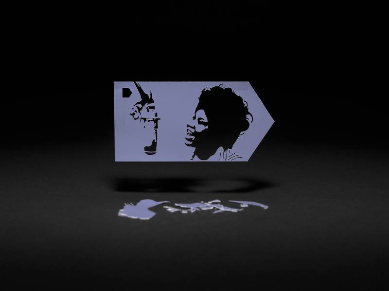
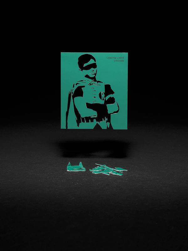
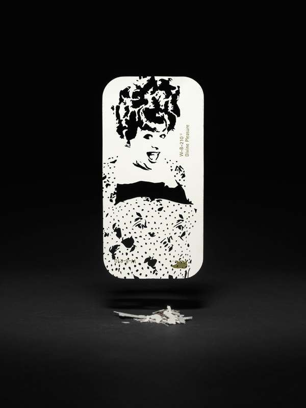
We love Thomas Allen’s work. His witty and clever 3D pulp fiction poses are a joy. In ‘Paint by Numbers’ Tom edited found images to make posterized, multi-layered cutout templates in Photoshop. (“It took nearly as long to render the templates as it did to create the cut out images!,” he tells us). He then snips out the figure to rework as decor tiles, personalising the idea of color with popular historical and cultural associations.
Cut-outs of Donald Trump and Gene Wilder (as Willy Wonka in a film of Roald Dahl’s ‘Chocolate Factory’) become associated with color cards. Trump is the adipose, pustular and blancmange-sickly ‘Blowfish’. Wilder is a dribbled urine-yellowy ‘Golden Ticket’ that looks a lot like magnolia, the default color-by-committee for rented hallways.
Color your walls and windows with apoplectical desire and projected emotions, homemaker – live the timid American VIP dream.
It’s a lot of fun.
Says Tomas:
“Nearly sixty years ago, consumers (or housewives to be more specific) selected wall coverings to match their drapes, rugs and furniture. Retailers developed visual color systems (e.g. Sears Roebuck and Company’s Color Harmony Selector) to make choosing a paint color fun, easy and fool-proof. Color names, like Sunshine Yellow, Smoke Gray and Red Coral, were straightforward and uncomplicated. After all, it was just paint.”
“It starts at Sears Color Bank where you select the perfect color scheme to go with your present rug or draperies” – Sears Roebuck and Company Master Mixed Interior Finishes brochure 1957
Color is now sold as visual shorthand for who you are and what you aspire to be. Color speaks and shows.
“Today, home improvement stores devote major real estate to paint with brightly illuminated displays packed with thousands of pigmented samples saturated with potential. Why? Because something truly remarkable has happened to color (the science of human perception measured by hue, chroma and value): it’s come to life! With names like Heartbeat, Inhale, Exhale and Sigh, housepaint has been humanized and it wants to make our lives better. So-much-so that paint manufacturers have appointed color ‘ambassadors’ to keep us from making dull color choices.”
“Using a hushed palette kissed with misted mauves and atmospheric hues is a simple way to create a subtle touch of bohemia that hits the sweet spot between effortless and artistic” – Dutch Boy DAYDREAM color brochure 2015
“Pantone’s Color of the Year is All About Gender Fluidity ” – Fortune Magazine’s headline announcing Pantone’s Color of the Year for 2016.
Tom continues:
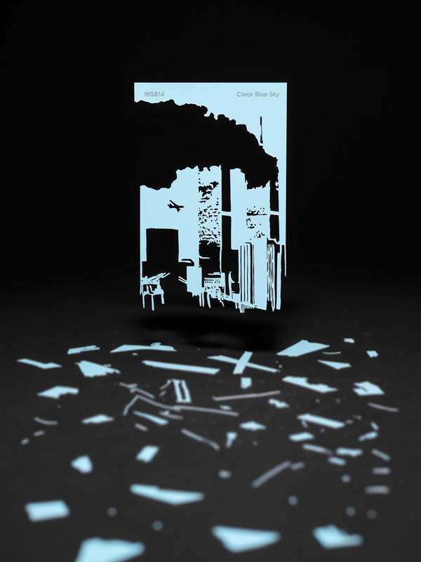
“Did this absurd marketing tactic, aimed at coloring my emotions, influence my sample choices (stockpiled and catalogued over the past two years)? Absolutely not. In fact, color had nothing to do with it. The arbitrary names printed on each lacquered card are what did it for me. Words like Shipwreck, Magical and Leaping Lizard recall a childhood spent sitting in front of the television while Clear Blue Sky, Blowfish and Sea Urchin picture a not-so-colorful reality – deftly rendered with a flick of a scalpel blade.”
“Posters were also created for the gallery windows. Each one has a made-up color (by me) that was sampled from photographs of the real thing – a direct opposite approach that seems to pervade the paint industry). For example, the yellow in Rescue Inhaler was sampled from a picture of one (I have asthma).”


To see Tom’s work in the flesh, head along to the Foley Gallery.
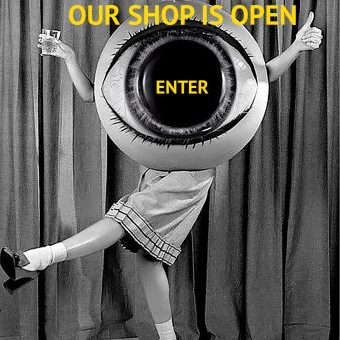
Would you like to support Flashbak?
Please consider making a donation to our site. We don't want to rely on ads to bring you the best of visual culture. You can also support us by signing up to our Mailing List. And you can also follow us on Facebook, Instagram and Twitter. For great art and culture delivered to your door, visit our shop.