“What gives our dreams their daring is that they can be realised”
— Le Corbusier
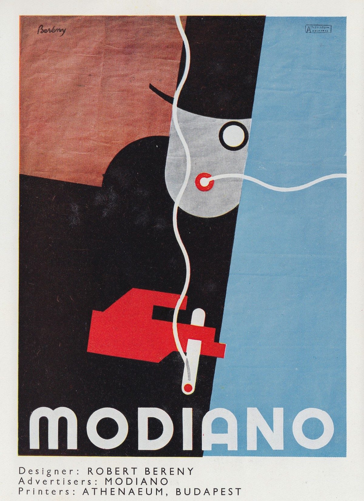
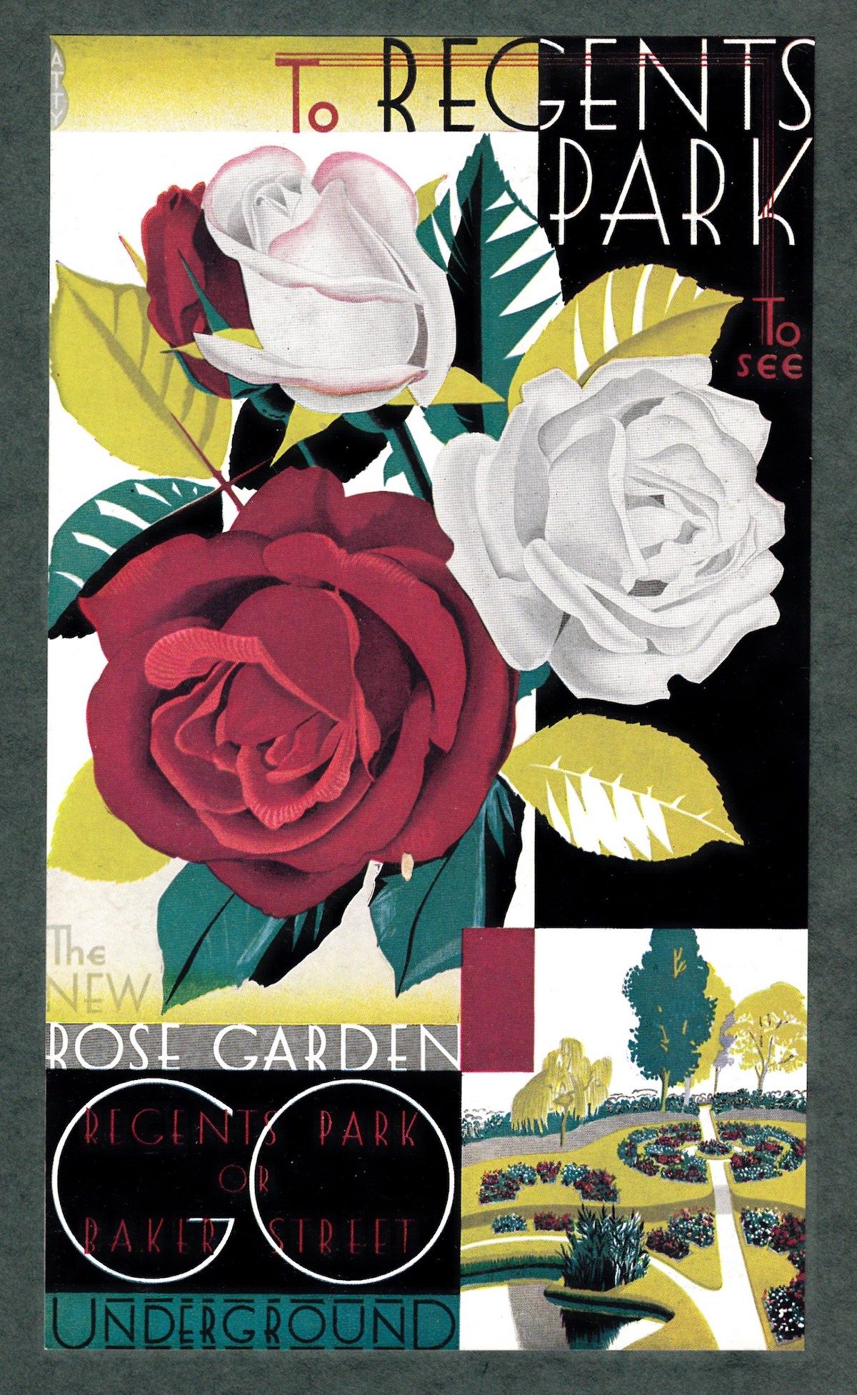
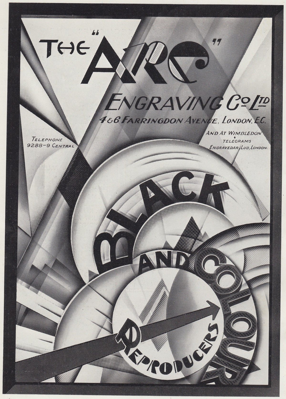
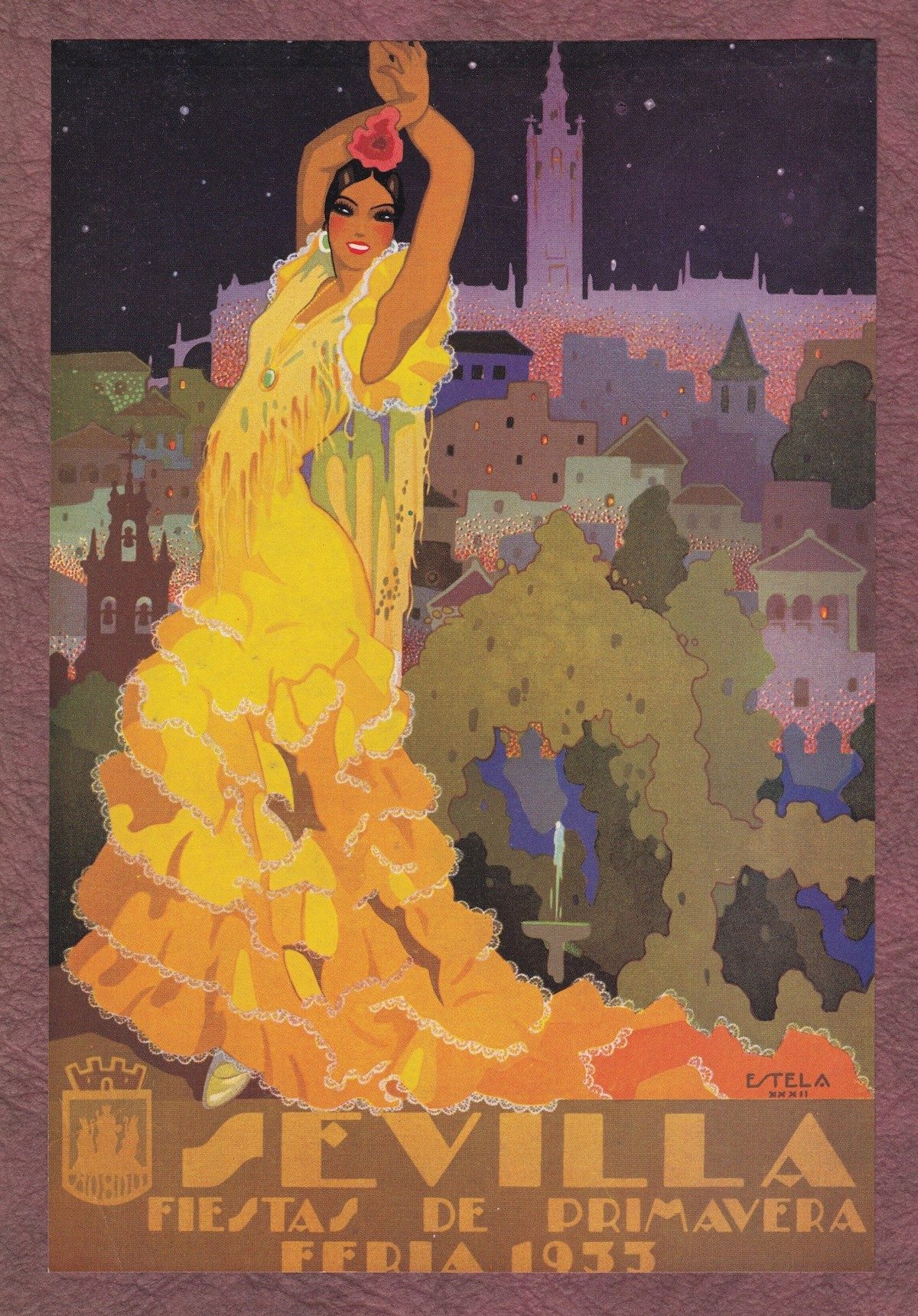
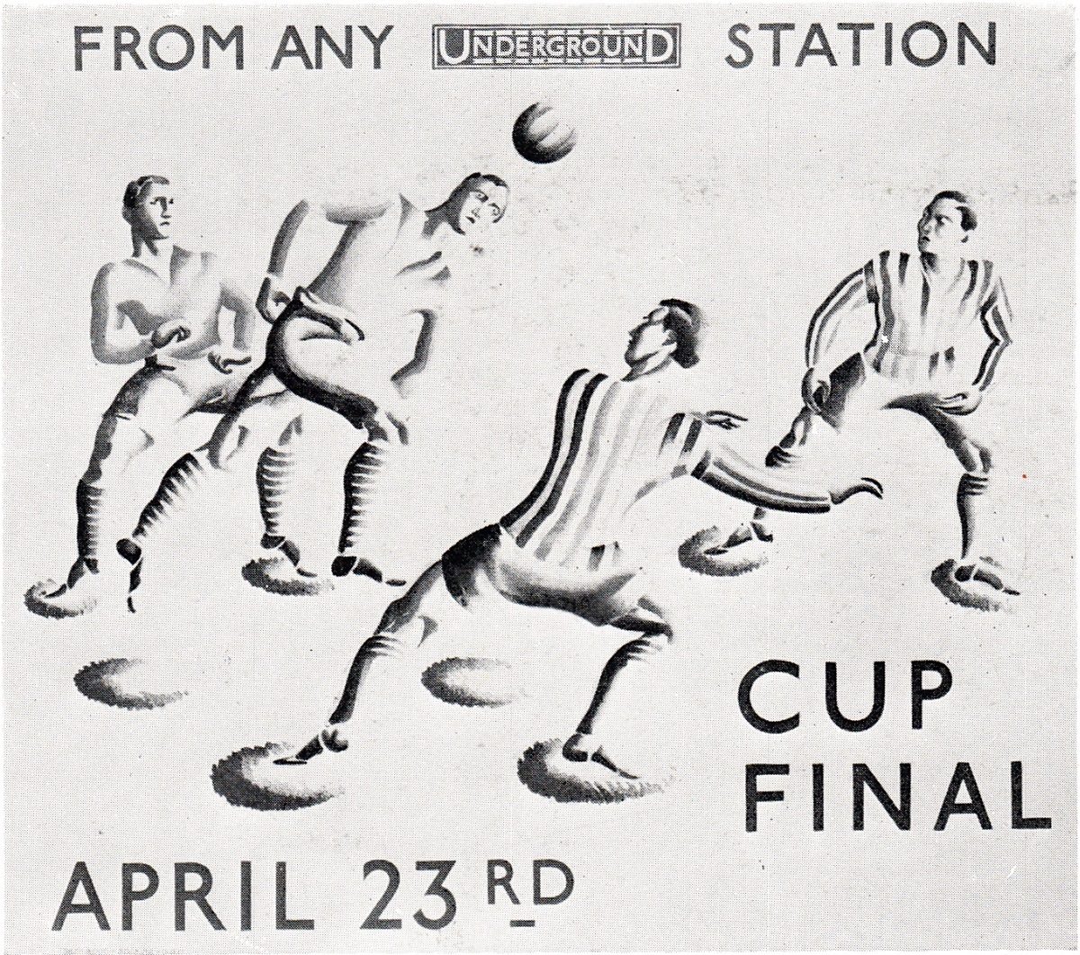
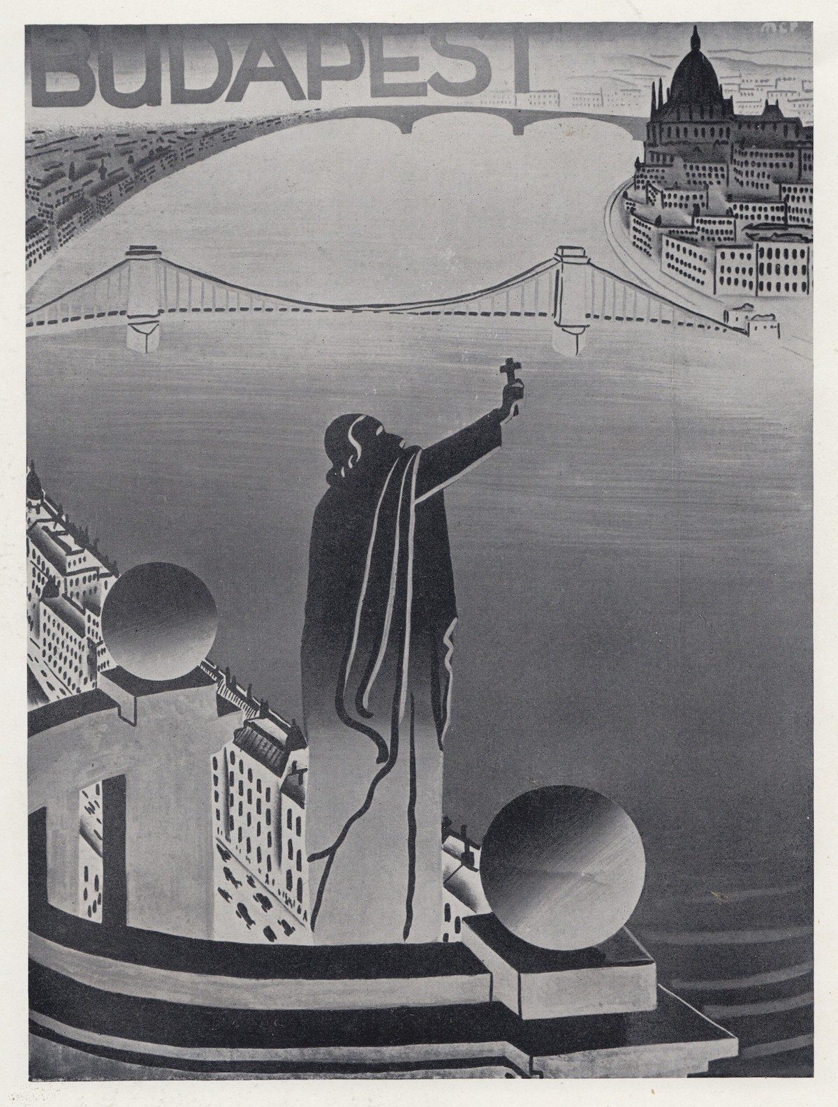
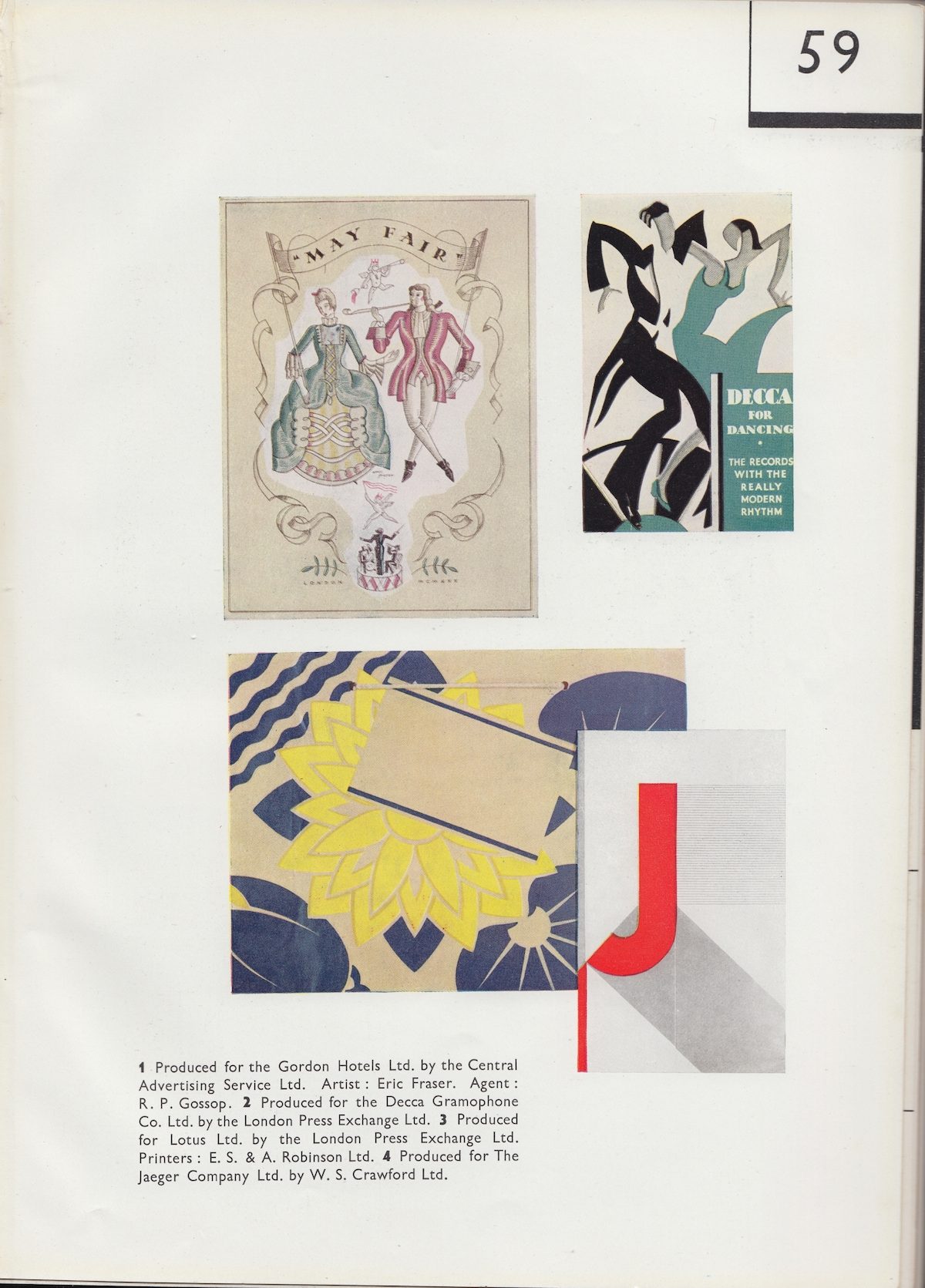
These images appeared in early issues of commercial art magazine Modern Publicity, published in London by The Studio Ltd (1930 – 1985). The annual for graphic design – posters, printed material, packaging and trade marks – from around the world began in 1924 as Posters and Publicity. It was renamed once more in 1980, becoming World Advertising Review, and it appears to have ceased publication in 1991. The images in this post below were scanned from the 1930 and 1933 editions.
As editors F. A. Mercer and W. Gaunt note in the 1930 magazine:
Modern Publicity corresponds to a process of evolution in the form of the book itself and to the increasing precision of its aim. For it is no longer possible to consider the poster as the only or even necessarily the main feature of progressive advertising as it was in the earlier days of the century, when a great gulf existed between posters like those of the Beggarstaff Brothers and the style of advertisement appearing in the newspapers and the magazines. Modern Publicity-this volume therefore, is an incitement to fresh efforts.
It is an indication of new lines of thought, new avenues of marketing. It shows how four of the keenest brains of to-day regard the commercial problems of today and tomorrow, and how best they think all the many forms of advertising may be used to co-operate in order to give their maximum assistance in bringing about industrial revival and success
Hymned advertising guru Sir William Crawford KBE had much to say on modernism in 1930. He and art director Ashley Havinden’s Crawford’s Advertising Agency was responsible for introducing a highly visual style more influenced by European artistic movements such as modernism and futurism than by traditional American marketing techniques. You can see lots more modern advertising posters, especially travel posters in the Flashbak Shop.
Ashley Havinden (1903-1973) created modernist typography and style influenced by cubism, futurism and The Bauhaus led to work for Chrysler motors, the GPO, Simpson’s department store and Eno’s fruit salts. Crawford’s surmised his vision:
“Ask me to review the last decade and I could fill a book with the story of how a small and distrusted and inexpert industry called advertising rose to the power and position and proud promise it holds today…
Within a few years the advertisements we are producing today will have been forgotten. But the spirit which produced them, the new and adventurous attitude of mind which is growing up around us at this time, will live on. A great revolution is taking place. It is taking place in architecture, in furniture, in painting, in writing, in music, in habits, in thought, and in outlook. ‘Humanity has struck its tents, and is once more on the march!’
I believe this revolution is as yet only in its earliest beginnings. I believe that we have not even begun to visualise the transformation it will eventually bring about in every theatre of human activity…
There is a new spirit – in road making, in architecture, in engineering, in advertising. Where it will take us eventually no man can forecast. The picture of the future in my mind is stupendous. We move today in what the mathematicians call geometric progression. Each fresh discovery leads us to make ten others…
Twenty-five years ago man had not flown. Twenty years ago the escalator was but a dream. Ten years ago the speed and smoothness of the six-wheel motor-bus would have seemed incredible. Ten-five-two years ago, the British industry did not possess the vital power to move men’s minds which breathes from these advertisements.”
“In the general style of American press advertisements of today there is evident a freshness which is very attractive and not a little due to the renewed vigour of their illustrations.
In the same way Europe became enamoured of a very geometrical and abstract form of advertising, from which any sort of realistic appeals was excluded. Spots, squares, blunt arrows, sans serif type – and purely typographical layout – were the order of the day. Admitted that an advertisement must have a backbone; that it must be solidly based on some scheme or foundation of pattern; but this also is a thing that can be, and has been, overdone. The clean look of the typographical page, the mysterious sparkle of its symbolic ornament at fist provoked interest because they were new and strong; but their strength is becoming wearisome and new devices must be found. [..]
During the economic changes [that have gone in the last decade] ‘Modern Publicity’has maintained a steady and consistent level of the best in advertising, and in the third year of a great depression we venture to think its standard is as high as ever and in some respects higher than before. The high level of skill and invention which advertising displays is a good omen for the future.”
– Introduction to Modern Publicity – 1933
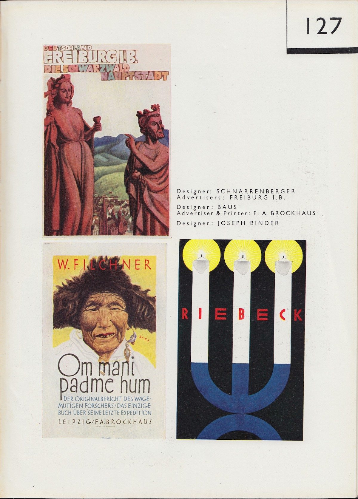
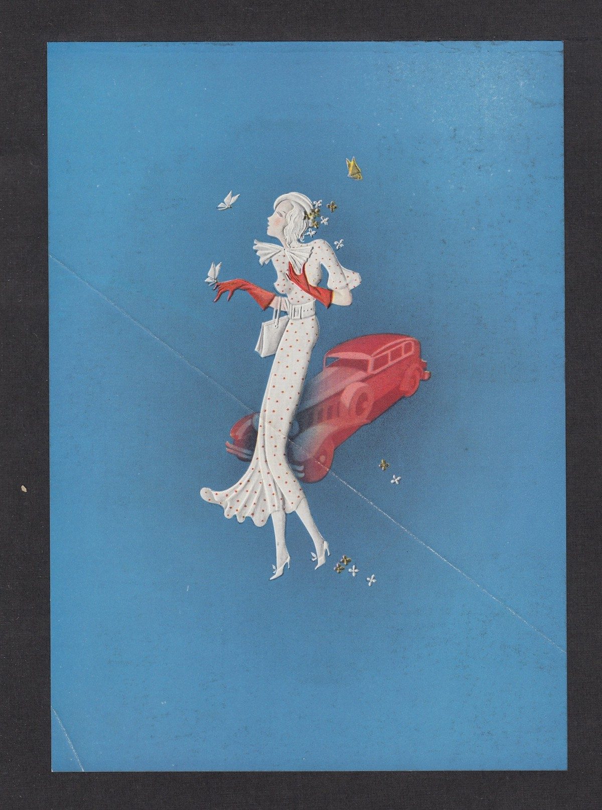
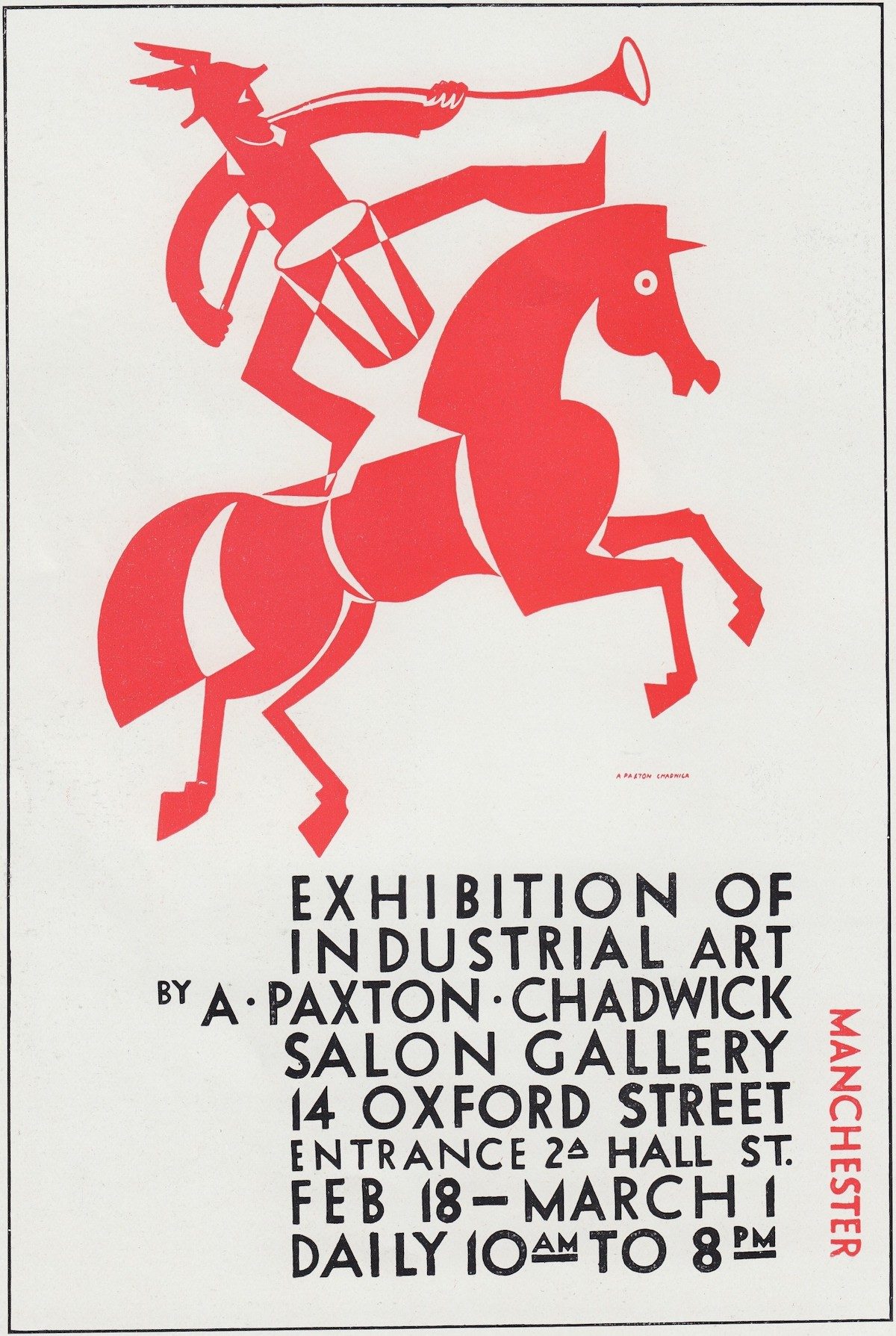
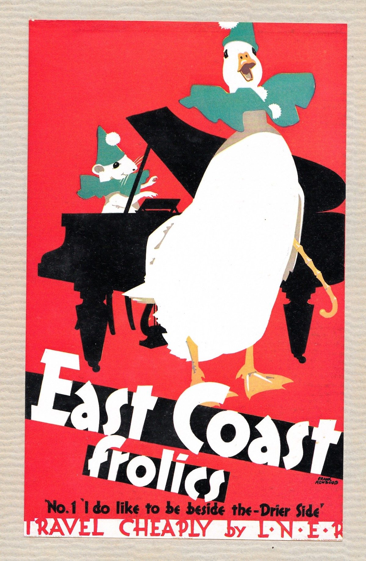
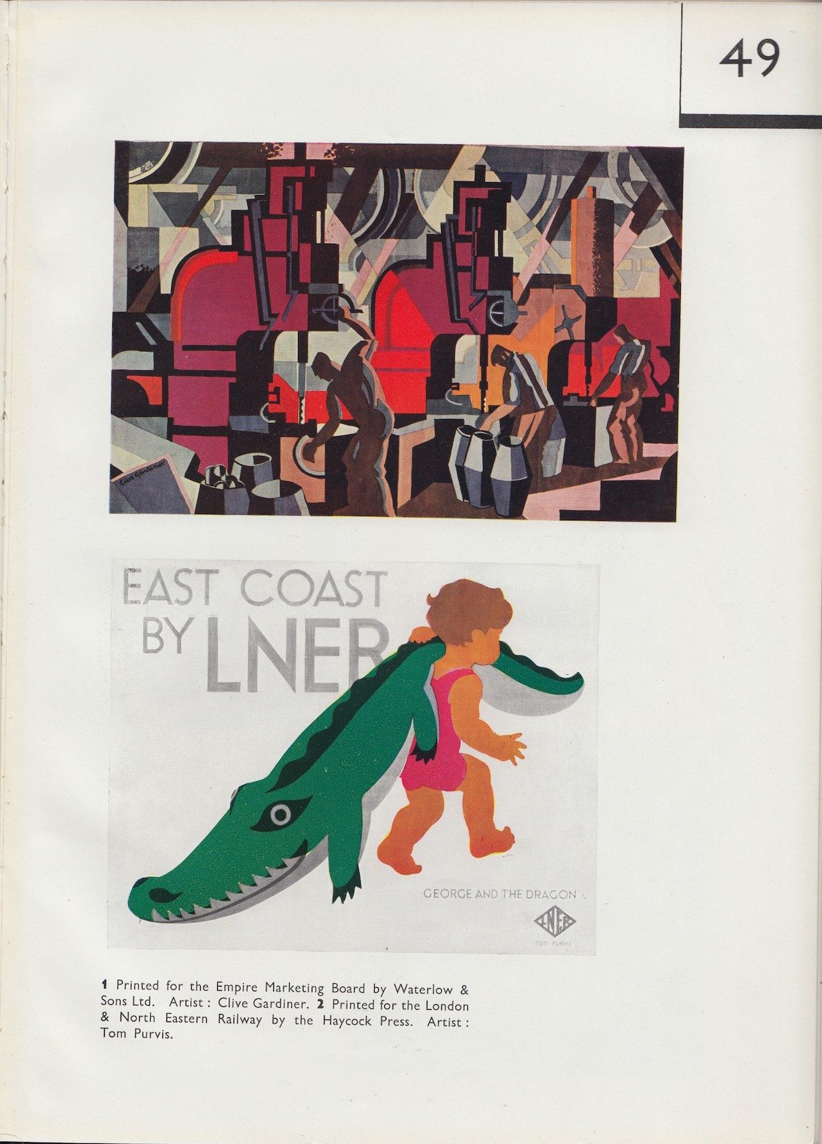
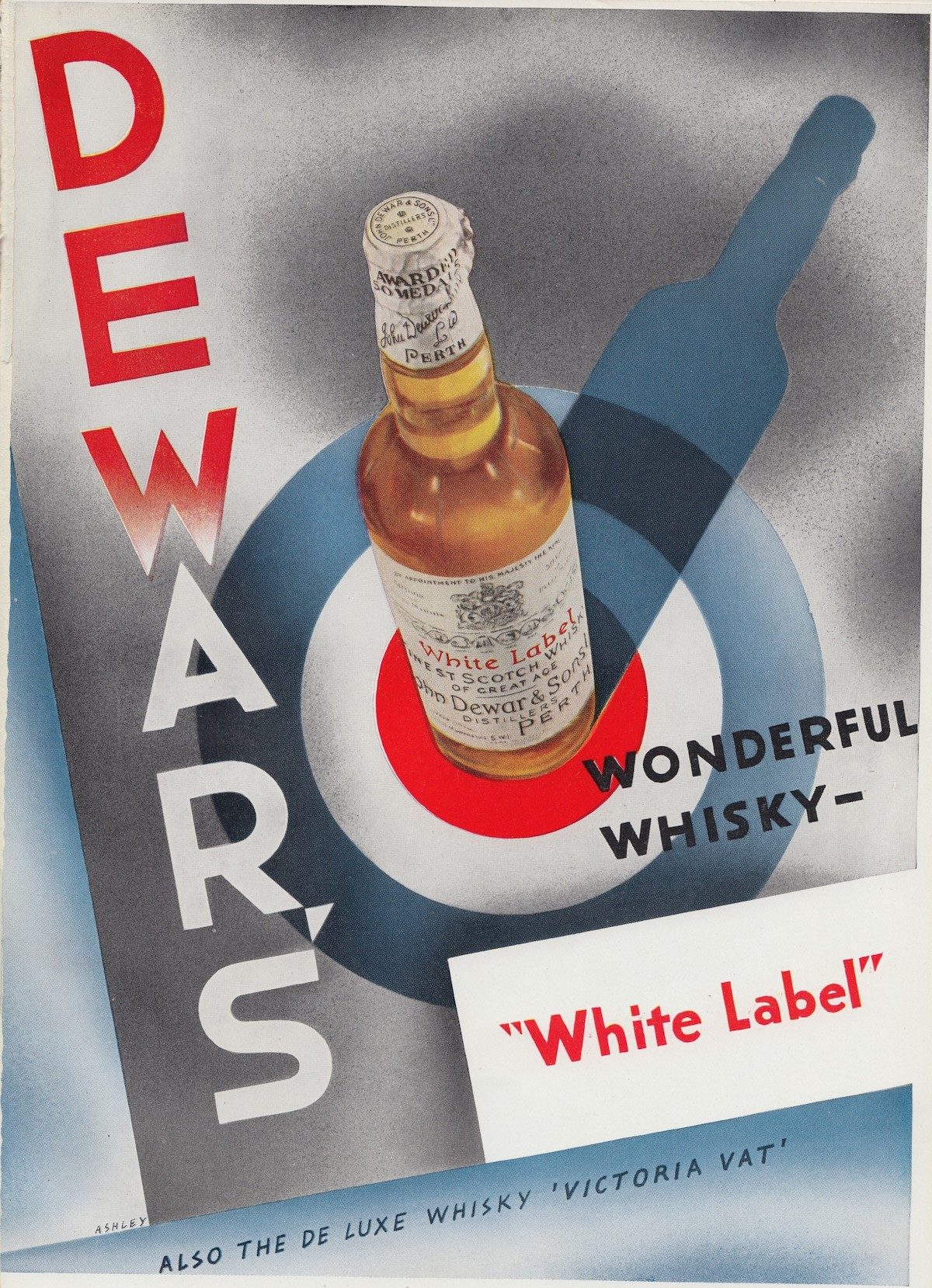
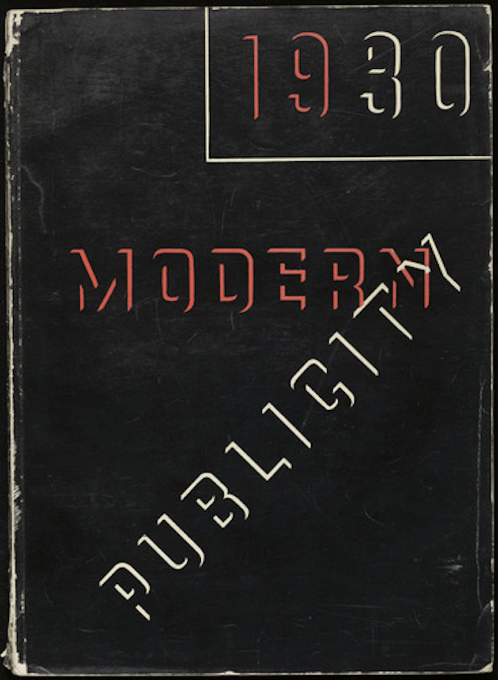
Modern Publicity – Commercial Art Annual’ 1930, Edited by FA Mercer and W Gaunt. Published by The Studio Limited, 44 Leicester Square, London. Scanned by Paul K at BiblioOdyssey.
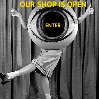
Order: high quality Giclee posters are available in the Shop.
Would you like to support Flashbak?
Please consider making a donation to our site. We don't want to rely on ads to bring you the best of visual culture. You can also support us by signing up to our Mailing List. And you can also follow us on Facebook, Instagram and Twitter. For great art and culture delivered to your door, visit our shop.