The 1970s were a bit bipolar when it came to their interior decorating. On the one hand, colors could go off the deep end into wild bursts of retina-scarring colors (as we discussed in Seeing Red In The 1970s: A Decade’s Fixation With The Colour Of Death, Fear And Regret). On the other hand, things never looked so brown as they did in the 1970s. In a counter-reaction to the psychedelic day-glo colors of the 1960s, most homes went “full brown”.
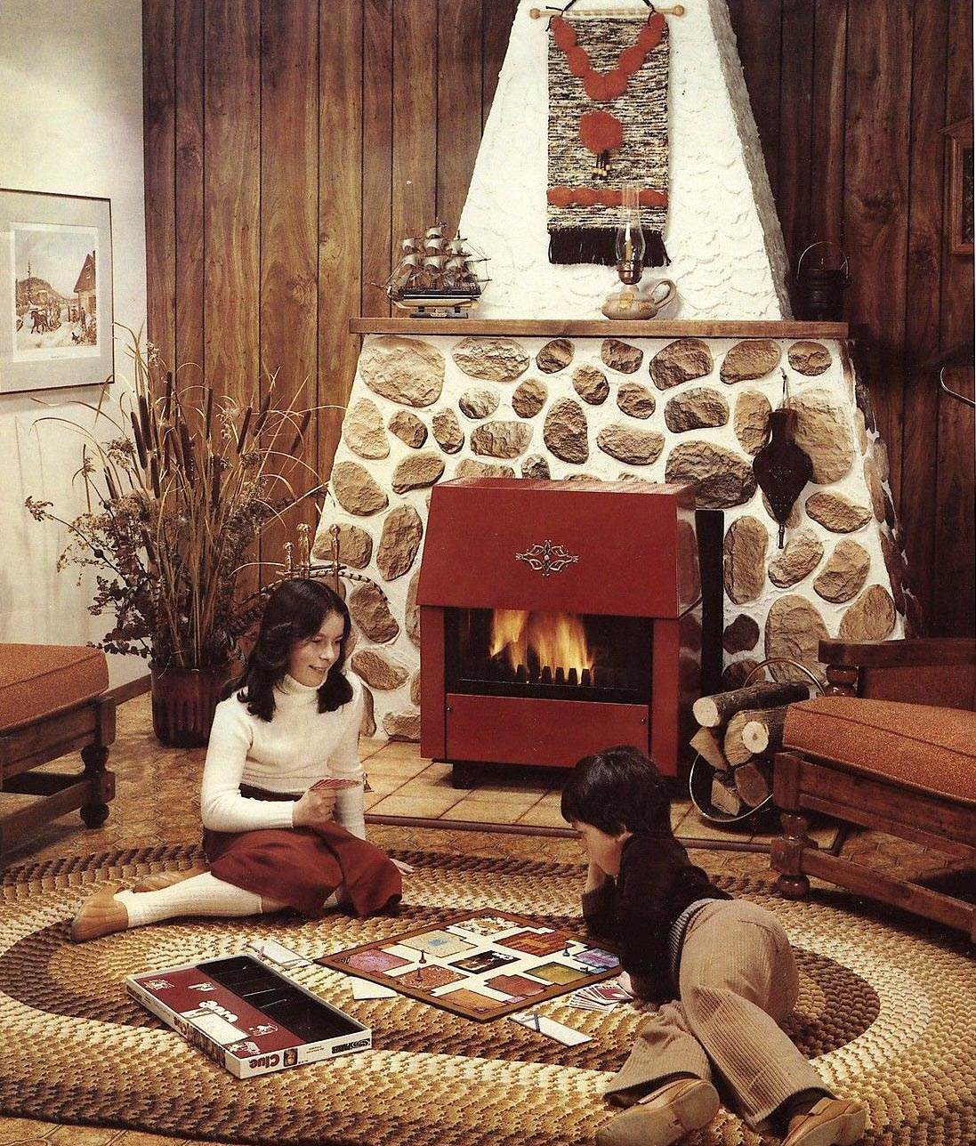
And when I say “full brown” that means the clothing as well. Yes, there were the occasional color accents (as in the red fireplace above), but the official color of 1970s homes was inarguably BROWN.
(Note: I considered titling this story “The Browning of America”, but that saying has since become a derogatory term for the increase in non-white (Hispanic, African-American) populations in the US – and I definitely did not want that connotation.)
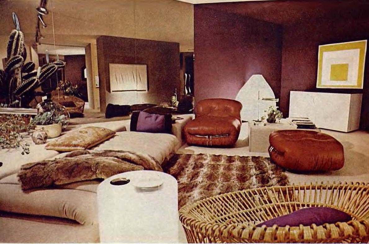
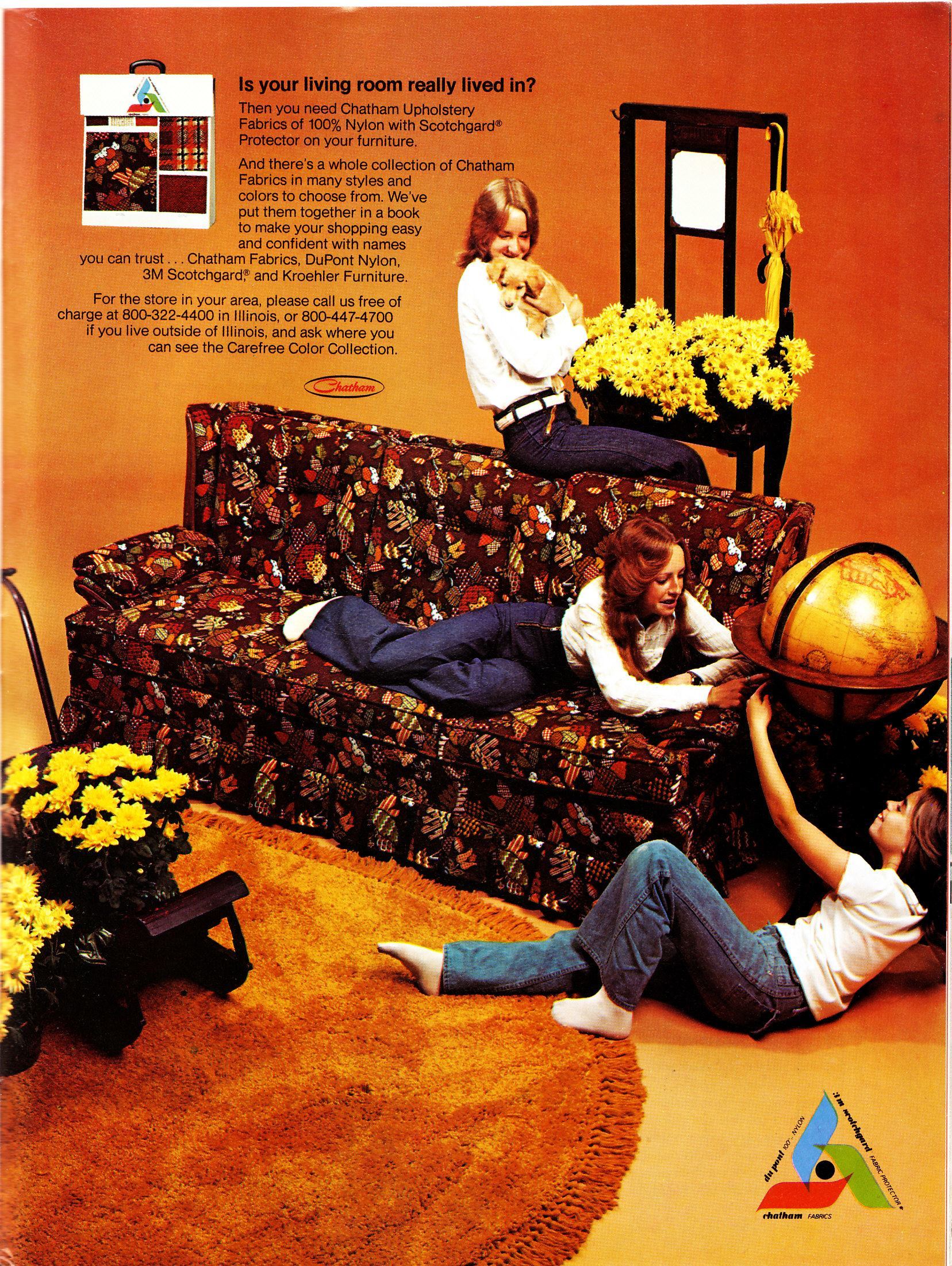
An awesome living room from 1974. The best way to describe the color palette of the 70s might be simply to say: “brown, brown, brown, brown, a dash of purple, brown, brown, brown, a bit of yellow, brown, brown, brown….”
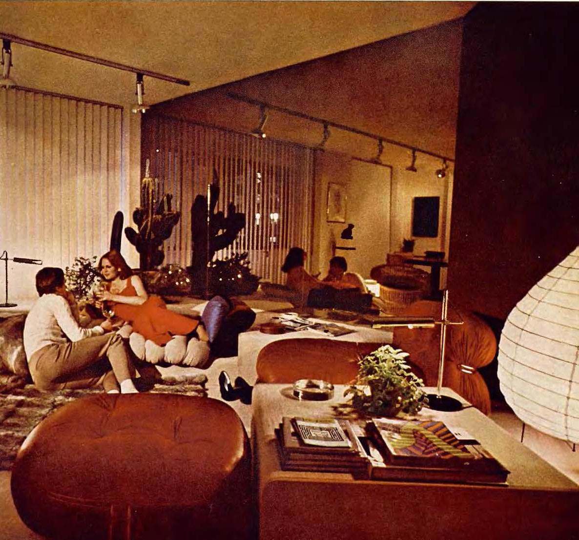
Another look at a posh ’74 living room. This one has a mirror to reflect and magnify its “brownness”.
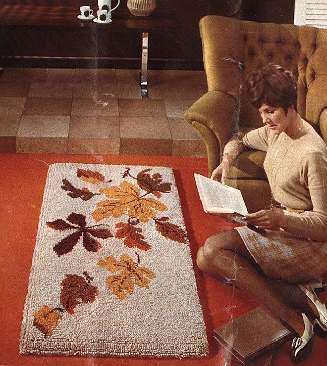
It’s probably a bit simplistic to say it all went specifically brown. It was more of a transition to earth tones, which included Burnt Orange and Harvest Gold.
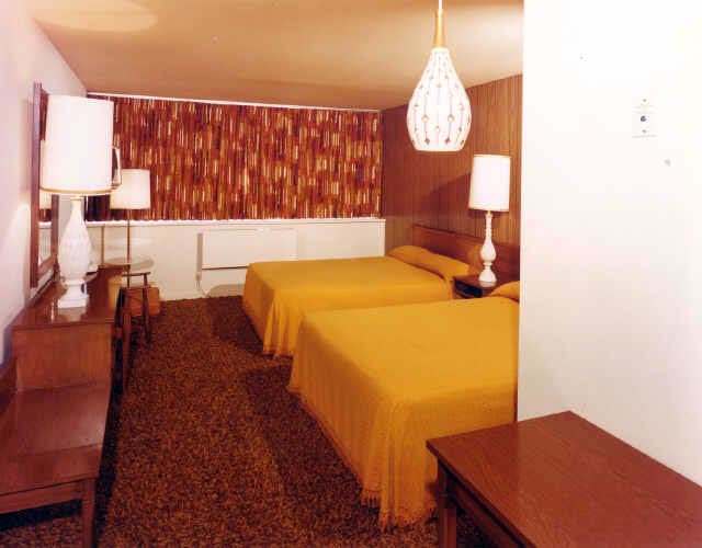
A typical 70s hotel room.
It’s interesting to note the cycle of tastes in color over the decades. The first half of the 20th century was pretty drab. Plastics hadn’t arrived, and dyeing textiles bright colors was expensive or impossible. When the late 1950s rolled around, you started to see mint green and lemon rearing their ugly heads… and by the 1960s there was a full-on eyeball assault as a reaction against the drab earlier years.
Naturally, there was another counter-reaction to this in the 1970s, where earth tones became the colors-of-choice over the plastic, artificial look of the previous decade. This fit nicely with the hippie back-to-nature, down-with-plastics mentality the pervaded most of the decade. This lasted until the 1980s, when there was yet another counter-reaction and earth tones were jettisoned entirely in favor of pastels and bright optimistic colors…. but we’ll cover that another day. Back to brown we go….
“Oh, honey, it’s wonderful. It’s deep rich browns perfectly complement our wholly brown world.”
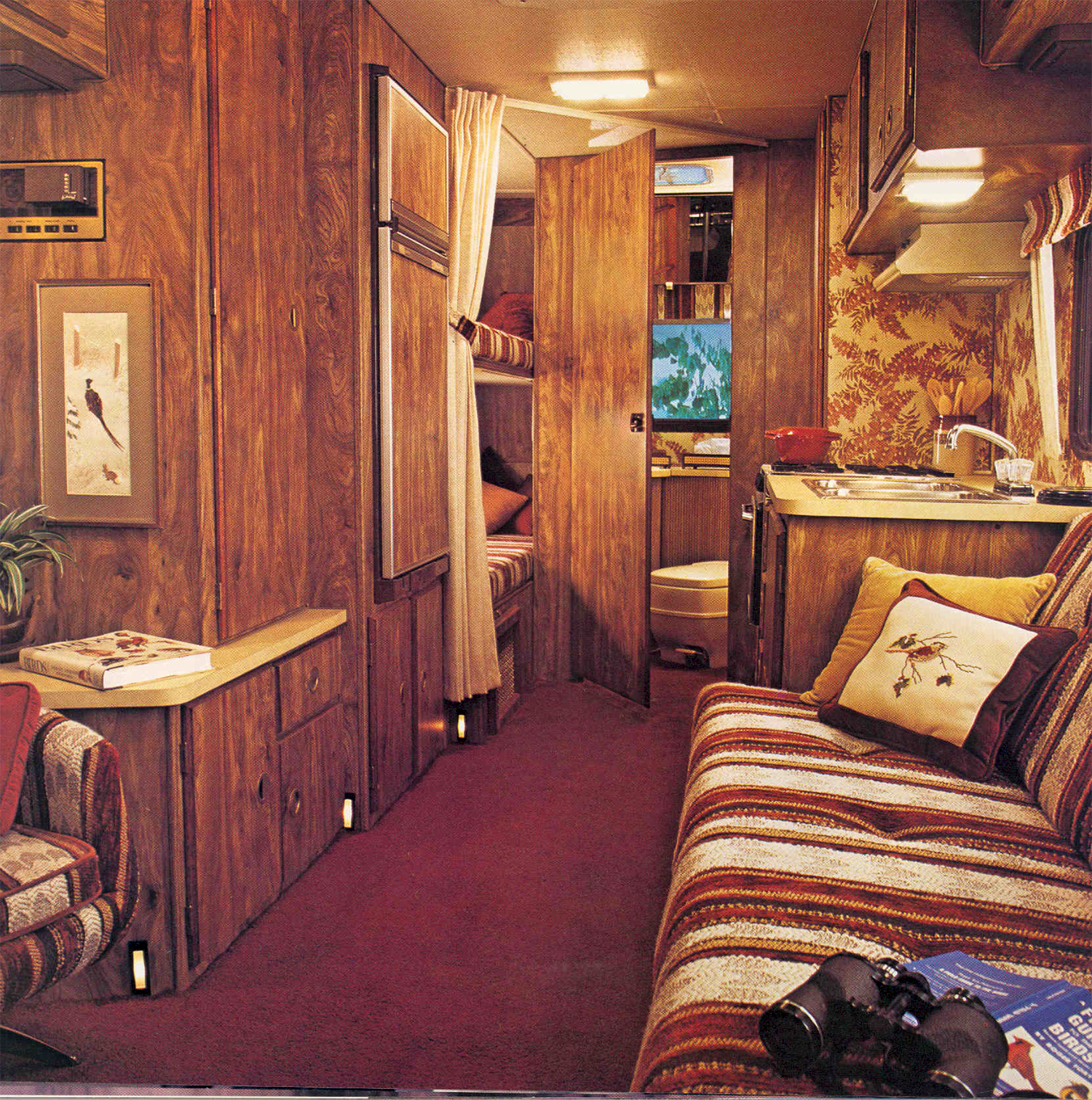
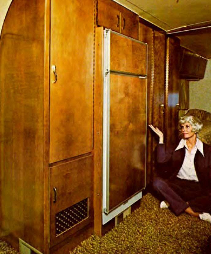
And if we’re going to talk about brown living areas, we can’t neglect to mention RVs. Truly, no living space on earth was more brown than the 1970s Winnebago.
But if we’re going to talk about browning up our living spaces, there’s an elephant in the room that simply must be addressed….
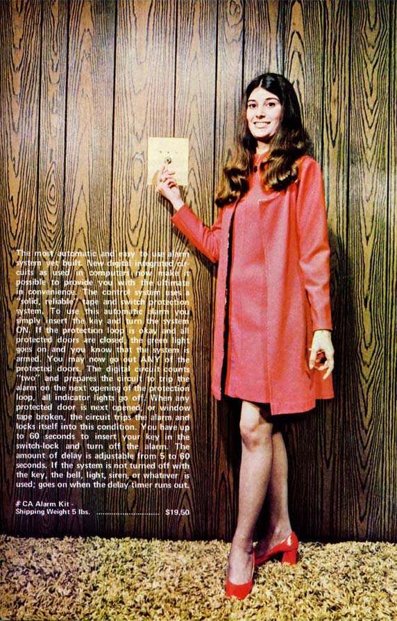
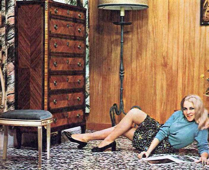
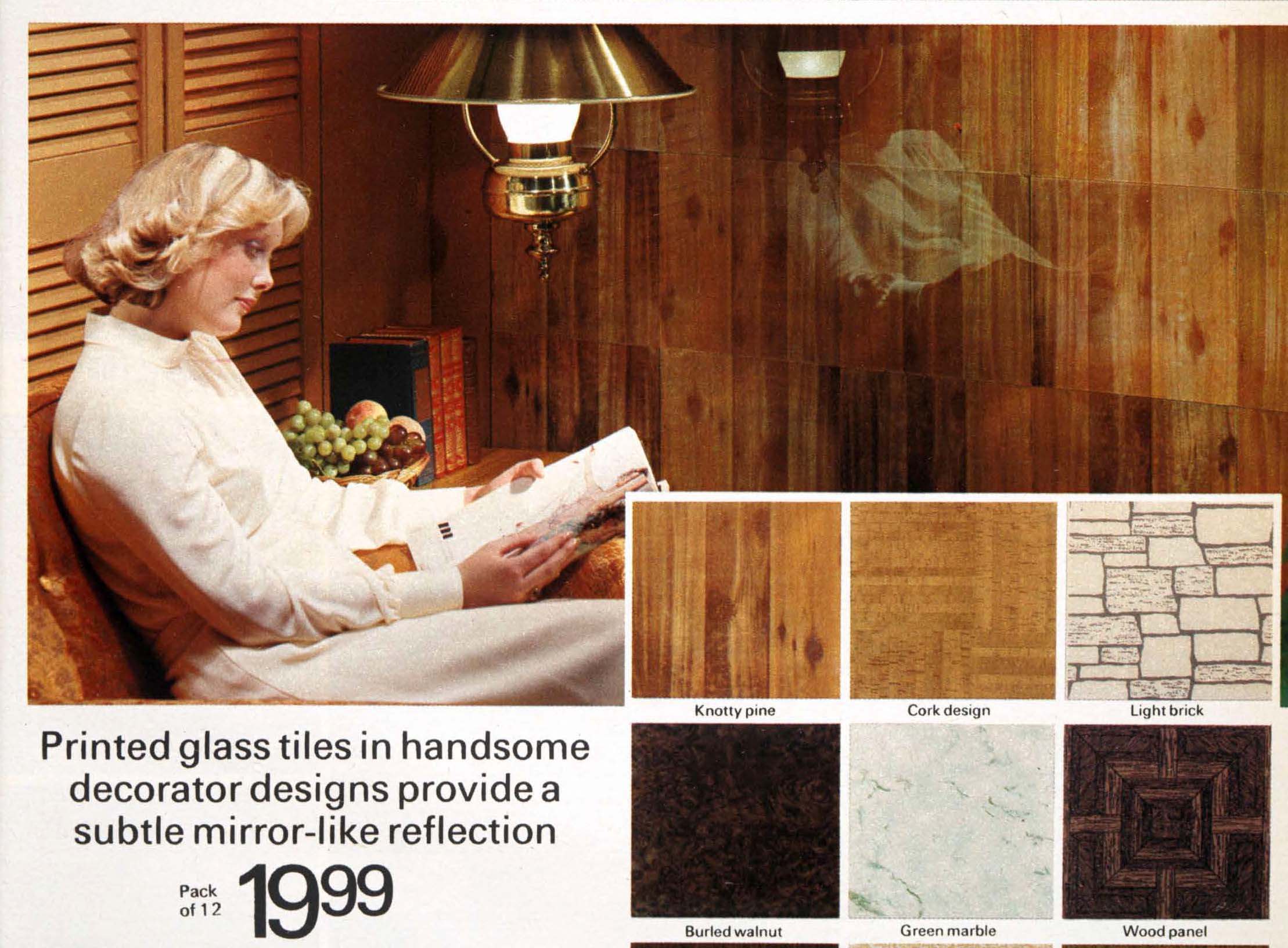
Mighty Wood Paneling. Yes, as if everything wasn’t brown enough, 1970s homes had to add paneling. No wall was spared.
Wood paneling came to be absolutely detested in the late 1980s-90s. It was looked upon as straight-up trashy. If you owned a home during this period, chances are you threw out the cheap composite paneling and replaced it with dry wall. It’s easy to forget that it was once considered stylish.
What percentage of 1970s rumpus rooms and dens weren’t lined with brown paneling? Answer: 0%
Everyone remembers the Brady den, right?
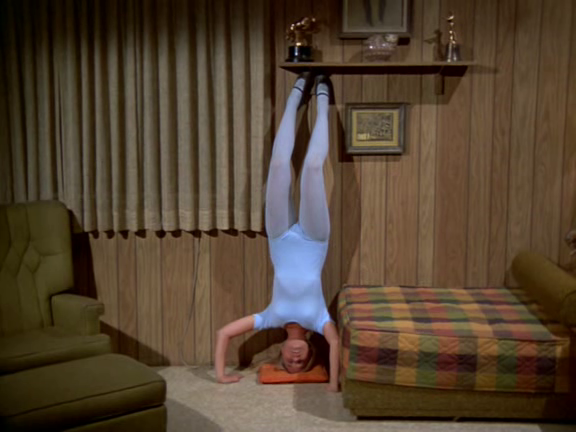
Don’t be distracted by Marcia doing a headstand in a leotard. Just savor the all-encompassing brown of the Brady Bunch living space. Brown is Beautiful.
So, picture if you will, a basement lined with dark wood paneling, with a burnt orange carpet, and brown upholstered furniture…. and this is where you spent your life for nearly a decade. It’s not wonder that people of the 1980s ran screaming for a bucket of pastel pink!
Truth be told, I have to admit that I kind of like the ubiquitous brown. It gave the decade a definite character – you can look at a 1970s interior and immediately tell that it’s from that decade. Whereas, today’s decor doesn’t quite have a trademark look…. and, somehow, I don’t think that’s a good thing. It’s not as if we have all gone our own bold directions; quite the opposite. It seems we’ve abandoned the day-glo 60s, the brown 70s and the pastel 80s in favor of…. what? A sort of “meh” sensibility of yawn inducing conservative colors, stainless steel appliances and granite countertops. I say Bring Back the Brown!
Would you like to support Flashbak?
Please consider making a donation to our site. We don't want to rely on ads to bring you the best of visual culture. You can also support us by signing up to our Mailing List. And you can also follow us on Facebook, Instagram and Twitter. For great art and culture delivered to your door, visit our shop.